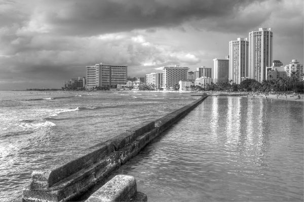
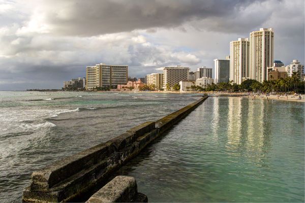
Waikiki from Queen's Beach Pier - B&W or Color?
Jan 22, 2012 09:02:03 #

Any preference for B&W or Color?
Waikiki from Queen's Beach Pier
Waikiki from Queen's Beach Pier
Jan 22, 2012 09:28:31 #
Jan 22, 2012 10:15:24 #

Jan 22, 2012 10:51:44 #

Jan 22, 2012 12:13:05 #

dlwhawaii wrote:
Any preference for B&W or Color?
This is an interesting paradox of choice. Looking solely at the overall images, the Black & White image has the impact; however, if you are trying say Waikiki then the color image has to win out for one clear and simple reason - The Royal Hawaiian Hotel!
Opened to the public on February 1, 1927, this iconic hotel stood alone on Waikiki Beach as the "Pink Palace", a regal and majestic structure. Visited by many famous people in the early years, FDR used this hotel on many occasions resulting in the Royal Hawaiian Hotel being dubbed the Western White House. . .the first use of this term.
I walked along Waikiki beach many times in the 1950's, and fondly recall this solitary grand pink hotel. When Hawaii became a State in 1959, the landscape of Waikiki beach began to change. Tall glass and steel hotels were built, and built, and built. Over the ensuing years, The Royal Hawaiian seems to have been swallowed up, becoming less and less of a commanding structure on the beach and the skyline, unless you walked along the beach and stood facing the "Pink Palace".
For this reason, the color image wins out in my mind, as you can clearly see the iconic pink hotel along the beach front. It still catches the eye and suggests a grand presence of another time. Lacking the color, this wonderful first Waikiki hotel is not noticed at all.
Because of where the images represent, I clearly vote COLOR.
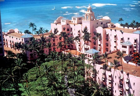
Below is a tight image of The Royal Hawaiian Hotel (from the internet), suggesting its once grand presence, now lost among a sea of high rise steel and glass ugly structures. What chance does a 6 story hotel have surrounded by the onslaught of the high rise?
Jan 22, 2012 12:19:20 #

Jan 22, 2012 12:22:44 #

dlwhawaii wrote:
Any preference for B&W or Color?
For initial impact, I prefer the black and white shot. Great composition by the way. Would be happy with either one.
Jan 22, 2012 13:08:39 #

It depends what You are looking for...if its impact and mood,I would go with the B&W . If is detail you want...color
Jan 22, 2012 13:43:24 #
Aloha and many thanks for your cogent comments. I too like the B&W for sheer impact and the color for mood and details. Lived on Oahu for 17+ years and still injoy some of the icons. Haven't done B&W in many years, but will continue to work with it to improve. Again many thanks.
Jan 22, 2012 13:56:09 #

Either, or. Beautiful, anyway you look at it.
dlwhawaii wrote:
Any preference for B&W or Color?
Jan 23, 2012 08:49:09 #

Jan 23, 2012 12:21:47 #

If you want to reply, then register here. Registration is free and your account is created instantly, so you can post right away.