Please tell me which Jumper image is better
Jun 22, 2014 01:27:12 #
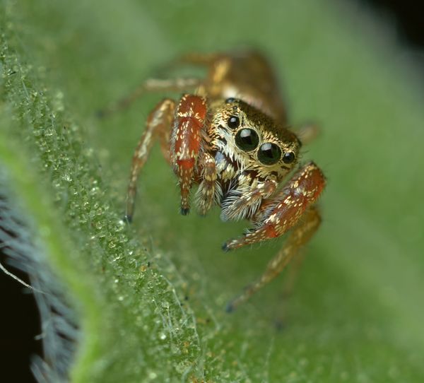
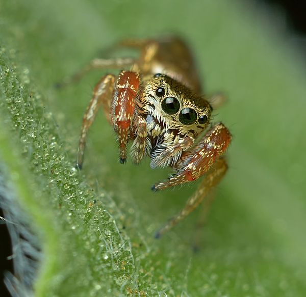
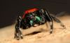
I'm would like critique and opinions about which of these images of the same shot is better and why. Or, what I could have done better/differently in PP.
Download tells the tale.
Thanks :wink:
Download tells the tale.
Thanks :wink:
Jun 22, 2014 01:31:20 #

Jun 22, 2014 02:52:14 #
I love both shots, but like #2 the most also.
It's closer and clearer. Thank you for sharing these.
It's closer and clearer. Thank you for sharing these.
Jun 22, 2014 02:52:51 #

I like the second. It seems to a crop of the first, and the foreground texture appears to have more depth of field. The dark areas in the corners are more equal. Also the contrast seems better, the highlights in the first seem a little foggy, diminished, the second seems sharper, clearer. The second is better centered, although modern opinion is to have something off center, but in this case I don't think there is anything to support the off-centeredness of the first, the details more abundant in the lower left corner of the first are just a distraction from real interest of the picture.
Jun 22, 2014 05:15:27 #
Jun 22, 2014 12:08:28 #
Jun 22, 2014 19:31:42 #

Jun 23, 2014 08:13:51 #

Jun 23, 2014 12:44:59 #
Thanks everyone for the input. I suspected #2 was better. I'm trying a few new things in PP and trying to keep adjustments minimal but, made my images as good as they can be or, save a less than perfect shot.
When I'm scrutinizing in real close in post, is what prompted the question. I wasn't certain if #2 looked over done when downloaded.
When I'm scrutinizing in real close in post, is what prompted the question. I wasn't certain if #2 looked over done when downloaded.
Jun 23, 2014 23:02:47 #
Jun 23, 2014 23:43:46 #
Bill - I actually prefer Picture 1. There are more blown out white scales in image 2. Did you kick up the exposure, highlights or whites in this photo? Just kick up the contrast and perhaps a smidgen of saturation in the 1st photo and I think it will pop..
Jun 24, 2014 05:19:15 #

Jun 25, 2014 04:03:51 #
A-PeeR wrote:
Bill - I actually prefer Picture 1. There are more blown out white scales in image 2. Did you kick up the exposure, highlights or whites in this photo? Just kick up the contrast and perhaps a smidgen of saturation in the 1st photo and I think it will pop..
I don't recall exactly. I did roughly the same treatment using two different software. I'm experimenting and trying to learn how to get the best from my images. I have a long way to go in all areas.
I guess the scales do look slightly blown out, now that you point it out. I would have never noticed. I still need to learn what to look for.
If you want to reply, then register here. Registration is free and your account is created instantly, so you can post right away.