Check out Drone Video and Photography Forum section of our forum.
Heavy Horses at work
Mar 31, 2014 08:26:28 #

One of my better shots, am looking to improve things like composition etc. I do not have super lenses so lens sharpness is what it is.
I am try to teach by brain to look at a scene, and although this shot is a vast improvement on my previous efforts, I am quite sure I have a long way to go. Your comments will be appreciated.
I am try to teach by brain to look at a scene, and although this shot is a vast improvement on my previous efforts, I am quite sure I have a long way to go. Your comments will be appreciated.

Mar 31, 2014 09:11:01 #
DavidPine
Loc: Fredericksburg, TX
I like the contour, colors and the contrast. I couldn't download to get a better look. I think there is too much foreground and I would have like to have the driver a little more to the right edge. Overall, the composition is very good. Good shot.
Searcher wrote:
One of my better shots, am looking to improve things like composition etc. I do not have super lenses so lens sharpness is what it is.
I am try to teach by brain to look at a scene, and although this shot is a vast improvement on my previous efforts, I am quite sure I have a long way to go. Your comments will be appreciated.
I am try to teach by brain to look at a scene, and although this shot is a vast improvement on my previous efforts, I am quite sure I have a long way to go. Your comments will be appreciated.
Mar 31, 2014 09:44:44 #
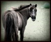
The middle horse is out of step with the others...ok...only joking. Good shot. Agree with David otherwise. Also would have liked to see the driver more engaged with his horses...looks like he is being distracted with the reins. ;-)
Check out Professional and Advanced Portraiture section of our forum.
Mar 31, 2014 10:39:48 #

Wish we could see it larger. I like the composition but think you could remove about half the foreground grass. I like the buildings at the top of the frame. Those look interesting, I'd leave them in the frame. Good photo!
Mar 31, 2014 10:41:58 #
Nice shot. I like the composition. Something about the two broad bands of contrasting color really draws my interest. I agree re foreground (bit too much). I also notice there is a hint of some very interesting architecture in the top left corner, which distracts a bit from your subject. I'd either crop it out entirely (especially if the original doesn't show the buildings in their entirety), or perhaps crop to keep them entirely in the photo, though I'd vote for the former.
Look at me, prattling on as if I have a clue about composition or color. Just giving my reactions. :lol:
Look at me, prattling on as if I have a clue about composition or color. Just giving my reactions. :lol:
Mar 31, 2014 12:17:38 #

I have to concur. The foreground could be cut in half and the top should be cropped below the buildings. If you want to keep your ratio you could take a little off the right and more off the left, but no so much that you are crowding the horses. You might have waited a second to get the driver looking at the team giving more connection between him and them. In this image it looks like he is fiddling with the reins and not paying attention to the horse.
You exposure looks to be good. No way to judge sharpness from this image, but you aren't asking for that.
BTW what are they pulling? I don't recognize the implement.
You exposure looks to be good. No way to judge sharpness from this image, but you aren't asking for that.
BTW what are they pulling? I don't recognize the implement.
Mar 31, 2014 18:32:55 #

I agree with CM and David et al. I think one of the things we all fail to do is work the scene; move around and try different angles. In this case a lot of what previous critiquers object to might be cures by moving the camera left. This would shorten the distance between the man and horses (changing the aspedt ratio of the image), get rid of the upper left area distractions, and give you a better shot at cropping. Another thing I see and like is the repeating of the blue in the horses' gear. It would be a neat touch to change the handler's shirt color to closely match it.
Check out Underwater Photography Forum section of our forum.
Mar 31, 2014 18:40:41 #
photoninja1 wrote:
I agree with CM and David et al. I think one of t... (show quote)
Thank you. I have reposted my edited version in a new thread.
I did take quite a few shots of this scene from different angles, but almost every one was swamped by children running across at the crucial moment. This one was the pick of the bunch.
Mar 31, 2014 20:43:33 #

Searcher wrote:
One of my better shots, am looking to improve things like composition etc. I do not have super lenses so lens sharpness is what it is.
I am try to teach by brain to look at a scene, and although this shot is a vast improvement on my previous efforts, I am quite sure I have a long way to go. Your comments will be appreciated.
I am try to teach by brain to look at a scene, and although this shot is a vast improvement on my previous efforts, I am quite sure I have a long way to go. Your comments will be appreciated.
I like the image and agree with ninja about the virues of "working the scene"
the composition is fairly unrelievedly horizontal. getting a bit closer and the down low so the lead horse would the highpoint from which perspective lines could drop a bit to tne man on one side and the other horses to the left would give an interesting view.
Dave in SD
Apr 1, 2014 09:40:15 #

I enjoyed your picture Searcher. Like others, I think it could have been improved by cropping. From my vantage, having walked alongside my grandfather as he worked his horses, I have trouble visioning anyone in the field without a sun hat. That and cropping the shot to eliminate the distraction of the buildings. The foreground was the reason for being out there with the horses, so to me it is part story the picture tells. If the children were following the action, they too would have been part of the story. I enjoy your posts.
Apr 1, 2014 09:44:29 #
Leon S wrote:
I enjoyed your picture Searcher. Like others, I t... (show quote)
Thank you Leon, there is a cropped version here http://www.uglyhedgehog.com/tpr?p=3351209&t=197871
The children were running across in front of the horses to get to the Ice Cream Van, so I left those out.
Apr 1, 2014 09:51:14 #
Uuglypher wrote:
I like the image and agree with ninja about the virues of "working the scene"
the composition is fairly unrelievedly horizontal. getting a bit closer and the down low so the lead horse would the highpoint from which perspective lines could drop a bit to tne man on one side and the other horses to the left would give an interesting view.
Dave in SD
the composition is fairly unrelievedly horizontal. getting a bit closer and the down low so the lead horse would the highpoint from which perspective lines could drop a bit to tne man on one side and the other horses to the left would give an interesting view.
Dave in SD
I wish I had thought of that. My problem is that I am not used to Pictorial or Artistic Photography, hence this post. I have spent fifty years on photographically recording facts, rarely trying to make the image look good. Surgical procedures and wounds are not supposed to look pretty, so all this is a new experience for me.
Apr 1, 2014 10:01:24 #
Searcher wrote:
Thank you Leon, there is a cropped version here http://www.uglyhedgehog.com/tpr?p=3351209&t=197871
The children were running across in front of the horses to get to the Ice Cream Van, so I left those out.
The children were running across in front of the horses to get to the Ice Cream Van, so I left those out.
There were times when I ran out in front also, but that got my butt warmed hotter than the sun did that day. I still like the shot.
Apr 1, 2014 11:13:04 #

I think the shot could be improved by cropping on the left and top. For me, the subject is too much in the center. But I do like the subject and exposure.
If you want to reply, then register here. Registration is free and your account is created instantly, so you can post right away.
Check out Astronomical Photography Forum section of our forum.