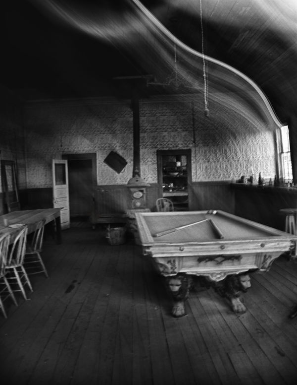
bodie pool table bw & color
Dec 30, 2011 22:40:53 #

two looks at the same table.
I'm going to put one of them into a juried exhibit next week. Which one is going in?
I'm going to put one of them into a juried exhibit next week. Which one is going in?
black and white

Dec 30, 2011 23:02:40 #

What kind of camera did you take theses with? They look pretty blurry. Almost look likeit was taken with a pinhole camera.
Dec 30, 2011 23:12:21 #

Dec 31, 2011 02:43:09 #

There is more detail in the B&W. Look at the floor and oblinged stain for my reference.
Dec 31, 2011 09:36:52 #

Like the B&W one better; looks to me like the detail is better and the room and table just looks "older" and better in B&W.
Oh, by the way, if you are including a title with the photo you enter, the table is actually a billiard table, not a pool table-no pockets.
Oh, by the way, if you are including a title with the photo you enter, the table is actually a billiard table, not a pool table-no pockets.
Dec 31, 2011 13:10:54 #

Either picture is an interesting subject. Personally if I wanted to highlight the pool table I would crop the picture to get rid of the bar and the open door in back. Then I would blow the images up to 100% and see if they are still in focus and check the digital noise. Digital noise you can edit out, if they are blurry at that magnification you probably won't get far in a juried show.
Dec 31, 2011 14:26:45 #
One of the most interesting things about this image is the way the light is bent over the table. To me it adds so must interest.
Dec 31, 2011 14:34:25 #

Like the b&w...like the concept...but seems to be tilting to the left and a little out of focus?
<Are my eyes deceiving me AGAIN? Sheesh!>
<Are my eyes deceiving me AGAIN? Sheesh!>
Dec 31, 2011 14:41:23 #
philo wrote:
One of the most interesting things about this image is the way the light is bent over the table. To me it adds so must interest.
I agree with you on that subject; however I still recommending some cropping to like a 5" x 9". That would cutout the door on the left and the top crop would be at a point where the curve of the ceiling mates with the left side. I did a quick crop that way and I think it helps. Also would brighten up the image a bit. I'll post if you want, but not without your permission.
Dec 31, 2011 15:03:35 #
Dec 31, 2011 15:06:07 #
philo wrote:
please post ..thanks
These are my thoughts, you are the judge--not me! Thanks for looking at my suggestion.

Dec 31, 2011 15:13:46 #
Dec 31, 2011 15:19:04 #
philo wrote:
I really like it. good job thanks
My thanks to you. I approach making changes very carefully and so glad it worked in this instance. Have a Happy New Year!
Jan 1, 2012 01:06:13 #

I love the study of the entire room and the obvious age of the furnishings. Either of the first two images is preferable to the one that is cropped close to the sides of the table. I think the chairs and the door add a lot to the image.
My cropping would be down from the top to about the top of the window and just a tad off the bottom.
I don't understand the light streaks from the window and seemingly from the other end of the table. It is very distracting, to me. Is this a print from an old, old negative?
My vote is for the color shot with the cropping I suggested.
Jan 1, 2012 01:06:26 #
TimothyBuss
Loc: Virginia/West Virginia
Been going back and forth between the two versions for about an hour now, I think the b&w gives the ethereal "haunting quality" that I believe you were looking for. I would pick the b&w if I was a jurist. Hope you win. It is a very good photograph. :thumbup:
If you want to reply, then register here. Registration is free and your account is created instantly, so you can post right away.