Colour or B&W for this picture
Feb 13, 2014 11:14:16 #

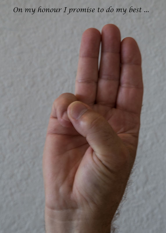
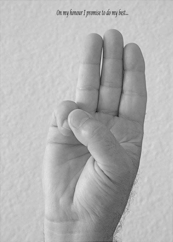
Hi all, our camera club's theme this month is hard promises so after thinking about it, I thought the the Boy Scout promise is one of the toughest promises out there so I thought a photo of the Scout Salute might be a good idea. I have two versions one in colour and one in B&W. Which one do you think conveys the message better.
Thanks for any comments and feel free to critique as well.
Thanks for any comments and feel free to critique as well.
Feb 13, 2014 11:29:10 #

Colour. I don't think there is nearly enough contrast in the B&W image - the hand should, IMO, be darker.
Feb 13, 2014 11:33:42 #

I prefer the color rather than the B&W. In the B&W the hand blends too well into the background.
The idea for the photograph seems sound but I believe the photograph would be improved by better focus on the hand. The exposure duration was 1/3 of a second and the focal length was 93mm. Unless you used something (tripod) to steady the camera, camera shake or motion blur may be evident. Another idea would be to use a flash.
Hope this helps. 8-)
Feb 13, 2014 11:33:51 #
DaveMM wrote:
Colour. I don't think there is nearly enough contrast in the B&W image - the hand should, IMO, be darker.
Thanks Dave, I agree I would have liked the hand darker but I am next to useless with Elements, lol.
Feb 13, 2014 11:33:52 #
Feb 13, 2014 11:35:41 #
happy sailor wrote:
Hi all, our camera club's theme this month is hard promises so after thinking about it, I thought the the Boy Scout promise is one of the toughest promises out there so I thought a photo of the Scout Salute might be a good idea. I have two versions one in colour and one in B&W. Which one do you think conveys the message better.
Thanks for any comments and feel free to critique as well.
Thanks for any comments and feel free to critique as well.
In this instance I prefer the colour only because the B&W lacks tone and contrast IMHO.
Feb 13, 2014 11:37:40 #

happy sailor wrote:
Hi all, our camera club's theme this month is hard promises so after thinking about it, I thought the the Boy Scout promise is one of the toughest promises out there so I thought a photo of the Scout Salute might be a good idea. I have two versions one in colour and one in B&W. Which one do you think conveys the message better.
Thanks for any comments and feel free to critique as well.
Thanks for any comments and feel free to critique as well.
I like the black and white for this-puts all the attention on what the hand is doing.
Feb 13, 2014 13:26:13 #

Black & white looks good in certain situations, faces, scenes with good contrast or to set a mood. I see no reason to make this one black & white.
Feb 13, 2014 14:21:39 #

happy sailor wrote:
Hi all, our camera club's theme this month is hard promises so after thinking about it, I thought the the Boy Scout promise is one of the toughest promises out there so I thought a photo of the Scout Salute might be a good idea. I have two versions one in colour and one in B&W. Which one do you think conveys the message better.
Thanks for any comments and feel free to critique as well.
Thanks for any comments and feel free to critique as well.
Color has more contrast and makes the hand standout, but the hand apears to be out of focus or has movement.
Feb 13, 2014 14:38:55 #
DaveMM wrote:
Colour. I don't think there is nearly enough contrast in the B&W image - the hand should, IMO, be darker.
Color, but you should try to brighten up the hand.
Feb 14, 2014 07:20:17 #

Feb 14, 2014 10:44:02 #

Feb 14, 2014 13:44:07 #

happy sailor wrote:
Hi all, our camera club's theme this month is hard promises so after thinking about it, I thought the the Boy Scout promise is one of the toughest promises out there so I thought a photo of the Scout Salute might be a good idea. I have two versions one in colour and one in B&W. Which one do you think conveys the message better.
Thanks for any comments and feel free to critique as well.
Thanks for any comments and feel free to critique as well.
Because the b/w version lacks appropriate contrast and texture, the color version is better. But I think your idea might have more impact if you have two hands in the image, one in front of the other. The front one would be a 12-year-old's hand, the back one the hand of a much older man. This would reflect the idea of keeping the promise. Just a suggestion.
Feb 14, 2014 13:47:40 #

happy sailor wrote:
Thanks Dave, I agree I would have liked the hand darker but I am next to useless with Elements, lol.
Looks like straight from the camera. BW straight from a digital needs a lot of tweaking.
Feb 14, 2014 21:18:58 #
wlgoode wrote:
Looks like straight from the camera. BW straight from a digital needs a lot of tweaking.
Thanks all for your comments, I still like the idea and will reshoot it with some different settings and light.
Thanks again for your input
If you want to reply, then register here. Registration is free and your account is created instantly, so you can post right away.