pictures from Alaska
Sep 15, 2011 16:08:10 #

here are some photo's I took in Alaska in July.
I wanted to catch the whale jumping out of the water or ice falling in to the water, but I had to settle for these.
Tell me what you think, I have several more that are completely different.
I wanted to catch the whale jumping out of the water or ice falling in to the water, but I had to settle for these.
Tell me what you think, I have several more that are completely different.
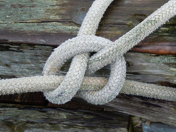
sailor's knot
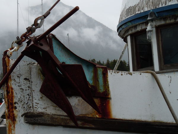
sailor's boat
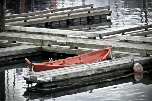
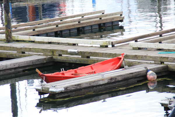
skiff
Sep 15, 2011 17:37:51 #

Interesting study in shapes and textures here. Love the use of selective color. Keep up the good work. :)
Sep 15, 2011 17:42:57 #

tack sharp details, very nice work, the bottom image is a stunning subject composition, very well seen and presented... correct me if I am wrong, but I don't see any of these as SC?
Sep 15, 2011 17:56:41 #
Sep 15, 2011 17:58:03 #
perfect. dont change a thing. i love the nautical theme.quite frankley the whale jumping out of the water or the ice falling into the ocean is about as cliche as bee on flower. these photos are more interesting the texture and details of a rope, the shapes of the boat, the red skiff against a grey background. much better composition. I award you a larry the hedgehog for excellance in nauticl theme.
Sep 15, 2011 18:03:22 #
Sep 15, 2011 18:04:37 #
Sep 15, 2011 18:38:16 #
yeah, I played with the colors some, but Alaska is kind of glummy
Sep 15, 2011 18:42:22 #
I mean gloomy, so the colors are close. Just play with a little in lightroom.
Sep 15, 2011 19:21:00 #

Love, love, love, the knot! Great pictures. They make me want to put Alaska on the bucket list.
Sep 16, 2011 08:59:47 #

I like. They are different.
If you could up the saturation of the red boat in #3, it would be a knockout.
If you could up the saturation of the red boat in #3, it would be a knockout.
Sep 16, 2011 09:01:03 #
I like. They are different.
If you could up the saturation of the red boat in #3, it would be a knockout.
If you could up the saturation of the red boat in #3, it would be a knockout.
Sep 18, 2011 00:27:18 #

I would consider going completely black and white with the background and having color only on the skiff. I think the effect would be stunning. Easy to do with layers and an eraser. I think the composition is very good.
Sep 18, 2011 01:01:09 #
okay, I'll try that, but I did desaturated the boat from the original to give it a more "urban" or "edgey" look.
I wish out of the over 500 hits i had on the pictures more people would have given there comments.
I thank you very, very much for yours.
After I edited it again I'll send it back out to see what you think, but, I do not like the "picasa" B&W look with the overly bold shot of colors. It looks fake and over done. I have yet to see one like that, that look good.
original shot
Sep 18, 2011 01:16:25 #
I agree with you that the color should not be overly bold. I think the desaturated version of your skiff would work better than the original. The more subtle addition of color would be more effective. I love the angled lines that the dock and boat provide. Can't wait to see what you come up with!
If you want to reply, then register here. Registration is free and your account is created instantly, so you can post right away.