Check out Sports Photography section of our forum.
Some favorites
Dec 28, 2011 11:51:31 #
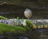
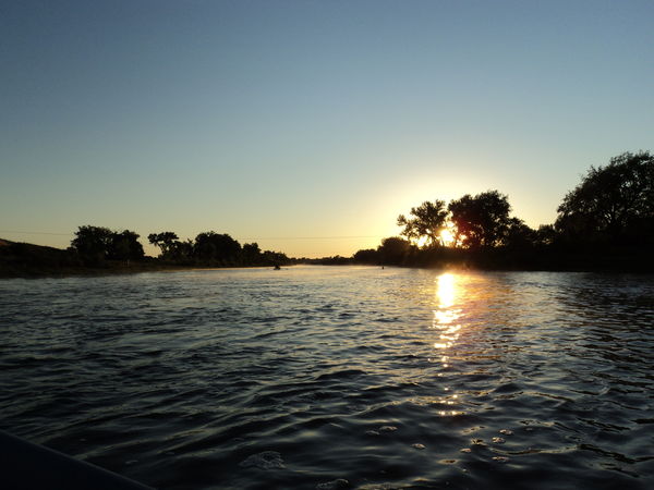
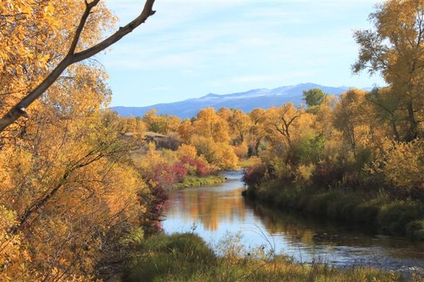
playing with my Cannon rebel. what do you think?
Sunrise on the Big Horn River
1st Birthday bliss

Fall colors
Dec 29, 2011 06:01:39 #

All three were great subjects. However, 1 and 2 are too centered. Google or look in photo handbooks for something called "rule of thirds." #3 is beautiful although the horizon seems a tad tilted. This is an easy fix with Picasa.
Dec 29, 2011 07:21:40 #

Just my thinking but I don't think the thirds rule applies in all pictures. #2 is a great picture. The rule of thirds would ruin this one.
Dec 29, 2011 07:43:46 #

suesart wrote:
playing with my Cannon rebel. what do you think?
I just think image 2 is adorable you captured the moment!
I also, like your third image.
Dec 29, 2011 08:04:30 #

I like all 3 images. The 1st one is not my favorite subject, but that is just me. The 2nd one is perfect just the way it is, and even better if it is your son or grandson. And the 3rd one is great as well. I would not change the "tilted horizon", that is the way it is. I think it gives it an interesting aspect to the picture. I could easily see this picture hanging in a house.
Dec 29, 2011 09:46:54 #

I like #3. I suggest you photoshop out the dark tree branch on the left. It is a point that the eye pulls away from the subject.
Great photo.
Image1
Great photo.
Image1
Dec 29, 2011 10:47:20 #

Check out The Dynamics of Photographic Lighting section of our forum.
Dec 29, 2011 14:18:36 #

I think more colors in the 3rd pic would have been a plus but just a bump of saturation would help
Dec 29, 2011 14:41:54 #
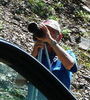
Image1 wrote:
I like #3. I suggest you photoshop out the dark tree branch on the left. It is a point that the eye pulls away from the subject.
Great photo.
Image1
Great photo.
Image1
I agree. The branch must go. It keeps grabbing my attention. Otherwise, beautiful!
If you want to reply, then register here. Registration is free and your account is created instantly, so you can post right away.
Check out Wedding Photography section of our forum.