Headshot for Dance Audition
Jan 16, 2014 20:05:37 #

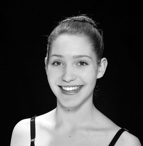
So here is a headshot I did for my daughter for a dance summer intensive. Any feedback on what I can do better would be greatly appreciated.
I'm experimenting with lighting and using my sb600 off camera. I had her under a flood light in the ceiling (for hair light and tried to place her at the half way mark). All I have is two small lights (from a small portable studio light box kit) and bounced one off of white form board on her left side and the other was on the right side slightly in the front. Then I set up my sb600 on a tripod with soft box on the left in front directed towards her.
I know it is not the perfect set up, but am trying to use what I have since the funds go towards the kids activities.
Again any feedback/suggestions will be greatly appreciated. Thank you GP

Jan 16, 2014 20:10:14 #

GPoyner wrote:
So here is a headshot I did for my daughter for a ... (show quote)
For head shots you want to go with a portrait orientation.
Jan 16, 2014 20:13:23 #
Good to know, I didn't see that in any of my research; but then again it is the web. Thank you GP
LoneRangeFinder wrote:
For head shots you want to go with a portrait orientation.
Check out Smartphone Photography section of our forum.
Jan 16, 2014 21:08:05 #

The lighting is pretty flat which is ok if that's what you want. I would move your light source a bit to one side or the other. Also remove the light on her right shoulder. I also agree with shooting in portrait orientation for this photo.
Jan 16, 2014 21:13:42 #

Pretty good and it certainly will work, but I think you used TOO MANY lights. :-)
The hair light is fine. I would have used the -600 with the soft box as the main a bit farther to the left (or right) and higher. Then any light coming from the opposite side should have been dialed down a bit.
Here is why: You have SO MUCH light, that the lighting is way too flat. There is no dimension to her face because everything is lit by about the same amount of light. You can tell the main is too much in front by the position of the catchlights in her eyes. Too close to the center of the eye and two catchlights way to close to one another meaning they are lighting both sides of the face about equally.
If the catchlight is not around the 10 or 2 o'clock position, it is probably not positioned properly. That is not a 100% statement, but one of the classic light positions that "works."
The B&W conversion could use a bit of contrast - the whole image is on the flat side. In the Levels or Curves dialog, hold down the Option key and start to drag that right-hand slider to the left until you start to see parts of the image turn white. Just after you begin to see white, THAT is a good place to increase the highlights. Do the same to the left slider to see things (not the background) begin to go black. Those two techniques will usually ensure decent contrast. My example is attached as well as a better crop.
Jan 16, 2014 21:51:54 #
Thank you for the example...funny I thought I didn't have enough light. So I'll give it another try...since I'm using only what I have for lights, then diffusing the one light opposite from the sb600 and not using the lower light that is reflected off the form board that should give me more dimension?
I was afraid that I would have too little light thus used what I found as a set up on the web and such...which all call for at least 3 or more lights.
Thank you again..GP
I was afraid that I would have too little light thus used what I found as a set up on the web and such...which all call for at least 3 or more lights.
Thank you again..GP
CaptainC wrote:
Pretty good and it certainly will work, but I thin... (show quote)
Jan 16, 2014 22:14:19 #
One of the best - actually THE best - way to learn lighting, is to start with one light and learn how the placement of that single light will cast shadows. Then add a second light, better yet just a reflector. THEN add a second light so you now have two lights and one reflector.
Starting out with multiple lights is NOT the easy way to do it. Every light source you add increases the complexity. One of the best portraits I ever made was done with ONE light - it received the highest award the PPA can award at the International Print Competition in 2012. One light.
Learning portrait lighting takes some time and requires lots of trial and critique. Relatively small placement changes can make a big difference in appearance.
Check out Black and White Photography section of our forum.
Jan 17, 2014 09:22:00 #
Yes, I should have tried one light off camera...maybe that'll be my project this weekend. Thank you for all the help. GP
CaptainC wrote:
One of the best - actually THE best - way to learn... (show quote)
Jan 17, 2014 12:28:37 #
CaptainC wrote:
Pretty good and it certainly will work, but I think you used TOO MANY lights. :-)
The hair light is fine. I would have used the -600 with the soft box as the main a bit farther to the left (or right) and higher. Then any light coming from the opposite side should have been dialed down a bit.
The hair light is fine. I would have used the -600 with the soft box as the main a bit farther to the left (or right) and higher. Then any light coming from the opposite side should have been dialed down a bit.
Apologies as I am very amateur and don't do portrait, but I thought the forehead/hairline a bit washed out. I passed through easy HDR only doing LDR. I was pleased with the result.

Jan 17, 2014 12:59:01 #
nairiam wrote:
Apologies as I am very amateur and don't do portrait, but I thought the forehead/hairline a bit washed out. I passed through easy HDR only doing LDR. I was pleased with the result.
Oh no! Now the skin look splotchy and you have exaggerated all the skin flaws. I'm sorry but this is not an improvement. This just needed to be lit properly in the first place.
To be clear, the original is not bad at all. Better lighting would have improved the dimensionality of the face, but the original is certainly a good image.
Jan 17, 2014 13:32:14 #
CaptainC wrote:
Oh no! Now the skin look splotchy and you have exaggerated all the skin flaws. I'm sorry but this is not an improvement. This just needed to be lit properly in the first place.
To be clear, the original is not bad at all. Better lighting would have improved the dimensionality of the face, but the original is certainly a good image.
To be clear, the original is not bad at all. Better lighting would have improved the dimensionality of the face, but the original is certainly a good image.
I did notice and nearly didn't post for this reason. It does not flatter! I do appreciate the comment. Not an occasion where we accept "Warts and all!"!!
If you want to reply, then register here. Registration is free and your account is created instantly, so you can post right away.
Check out Software and Computer Support for Photographers section of our forum.