A rookie with PSE12/and the nikon P520
Jan 8, 2014 12:27:33 #

Hello, I have been hanging around the site for awhile mostly viewing, but today started to get a little more ambitious about making some posts.
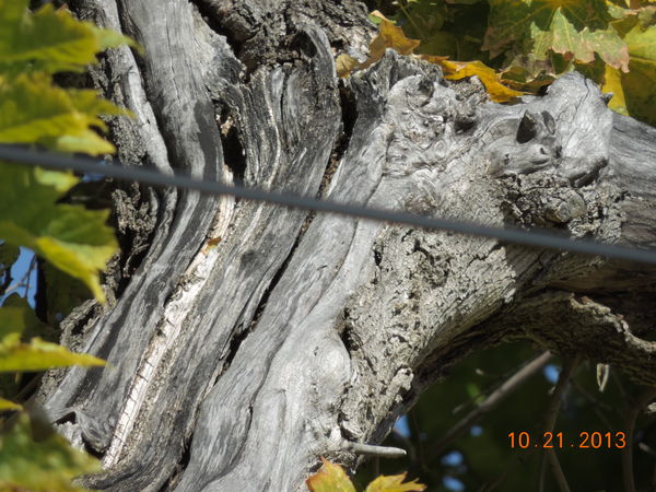
I am in no way shape or form a photographer, but I recently bought a Nikon P520, and later purchased Photo Shop Elements 12. I wish I had done more homework before buying the camera, but oh well.........It should be a good one to learn on. Anyway, here is a photo that I took not long after I bought the camera "just trying to get the feel of it"
I zoomed in on my neighbors tree and power line, then with elements I removed the power line.
Could I please get a critique and possibly some ideas on using it better?
Everthing as is, (except the temperature right now)
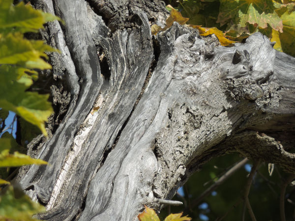
After using the spot healing brush
Jan 8, 2014 12:32:14 #

You did a great job at removing unwanted distractions. Could also remove the blue at the left because it doesn't look like a flower or anything, mostly detracts of the center of interest. Blue spots at right look good to me.
My wayor learning
1- Start with program mode "P"
2- Read the manual well
3- Learn with other users of same camera here and there
4- Look at settings of same camera on Flickr, etc... (make a search for your camera)
5- PRACTICE and READ everything photography here and there.
My wayor learning
1- Start with program mode "P"
2- Read the manual well
3- Learn with other users of same camera here and there
4- Look at settings of same camera on Flickr, etc... (make a search for your camera)
5- PRACTICE and READ everything photography here and there.
Jan 8, 2014 12:32:53 #

Removal of the power line certainly looks good to me. It would be difficult to do a better job.
Go into your camera's menu and turn off the time/date stamp. I assume you removed it via photoshop also.
Go into your camera's menu and turn off the time/date stamp. I assume you removed it via photoshop also.
Jan 8, 2014 12:34:22 #

You sure did nice job. I agree with Aldebaran about removing the blue (at least the large one on left).
Regis
Regis
Jan 8, 2014 13:42:55 #
Thank you so much for your inputs, Aldebaran; Ronwande; and RegisG.
I removed the right, then another with both. I think I like it better with all blue removed. It gave me a chance to experiment with the clone stamp, I think the stamp worked pretty good for my first attempt. Or is it to early to pat myself on the back?
I removed the right, then another with both. I think I like it better with all blue removed. It gave me a chance to experiment with the clone stamp, I think the stamp worked pretty good for my first attempt. Or is it to early to pat myself on the back?
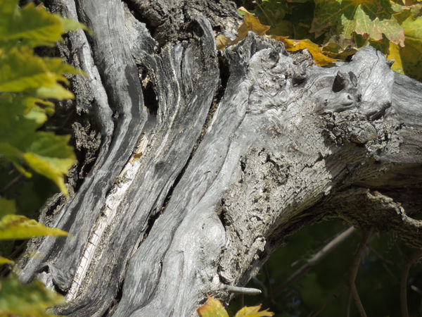
1st attempt

I like this one best

Jan 8, 2014 13:44:14 #
Thank you Ronwande,
I have turned the time/date stamp off since
I have turned the time/date stamp off since
Jan 8, 2014 13:45:20 #
Thank you Regis, you're responsible for me doing both sides. I like that best
Jan 8, 2014 14:11:37 #
I took it one step further on the left, now I am pleased.
Thank you
Thank you
Practiced a little more with the clone stamp
Jan 8, 2014 15:17:11 #

Jan 8, 2014 15:22:05 #
Jan 8, 2014 18:46:36 #

Jan 9, 2014 10:26:41 #

Old Grey Beard wrote:
Thank you so much for your inputs, Aldebaran; Ronwande; and RegisG.
I removed the right, then another with both. I think I like it better with all blue removed. It gave me a chance to experiment with the clone stamp, I think the stamp worked pretty good for my first attempt. Or is it to early to pat myself on the back?
I removed the right, then another with both. I think I like it better with all blue removed. It gave me a chance to experiment with the clone stamp, I think the stamp worked pretty good for my first attempt. Or is it to early to pat myself on the back?
Personal opinion: I think you should keep the blues at the right side
Will look more interesting and very natural also. Without the blues look a little dull to me...Just my opinion.
Jan 9, 2014 11:16:25 #
crissx09 wrote:
Personal opinion: I think you should keep the blues at the right side
Will look more interesting and very natural also. Without the blues look a little dull to me...Just my opinion.
Will look more interesting and very natural also. Without the blues look a little dull to me...Just my opinion.
I think you're right crissx09, I touched it up again.
Thanks

Jan 9, 2014 14:33:46 #

Your work is a strong testimonial to the great effects a newbie to the PSE family can get with just a little practice.
Anyone fearful of the learning curve should take inspiration from this set of postings.
Anyone fearful of the learning curve should take inspiration from this set of postings.
Jan 9, 2014 15:36:13 #
If you want to reply, then register here. Registration is free and your account is created instantly, so you can post right away.