Ex pro looking for feedback.
Dec 25, 2013 02:23:24 #
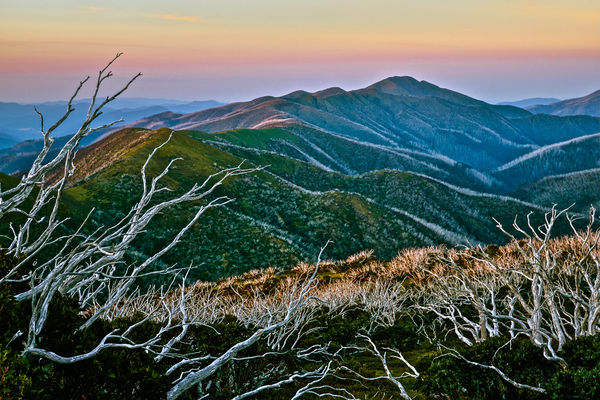
Hello, opinions of this photo taken of Mt Feathertop in Victoria, Australia, will be taken 'on board'.
I was a pro photographer for many years, many years ago. Got out when digital started to take over from transparencies.
Recently purchased new equipment: Nikon D800 and various top quality Nikon lenses. However, I have been constantly disappointed with the results, especially landscapes.
Recently got Lightroom 5 and think I am just now starting to understand how to 'tweak' photos to make them look good quality. And, just starting to understand how to make them look good whether printing or on a computer.
Do you think this looks pro quality? If not, or if so, let me know why.
Mt Feathertop at sunset.
Dec 25, 2013 02:48:28 #

I am not the finest judge on UHH, but as the art buyer famously says, "I know what I like." I like color, good composition, things in focus where appropriate and out of focus where appropriate, and a little drama. Photos that have something to say. Foreground, middle ground and background elements are great, if they are good ones.
I'd say this photo is hitting on all cylinders. It certainly meets my criteria for a professional looking photograph. I love it.
I'd say this photo is hitting on all cylinders. It certainly meets my criteria for a professional looking photograph. I love it.
Dec 25, 2013 03:03:14 #

Very cool shot. I really like the color transitions both in the clouds and across the mountain tops. I'd love to have been there to see it in person.
Dec 25, 2013 03:13:11 #

I can't tell if you have applied an effect in PP that makes this look more like a painting than a photograph?
Dec 25, 2013 03:25:06 #
It doesn't look like you have lost your touch. It is an interesting scene and the composition is first rate. I don't know what the actual scene looks like, but I would prefer a less saturated and contrasty image. I would also clean up the halos around the branches that are jutting into the sky on the left.
Dec 25, 2013 03:27:33 #
An interesting summary Tomato, thanks. No 'effect' as asked applied Yankle: but for the first time I used 'tweaks' such as clarity etc etc which certainly seemed to improve the look of the photo on a computer screen.
Dec 25, 2013 03:32:13 #
I am actually not sure where the halos are Chinaman? It is interesting: these days everyone seems to tweak photos so they look overly saturated and contrasting. I am trying to make them look natural quality so I am interested in your opinion. My primary aim is to make photos look sharp and clear like the old days: so many of my shots look as if they lack definition compared to the pro photos I see by pro digital photographers. However, I have recently realised that is because they know how to tweak them to make them look high quality on computer screens AND when printed.
Dec 25, 2013 05:36:00 #

Dec 25, 2013 07:05:52 #
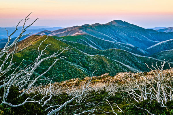
Agree with Bret. Back off a little and this shot can go into National Geographic magazine. And I think their contributes ARE pros.
Dec 25, 2013 07:16:32 #
Ok, here it is 'backed off' a bit. This looks as 'natural' as I remember it at the time. It is interesting to read everyone's opinion because I see so many photos that are obviously severely 'over saturated' but sold by pro photographers and I thought mine was a lot less saturated.
Mt Feathertop at sunset less saturated!
Dec 25, 2013 07:51:34 #
I don't think its so much the color. What iso did you use...and also...I see 31mm...what lens are you using with that D800? When I down-loaded it I see almost what looks like a painted affect.
Dec 25, 2013 09:58:26 #
Dec 25, 2013 12:59:42 #
Very nice. I always add a background layer in PS, bring that into one of the various Topaz plugins, then modify the layer transparency to produce a more realistic final output.
Dec 25, 2013 13:42:55 #

I just keep looking at the second image you attached and marvel. Such an absolutely engaging picture. As someone else already said, "you haven't lost your touch." Can't wait to see more from you in the near future.
Dec 26, 2013 02:51:57 #
I have never even heard of that grenaderphoto, will look into into it. Thanks for the feedback everybody!
If you want to reply, then register here. Registration is free and your account is created instantly, so you can post right away.