Bob this one is for you
Nov 5, 2013 17:46:09 #

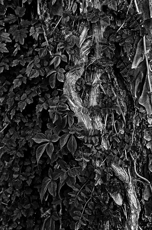
Bob, this is not what I call minimalist, however it is from the new series I am working on.

Nov 5, 2013 19:50:50 #
I like the way the vine winds its way through the composition. Everything is sharp and I think the exposure is very good. I also like the B&W. Nice photo. I don't know what I would have done differently.
Nov 5, 2013 21:05:15 #
Thank you ebrunner.
ebrunner wrote:
I like the way the vine winds its way through the composition. Everything is sharp and I think the exposure is very good. I also like the B&W. Nice photo. I don't know what I would have done differently.
Nov 5, 2013 22:10:53 #
Bram boy
Loc: Vancouver Island B.C. Canada
Bushido wrote:
Bob, this is not what I call minimalist, however it is from the new series I am working on.
nice hi lights on the main stem . great stuff
Nov 5, 2013 23:14:59 #
Thank you Bram boy.
Bram boy wrote:
nice hi lights on the main stem . great stuff
Nov 6, 2013 03:44:39 #

Bushido, I agree there's nothing more to be done .... you've pretty well nailed it. Either that, or you and I have the same editing style.
Nov 6, 2013 08:52:06 #

Bushido wrote:
Bob, this is not what I call minimalist, however it is from the new series I am working on.
I really enjoy the B&W treatment. Nice composition, exposure, and sharpness. :thumbup: :thumbup: :thumbup:
--Bob
Nov 6, 2013 08:53:25 #
I like it very much. If I made it, the only thing I might try would be to VERY slightly lighten the vine JUST a littlea hair more contrast, just to see
Nov 6, 2013 09:53:49 #
Chuck, I attempted your directions and here are is the result. The vine had the exposure lightened bay 1.36 and contrast added by 30%. The over all contrast was increased by 12%. All work was done in Lightroom.
Chuck_893 wrote:
I like it very much. If I made it, the only thing I might try would be to VERY slightly lighten the vine JUST a littlea hair more contrast, just to see
Nov 6, 2013 10:03:07 #
Bushido wrote:
Chuck, I attempted your directions and here are is the result. The vine had the exposure lightened bay 1.36 and contrast added by 30%. The over all contrast was increased by 12%. All work was done in Lightroom.
I like it! Looks like the difference between a no. 2 and a no. 3 paper. Just a little more snap. I think it works.
Nov 6, 2013 10:16:44 #
I agree after a few minutes of comparison.
Chuck_893 wrote:
I like it! Looks like the difference between a no. 2 and a no. 3 paper. Just a little more snap. I think it works.
Nov 6, 2013 13:43:51 #

Bushido wrote:
Chuck, I attempted your directions and here are is the result. The vine had the exposure lightened bay 1.36 and contrast added by 30%. The over all contrast was increased by 12%. All work was done in Lightroom.
This is a really nice improvement. It really makes the vine the center of attention.
Nov 6, 2013 14:10:07 #

Bushido wrote:
Chuck, I attempted your directions and here are is the result. The vine had the exposure lightened bay 1.36 and contrast added by 30%. The over all contrast was increased by 12%. All work was done in Lightroom.
Excellent work Bushido, this version has much more "bite" to it.
Graham
If you want to reply, then register here. Registration is free and your account is created instantly, so you can post right away.