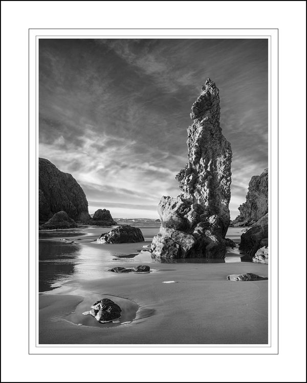
Sea Stack at Low Tide
Nov 5, 2013 13:13:14 #

I haven't been entering many images into competitions this year, but I am on a three month break from the festival circuit right now, so I am thinking it is a good time to put a few images into the local club and see how they are received. Before doing so, I thought it might be nice to try out the new Critique section of the forum in order to get a little early feedback.
I'm looking primarily for first impression, general reactions, and comments as to anything that really bothers you or you found initially jarring when you first saw the image. BTW, i am posting the smaller projection file, not the full print file. I have also posted the matting mockup version so that you can look at it as it will appear in its final framed form. I have a few things that I have spotted that I will most likely adjust, but I won't reveal them at this point so as not to color your perceptions.
Hopefully, when I get back this afternoon I'll have some helpful comments. Thanks in advance. --Jim--
Sea Stack at Low Tide: Bandon Beach, Oregon
Nov 5, 2013 13:22:01 #

Photographer Jim wrote:
I haven't been entering many images into competiti... (show quote)
I love this. The dynamic range is perfect. The scene is magnificent and interesting, and the closer you look, the more interesting details and textures are revealed. This one keeps the eyes interested. You can look at the wet sand, the different rocks, the waves, the little pools of water, the clouds. Everything is cohesive and it has a rich look. The only things I saw (and they might not bother anyone) are a small spot in one of the light bands in the sky, and a dark spot on the sand under the subject rock formation. It is very good that you presented it in its gallery mat. That gives this photo the presentation it deserves.
Nov 5, 2013 13:38:03 #

I was wondering long about this, and I do love the cloud formation, if I were printing in a darkroom I would use grade 3 paper and perhaps burn in the large centre rock more to darken and add more detail, but only because I would want it to stand out more against the light background.
In a monochromatic competition I would expect 2nd/3rd place or at least highly commended
In a monochromatic competition I would expect 2nd/3rd place or at least highly commended
Nov 5, 2013 13:57:17 #

First impression - Stunning, Second impression - Stunning. I'd be afraid of blowing some highlights with any more contrast...luv it just the way it is. Beautifully framed. Good luck with the competition.
Nov 5, 2013 14:17:59 #
jdubu
Loc: San Jose, CA
Creating more contrast between the center spire and clouds as JR1 suggested.
The small white pool of white below the base is distracting to me. The dark spot above it is less distracting.
I also am pulled out of the photo by the rock in the lower left that (to me) appears at first glance to be a face buried in the sand. Toning down the brightness and removing the right side highlite would blend it in as foreground for depth.
Nov 5, 2013 14:26:31 #
Heirloom Tomato wrote:
I love this. The dynamic range is perfect. The sce... (show quote)
May I amend my statement? The dark spot in the sky I referred to above was a spot on my monitor. Sorry, please don't look for the spot ... it isn't there.
Nov 5, 2013 14:51:26 #

I used to do stuff similar to this with medium format film, but have not learned to make a really good BW conversion in digital. I love the tesxtures and that the shot takes in the full dynamic range. I might try t clone in a little texture in the white spot and slightly increase the middle tone contrast. But that is nit picking. It's a great shot.
Nov 5, 2013 14:51:57 #
Bram boy
Loc: Vancouver Island B.C. Canada
it is perfect Jim light spot rock in forground . every thing here adds to the
picture . I would not change nothing . every thing here makes for a perfect
image . it would look great on the wall . 32 in long by what ever it takes wide
picture . I would not change nothing . every thing here makes for a perfect
image . it would look great on the wall . 32 in long by what ever it takes wide
Nov 5, 2013 15:00:59 #

First impression: the lowest clouds and the bottom third of the front of the rock share almost the same bright tonality such that they almost blend together. It would be nice to make a subtle distinction between the two to separate sky from rock face. If it were me, I'd make the rock face the darker of the two.
Nov 5, 2013 15:21:23 #

Photographer Jim wrote:
I haven't been entering many images into competiti... (show quote)
I love this type of work-- and this is pretty good. But on to the pickiness...: there are three specular highlights in the reflection at the base of the sea-stack, which I would remove. I would also think about cloning out the bit of sea foam in front of the stack.
I generally agree with the "same tonal range" comment.... However, since I like dark, foreboding skies-- I might opt for a darker sky for tonal separation--but this is the "statement" aspect of this image: What are you trying to convey? What mood do you wish to impart?
Nov 5, 2013 17:08:20 #

Nov 5, 2013 19:34:43 #

Nov 5, 2013 19:47:11 #

treadwl wrote:
Frame it and Hang it. This one is excellent.
Ditto. Composition, lighting, impact. Perfect. 8-)
Nov 5, 2013 20:31:56 #

Nice. The small sea foam batch in the middle of the photo. Looks like the horizon is off just a hair and by straightening the horizon, the main rock would straighten up just a bit.
Excellent capture
Excellent capture
Nov 5, 2013 21:47:40 #
Bram boy
Loc: Vancouver Island B.C. Canada
fstop22 wrote:
Nice. The small sea foam batch in the middle of the photo. Looks like the horizon is off just a hair and by straightening the horizon, the main rock would straighten up just a bit.
Excellent capture
Excellent capture
yea your right . good observation.
If you want to reply, then register here. Registration is free and your account is created instantly, so you can post right away.