Check out Photo Critique Section section of our forum.
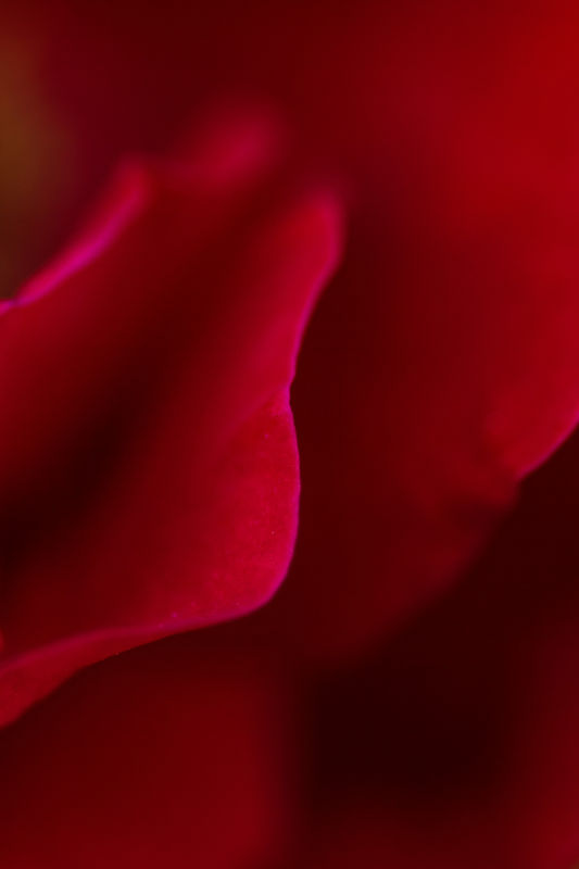
Abstract Rose
Nov 4, 2013 12:25:57 #
I know that by definition, an abstract can mean anything, but I am curious what others might think of this photo. Thoughts, improvements, try again....???
(after posting I noticed the color is so washed out that it may not be worth reviewing)
(after posting I noticed the color is so washed out that it may not be worth reviewing)

Nov 4, 2013 12:30:35 #

jteee wrote:
I know that by definition, an abstract can mean anything, but I am curious what others might think of this photo. Thoughts, improvements, try again....???
(after posting I noticed the color is so washed out that it may not be worth reviewing)
(after posting I noticed the color is so washed out that it may not be worth reviewing)
Hi jteee. For me, there isn't enough information to understand this. I was trying to see a pattern there, but what I saw looks like the heel of a foot instead of a flower. Maybe include a few more clues? It could be lovely with a few more details.
Nov 4, 2013 12:33:59 #
Heirloom Tomato wrote:
Hi jteee. For me, there isn't enough information to understand this. I was trying to see a pattern there, but what I saw looks like the heel of a foot instead of a flower. Maybe include a few more clues? It could be lovely with a few more details.
Yea, maybe moving a bit to the left, and backing out a bit would have helped. Thanks for the comment.
Check out Landscape Photography section of our forum.
Nov 4, 2013 13:29:17 #

Let's talk about the two issues separately:
1. The dull appearance of the posted photo - actually the downloadable version is much brighter but appears to have the red channel blown. Your own versions probably look real different on your computer, SO: check and see if you are exporting the jpeg in sRGB color space, or if perhaps ProPhoto color space is lurking around somewhere further down in your work flow. This has happened to me, and to others I know on this site and others. ProPhoto is a great workspace but plays H--- with posted photos.
2. The photo itself - I agree with other posters that some extra detail would help. I have seen beautiful shots by master photographers that have everything soft, but my own preference is to have at least some edge or area that is sharp, and either a very strong repetitive pattern/shape or sufficient detail to give some context for the abstract. But I'm speaking just from my perspective, I don't have enough knowledge of abstract photography to judge adequately.
Nov 4, 2013 13:45:12 #
minniev wrote:
Let's talk about the two issues separately: br br... (show quote)
I went back and checked, it was in ProPhoto (not sure how that happened), so am reposting to see if it improves the color, which is what I like best about the photo anyway. I had hoped that the one edge in focus would be enough to create interest, but, that's why I wanted to throw it out there.
Nov 4, 2013 13:48:52 #
jteee wrote:
I went back and checked, it was in ProPhoto (not sure how that happened), so am reposting to see if it improves the color, which is what I like best about the photo anyway. I had hoped that the one edge in focus would be enough to create interest, but, that's why I wanted to throw it out there.
That added rich sangria-liike colors. Still looks like a foot to me, though I agree it is a beautifully colored foot. :-P :-P
Nov 4, 2013 13:50:17 #
jteee wrote:
I went back and checked, it was in ProPhoto (not sure how that happened), so am reposting to see if it improves the color, which is what I like best about the photo anyway. I had hoped that the one edge in focus would be enough to create interest, but, that's why I wanted to throw it out there.
That's much better, the color is better on the small version and the red channel no longer appears blown on the original, allowing it to retain more detail on the edge of the petal. I suspected ProPhoto was the guilty party. Now, at least an abstract specialist can hopefully give you more feedback!
Check out Professional and Advanced Portraiture section of our forum.
Nov 4, 2013 15:55:42 #
Heirloom Tomato wrote:
That added rich sangria-liike colors. Still looks like a foot to me, though I agree it is a beautifully colored foot. :-P :-P
Thats one of the things I love about this forum (and artists,ie photographers), we all seem to see things differently. I can't see a foot, but glad you see something :D :D
Nov 4, 2013 15:57:12 #
minniev wrote:
That's much better, the color is better on the small version and the red channel no longer appears blown on the original, allowing it to retain more detail on the edge of the petal. I suspected ProPhoto was the guilty party. Now, at least an abstract specialist can hopefully give you more feedback!
Thanks for the tip, the color is now as my original anyway. Anybody who takes the time to look at my photo is, in my opinion, a specialist.
Nov 4, 2013 18:19:03 #
jteee wrote:
Thats one of the things I love about this forum (and artists,ie photographers), we all seem to see things differently. I can't see a foot, but glad you see something :D :D
:P :P Love your avatar, by the way.
Nov 4, 2013 21:10:21 #
lighthouse
Loc: No Fixed Abode
Very nice.
Only comments I can make.
I would like that sharp edge a fraction sharper and the red might be pushed a fraction too far. A little lighter might help.
Only comments I can make.
I would like that sharp edge a fraction sharper and the red might be pushed a fraction too far. A little lighter might help.
jteee wrote:
I went back and checked, it was in ProPhoto (not sure how that happened), so am reposting to see if it improves the color, which is what I like best about the photo anyway. I had hoped that the one edge in focus would be enough to create interest, but, that's why I wanted to throw it out there.
Check out True Macro-Photography Forum section of our forum.
Nov 5, 2013 06:24:41 #

Honest opinion ! Sorry, I just dont see anything in it worth keeping. But I never did care for most abstracts. looks a bit overcook/saturated by the plotchy colors on the petal in focus.
Nov 5, 2013 22:17:41 #
Brian in Whitby
Loc: Whitby, Ontario, Canada
I like the original, I like the brighter post even more. Too bad you spoiled the fun of guessing what it was.
I find it commendable to take a chance about what people might say to an unusual but creative photo.
I find it commendable to take a chance about what people might say to an unusual but creative photo.
If you want to reply, then register here. Registration is free and your account is created instantly, so you can post right away.