Which do you prefer
Oct 21, 2013 01:34:14 #

Trying to decide which one to print for my dad for Christmas, he grew up in San Francisco and loves the city.
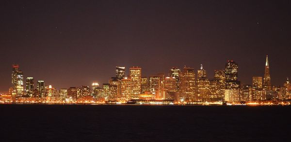
choice A
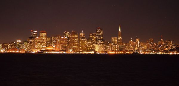
choice B
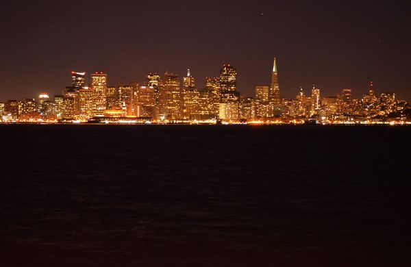
choice C
Oct 21, 2013 01:47:55 #

Oct 21, 2013 02:15:07 #

Oct 21, 2013 02:15:15 #

Oct 21, 2013 02:20:30 #

Oct 21, 2013 02:24:33 #
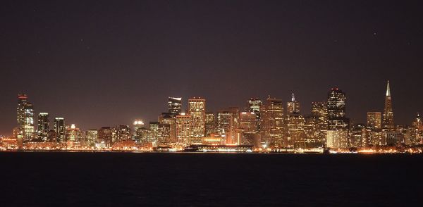
You all are so good, I was hoping you all would chime in and you have....looks like "A" has a strong lead! :-)
Oct 21, 2013 02:33:13 #
I like C the because it shows the detail of the water the best. But you need to crop out the lower third of that water. In any event, you need to straighten out the horizon of which ever one you decide to give your father. They are all pretty good!
Oct 21, 2013 02:40:59 #
lighthouse
Loc: No Fixed Abode
A
after levelling, crop all of the water and most of the sky, white balance corrected (its too warm) and darkened by about 1-1/2 stops.
after levelling, crop all of the water and most of the sky, white balance corrected (its too warm) and darkened by about 1-1/2 stops.
Oct 21, 2013 02:43:57 #
What does it's too warm mean, I am very much a novice so help me out here please. :-)
Oct 21, 2013 02:49:22 #
lighthouse
Loc: No Fixed Abode
OK, the colour balance has given it an orange cast which makes the blues look more purple.
If the white balance is shifted more back to blue then the colours would look more natural and your sky would be a blue cast instead of purple.
Then darkening the image may make your detail in the buildings sharper.
Did you take it in raw or jpg?
If the white balance is shifted more back to blue then the colours would look more natural and your sky would be a blue cast instead of purple.
Then darkening the image may make your detail in the buildings sharper.
Did you take it in raw or jpg?
RE wrote:
What does it's too warm mean, I am very much a novice so help me out here please. :-)
Oct 21, 2013 03:00:33 #
Thank you, i'll see what i can to about the color balance. I have been reading up on raw but not yet attempted it so jpeg.
Oct 21, 2013 03:09:50 #
Oct 21, 2013 03:43:07 #

RE wrote:
Messing with a copy of it, in your opinion is this better?
Yup. Looks good to me...
Oct 21, 2013 03:56:18 #
Oct 21, 2013 04:01:58 #

If you want to reply, then register here. Registration is free and your account is created instantly, so you can post right away.