Creative thinking, how'd I do?
Dec 10, 2011 16:02:28 #

I just completed my first boudoir/glamour shoot for a friend who will be presenting a photo book to her fiancee' as a Christmas present.
I had a creative pose in mind that did not pan out very well... but JUST got an idea which I thought might be the saving grace for it.
Although I have not done any retouching to these yet... except the creative treatment; Please tell me which you prefer:
Original?
B&W creative shot?
Or
Toss completely?
And why?
(I'm really thinking I saved this one with the creative perspective)
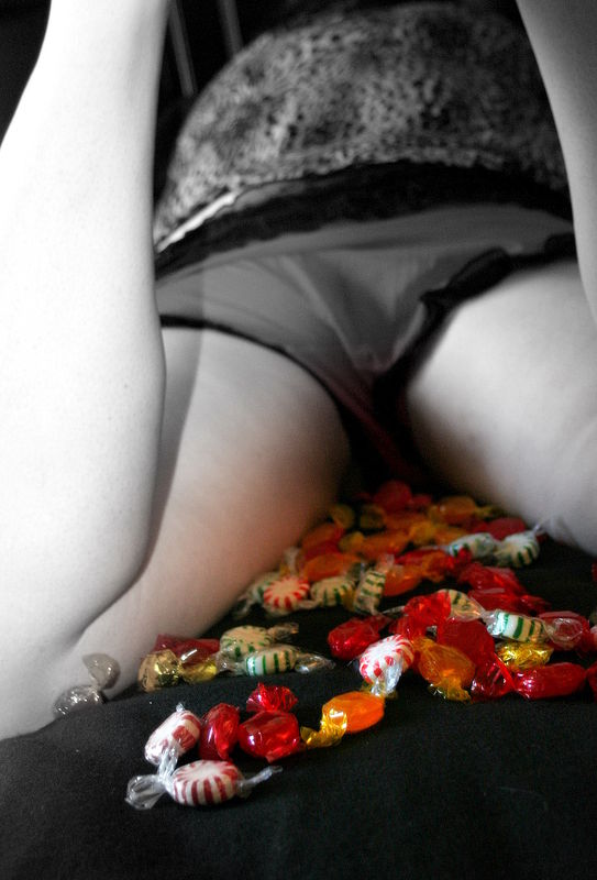
Focal B&W treatment, Creative Perspective
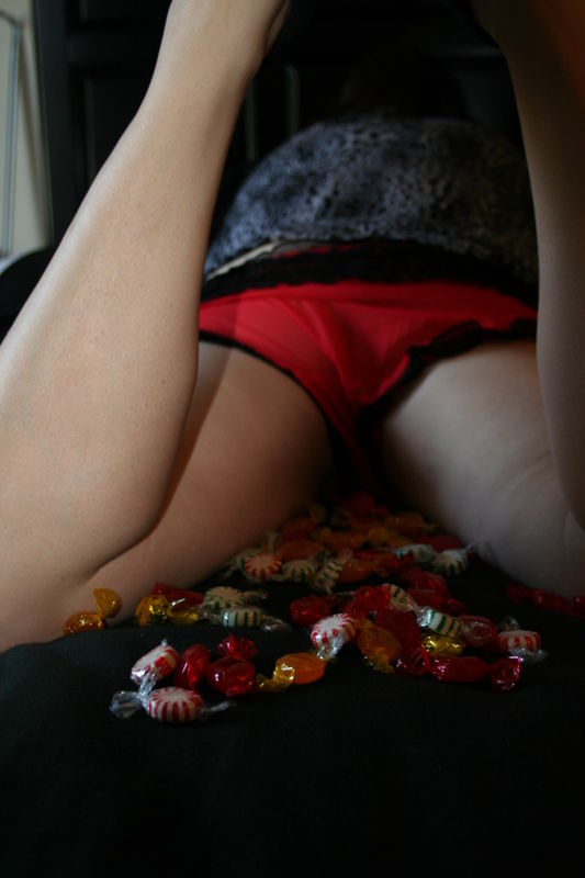
Original
Dec 10, 2011 16:04:39 #

I love the idea, very creative, I like the color one best, but then that is just my opion,,thanks for sharing
Dec 10, 2011 16:12:53 #
rickyd wrote:
I love the idea, very creative, I like the color one best, but then that is just my opion,,thanks for sharing
Thank YOU for responding so quickly and sharing your opinion.
She and I both thought the color version was a great concept but lacked the impact we expected it to have.
By changing to black and white alone... what impact there had been, disappeared.
But then I thought... "hmmm.. candy colors.
Why not let the colors of the candy tie the concept together with the suggestive placement of it!?"
As this was a fun little twist for consideration in an otherwise seriously glammed up series, I hated to lose it because it represents her quirky, fun personality and my creative imagination as a photographer.
I think it works better, now... but always curious to hear the thoughts of others :)
Dec 10, 2011 16:18:05 #
Dec 10, 2011 16:20:38 #
donrent wrote:
Personally, I think it is very tasteless
Tasteless?
Hmmm not the response I was going for, but thank you.
She thought it was fun and speaks to their personal dynamic (it's an inside joke between them)... and it's certainly not a shot or pose I would offer every client looking for glamour or boudoir shots.
I appreciate your opinion, Don... and putting in a vote to "Toss it". Thank you
Dec 10, 2011 16:41:42 #

For what my opinion is worth, I like the black and white conversion. I'm not sure what the picture, "means" but if she likes it, that's what counts.
Dec 10, 2011 16:47:54 #

Tilde, Im surprised at you.....
I think color is def better...but Im not sure i really like the concept going on here. As Frank said...its up to the client to like it and if she does...well thats great.
I think color is def better...but Im not sure i really like the concept going on here. As Frank said...its up to the client to like it and if she does...well thats great.
Dec 10, 2011 16:51:24 #
Tilde, your photos are alway awsome, the concept here is one that some will not care for, thats normal, but to me I thought it was cute as heck , but then am just an old redneck, lol, thanks for sharing
Dec 10, 2011 17:00:13 #
gonate
Loc: sacramento,calif
well its not a hard to take picm any body can do that , however not my style . trash it.
Dec 10, 2011 17:00:35 #
Frank T wrote:
For what my opinion is worth, I like the black and white conversion. I'm not sure what the picture, "means" but if she likes it, that's what counts.
Your opinion is exactly what I asked of you and of others in the forum who are inclined to offer it.
And I sincerely appreciate your offering of it. :)
Thank you!
Dec 10, 2011 17:05:03 #
gonate wrote:
well its not a hard to take picm any body can do that , however not my style . trash it.
You're absolutely right about that, too.
That's another for "trash it". Duly noted.
That's a pity... I really was pretty tickled that I'd found a way to save the poor photographic quality of the original.
And to clarify, it's not the concept itself I was asking feedback on, it was on the composition and photographic quality... the fact that I used the selective color treatment to save an otherwise boring, blurry shot.
*shrugs*
Anyhow... thank you.
Dec 10, 2011 17:06:20 #
MissC
Loc: Goodyear, AZ
My daughter and I were viewing your photo and its a very sexyidea. Especially the idea from a wife to her husband. Im sorry someone would call it tasteless...
Its exciting she wants to keep spark in her marriage and chose you to help her.
Anyhow, some suggestions we might add would be to straighten out her panties to where they're even on both "cheeks" per say and on the inside of her thighs then use your photo inhancer to lighten the area between her legs so its not so dark.
where you can see the frill of her panties on the inside of her legs clearly, and no shadow on her thighs.
I would think you want to inhance the area and have clear view of where the candy leads to..."sweetness not darkness"
I love the idea and your photo! I hope you dont think Im critisizing the photo I am by no means meaning to. Just a few suggestions that I'd personally think would inhance the photo. Both the B&W and Color are great. Good luck!
Dec 10, 2011 17:06:36 #
rickyd wrote:
Tilde, your photos are alway awsome, the concept here is one that some will not care for, thats normal, but to me I thought it was cute as heck , but then am just an old redneck, lol, thanks for sharing
*Grins*
I think it's cute, too. Thank you :) and thank you for the positive comment regarding my other work as well. I appreciate it!
Not everyone has the same sense of humor in this world... and I suppose that is a good thing. How boring and dull it would be if we ALL agreed all of the time...
Dec 10, 2011 17:10:55 #
MissC wrote:
My daughter and I were viewing your photo and its ... (show quote)
*smiles widely and nods*
Thank you for the encouraging thoughts and suggestions (and please thank your daughter as well.)
I haven't done any retouching on these yet (as I had not decided whether or not to keep it at the time) and most definitely intended to do exactly as you've suggested with the lighting, as that is a glaring weakness in this shot.
Straightening the panty-line is a detail I missed however and I appreciate you pointing it out.
You have a great eye and I appreciate the feedback.
Dec 10, 2011 17:26:32 #

tilde531 wrote:
quote=gonate well its not a hard to take picm any... (show quote)
Composition?, Photographic quality?, :thumbdown: IMHO
If you want to reply, then register here. Registration is free and your account is created instantly, so you can post right away.