What needs to be done?
Aug 13, 2013 20:10:52 #

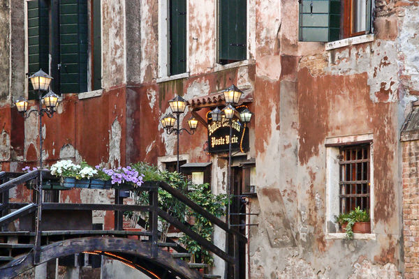
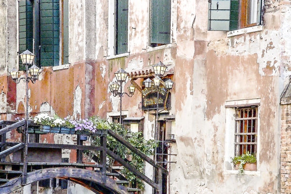
I'm thinking of printing this on canvas for our bedroom. Scene is from Venice. Before is the original shot. After is after pp. Which do you prefer? Anything need to be done to the photo? Should I find another? Critique, please!!!
Meanwhile I'm still looking through our travel photos for the one I want to see every night when I go to bed. :lol:
Meanwhile I'm still looking through our travel photos for the one I want to see every night when I go to bed. :lol:
Before
After
Aug 13, 2013 20:23:51 #

Original has nice deep colors, the next seems washed out. I like the original best.
Aug 13, 2013 20:29:19 #

Aug 13, 2013 20:29:24 #
MBW66 wrote:
Original has nice deep colors, the next seems washed out. I like the original best.
Agree on colors. I was sort of going for a watercolor feel in the After.
Aug 13, 2013 20:29:43 #
vicksart wrote:
I prefer the original for the same reason as MBW66.
Thanks.
Aug 13, 2013 20:30:00 #
no1 has good contrasting colours 2 looks over exposed. If I was going to do anything with this I would open it in raw and do some adjustments to get rid of the noise and a little sharpening. Then I would open the image in my main editor for final tuning.
Aug 13, 2013 20:31:27 #
datsmar
Loc: minnesota
HangtownGal wrote:
I'm thinking of printing this on canvas for our bedroom. Scene is from Venice. Before is the original shot. After is after pp. Which do you prefer? Anything need to be done to the photo? Should I find another? Critique, please!!!
Meanwhile I'm still looking through our travel photos for the one I want to see every night when I go to bed. :lol:
Meanwhile I'm still looking through our travel photos for the one I want to see every night when I go to bed. :lol:
I to like the rich in the first one
dave
Aug 13, 2013 20:53:48 #
Macromad wrote:
no1 has good contrasting colours 2 looks over exposed. If I was going to do anything with this I would open it in raw and do some adjustments to get rid of the noise and a little sharpening. Then I would open the image in my main editor for final tuning.
Gotcha! Thanks for taking your time to look and comment.
Aug 13, 2013 20:54:14 #
datsmar wrote:
I to like the rich in the first one
dave
dave
Well, Dave, seems you're in the majority.
Aug 13, 2013 21:09:28 #
It is a fine picture.
I don't know what program you are using , my only suggestion is if you have windows media gallery. Go to shadows in the exposure settings raising this seems to have made it possible to illuminate the dark strip on the footbridge and shutters so you can see there beautiful colors, and still leaves the desired effect to the reds I fell you are seeking that is lost in the lower photo. And I will point out that Sharpening just a very small bit did in fact help the green leaves, but just very little. It is a fine picture, that's for sure :) Thank you for sharing
I don't know what program you are using , my only suggestion is if you have windows media gallery. Go to shadows in the exposure settings raising this seems to have made it possible to illuminate the dark strip on the footbridge and shutters so you can see there beautiful colors, and still leaves the desired effect to the reds I fell you are seeking that is lost in the lower photo. And I will point out that Sharpening just a very small bit did in fact help the green leaves, but just very little. It is a fine picture, that's for sure :) Thank you for sharing
Aug 13, 2013 21:13:42 #
Pictxterowner wrote:
It is a fine picture. br I don't know what progra... (show quote)
Thanks so much for taking the time to look and comment. I use Photoshop with various plug-ins. I put through RAW, used an alabaster filter then erased to bring out the shutters and bridge. Used High Pass to sharpen.
Aug 13, 2013 21:49:32 #
I like the colors in the first photo. I think the second is overexposed. Nice photo.
Aug 13, 2013 21:52:26 #
ebrunner wrote:
I like the colors in the first photo. I think the second is overexposed. Nice photo.
Well, everyone seems to agree on the deep colors. The After isn't really overexposed, I used an alabaster action on it. Thought it might give it a watercolor look. My bad.
Aug 14, 2013 07:38:13 #

Having recently returned from Venice myself,it would have to be number one. The colours are like this on a lot of there buildings.Thanks for posting.
Aug 14, 2013 13:46:54 #
Nikonover wrote:
Having recently returned from Venice myself,it would have to be number one. The colours are like this on a lot of there buildings.Thanks for posting.
And thanks for your opinion.
If you want to reply, then register here. Registration is free and your account is created instantly, so you can post right away.