Ugly Hedgehog - Photography Forum
Home Active Topics Newest Pictures Search Login Register
Photo Contests, Challenges, Periodicals
WPC 1322 - Doors ANALYSIS
Page <prev 2 of 2
Aug 23, 2013 17:47:01   #
norvik1943 Loc: Jenks, OK and Domazan, France
 
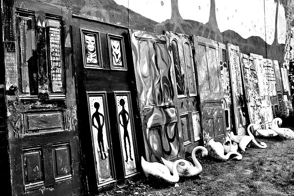
I'm not an expert, new member as well, but my son put me onto old doors and windows. When I saw this nice shot, I immediately wanted to make the doors look very old to bring out their character along with the great plastic swans at the base. I hope you dont' mind but I downloaded and played with the photo a bit. I converted to BW and upped the contrast. Now, I can see the character of the doors themselves rather than all the colors. Again, I hope you don't mind. I'll post my results.

Doors
Doors...

Reply
Sep 26, 2013 17:20:16   #
Heirloom Tomato Loc: Oregon
 
spectraflash wrote:
I think this is a great shot as it is. The swans add an element of intrigue to the photo. Without the swans, the image would be less interesting. In a perfect world, there might be a distinguished character, perhaps smoking a pipe while admiring the doors. It might have improved the photo but details like that aren't something one can easily influence. As for depth-of-field, it's perfect as shot. The reason is, the foreground doors that are in focus have already defined that there is a row of interesting, colorful doors, each with a unique pattern. The distant doors do not need to be sharp since we've already surmised that there is a series of cool looking doors. We can tell they're all interesting to some degree, which is all that's needed to communicate the idea. It's like cropping off the top of a subject's head to better frame the face. We know what a head is shaped like so we don't always need to see all of it. We assume the rest of the person's head is there, just as we assume the other doors are equally interesting as the ones in focus. It's a great photo and thanks for sharing it.
I think this is a great shot as it is. The swans a... (show quote)


Spectraflash, I agree with you 200% on this. If it were mine, I wouldn't change a thing. The color and focus work well, and there may be lots of details but they all contribute to the whole. Nothing distracts. The framing is fine, too. I love it!

Spectraflash, would love to see some of your work.

Reply
Page <prev 2 of 2
If you want to reply, then register here. Registration is free and your account is created instantly, so you can post right away.
Photo Contests, Challenges, Periodicals
UglyHedgehog.com - Forum
Copyright 2011-2024 Ugly Hedgehog, Inc.