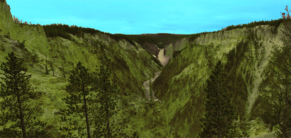
yellowstone park panorama
Nov 16, 2011 12:54:04 #


Nov 16, 2011 16:38:40 #
Dudley
Loc: Roseburg, Oregon
A tad on the blue side. Plus it could use a overall warming up, (esp. the sky.)
Please list how many images are used for the final product. How much overlap did you use? Was a tripod, manual mode used?
Please list how many images are used for the final product. How much overlap did you use? Was a tripod, manual mode used?
Nov 16, 2011 16:40:16 #

Nov 16, 2011 16:41:03 #

much too heavy on the blues and greens... doesn't look natural. the stitching looks good, though...
Nov 16, 2011 16:59:16 #
Nov 16, 2011 18:05:33 #

The white balance must have been way off or you used a blue filter. It is way too blue. I took it and messed with the levels a bit and did an auto color correction. The water and hills still look too saturated but I have failed at a complete fix on that with my PSE9.
original photo
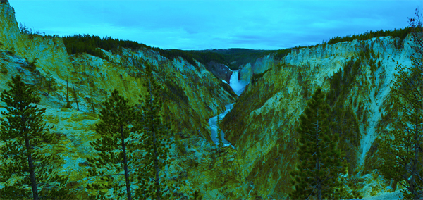
edited photo
Nov 16, 2011 18:06:21 #

Wow,
That looks way over-processed for my taste. I am not trying to be too harsh but that looks like something from the movie Avatar.
Here's a link so you can see what kind of panos others are posting here at UH.
Eric
http://www.uglyhedgehog.com/t-508-1.html
That looks way over-processed for my taste. I am not trying to be too harsh but that looks like something from the movie Avatar.
Here's a link so you can see what kind of panos others are posting here at UH.
Eric
http://www.uglyhedgehog.com/t-508-1.html
Nov 16, 2011 18:46:52 #

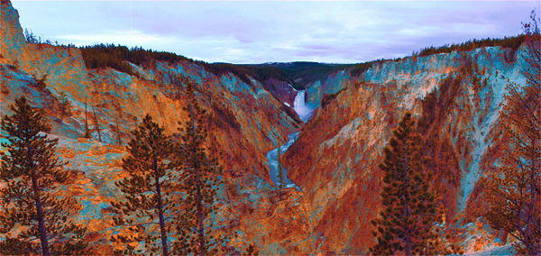
this may be a little more natural looking :) Edited selective color in PS

Nov 16, 2011 21:07:29 #
thank you all for your critique & help.i agree it is over processed.Dudley i like your version better but still something is missing.I think it was four pics.too bad i don't have an info on this pic.
Nov 16, 2011 21:29:33 #
Nov 16, 2011 21:36:44 #
this one looks good but not what i was looking for.i guess composition is boring itself.thank you again
Nov 16, 2011 21:41:08 #

minaev1976 wrote:
i tried.... :roll:
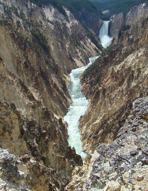
This is what my camera took. This is not tutched up.

Nov 16, 2011 22:45:52 #
Nov 17, 2011 22:19:14 #

If you want to reply, then register here. Registration is free and your account is created instantly, so you can post right away.