Check out Wedding Photography section of our forum.
Which one of the three?
Apr 21, 2013 08:54:11 #
marisa
Loc: Centerport,NY
BrentHarder wrote:
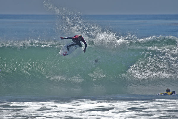
Sorry for the potential "overkill" but I'm having way to much fun with the "oil painting" filter and going to the next level by adding and enhancing color and depth. Which one of these three different cropping options do you prefer? PS, I hope you like what I did with my surfing image and the oil painting filter.
#1 for me, having him 1/3 in from the right makes it just right. I love the defect. Do you if this effect has another name other than oil painting?
Apr 21, 2013 09:31:03 #
Apr 21, 2013 10:37:51 #

#1- The Surfer & the Wave & the Curl all stand out. The picture is about "Action".---#3 U see the calm water & U know it is all going to end.--- I like how the Horizon is blocked out in #2, & the concentration on the face & balance in the arms.--- #1 is my favorite thou.
Check out Astronomical Photography Forum section of our forum.
Apr 21, 2013 10:50:37 #
Apr 21, 2013 10:59:44 #
I like #3, it seems to be easier on the eyes and shows less distortion that the surfer in #2.
Apr 21, 2013 11:01:14 #

These are all really cool but I think personally I like number 2 the best.
Apr 21, 2013 11:02:30 #

[quote=Nightski]
Another Minnesotan going for #2.
BrentHarder wrote:
Sorry for the potential "overkill" but I'm having way to much fun with the "oil painting" filter and going to the next level by adding and enhancing color and depth.
I like #2. I think it personal preference. But out of #1 and #3, I like #1 better.
I like #2. I think it personal preference. But out of #1 and #3, I like #1 better.
Another Minnesotan going for #2.
Check out Underwater Photography Forum section of our forum.
Apr 21, 2013 11:20:46 #

BrentHarder wrote:
Sorry for the potential "overkill" but I'm having way to much fun with the "oil painting" filter and going to the next level by adding and enhancing color and depth. Which one of these three different cropping options do you prefer? PS, I hope you like what I did with my surfing image and the oil painting filter.
# 3
Apr 21, 2013 11:50:17 #

Leicaflex wrote:
Number one for me, the composition is just right for all the action.
I was asked in a PM about my personal favorite and I had to agree with you. It seems that there are more votes for that cropping choice than any other one. Thanks for responding Leicaflex!
Apr 21, 2013 11:52:48 #
Bret wrote:
#3 wins it...very nice shot.
Ohhhhh Bret, you like the foam at the bottom and don't think it's distracting? Ok, you and two others so far like that one. There is NO wrong answer.....it's all personal preference! We all win!
Apr 21, 2013 11:55:40 #
angler wrote:
Number 1 for me.Great stuff.
Thanks angler for your response. I also agree with you.
Check out Sports Photography section of our forum.
Apr 21, 2013 12:07:31 #
Bob1190 wrote:
Horizontal for me. :thumbup:
Bob1190, there are TWO horizontal ones....do you like both?
Apr 21, 2013 12:16:25 #
Tom DePuy wrote:
Brent , I like the first one the best, I kinda can get a sensation of the power of the wave in the first one, my second choice is number three
I'm agreeing with you about #1. Speaking of "power" ......the surfer was moving from right to left in this photo and had so much power and speed that his trail went across the top of the wave and then he turned when I shot this image, that is why he has a rooster tail splashing from his turn. The trail on the right top of the wave was a combination of the wave and his trail.
Apr 21, 2013 12:21:47 #
BrentHarder wrote:
Sorry for the potential "overkill" but I'm having way to much fun with the "oil painting" filter and going to the next level by adding and enhancing color and depth. Which one of these three different cropping options do you prefer? PS, I hope you like what I did with my surfing image and the oil painting filter.
...#1...
Apr 21, 2013 12:26:35 #
R.G. wrote:
#3 for a wall, #2 for an album, book or magazine.
You cropped out the very top of the splash in #1, and I find that my eye follows the line of the splash and wants to go all the way out to the end. I also think that in #1 the wave has a luminosity that's slightly lacking in #3, but I think that the subject suits the extra space that #3 has.
You cropped out the very top of the splash in #1, and I find that my eye follows the line of the splash and wants to go all the way out to the end. I also think that in #1 the wave has a luminosity that's slightly lacking in #3, but I think that the subject suits the extra space that #3 has.
HI R.G., you mentioned "luminosity"......I wanted to show you and the other UHH members what the original photo that I took, looked like. The luminosity is even more powerful in the original. I wanted to POP the wave and added shadows under the lip at the sacrifice of not having the luminosity so much.
luminosity
If you want to reply, then register here. Registration is free and your account is created instantly, so you can post right away.