Posts for: Bmac
Mar 14, 2019 20:11:21 #
kpmac wrote:
Very nice, Bmac. Well composed and colorful.
Thanks kpmac, appreciate it

Mar 14, 2019 20:10:49 #
NJFrank wrote:
Very nice capture. The sky really helps the image pop.
Thanks Frank, it was a beautiful day.
Mar 14, 2019 20:10:13 #
brontodon wrote:
The ripples in the water and the clouds in the sky echo and complement each other. Looking at the water, I can almost see the motion.
Thanks for the nice comment Brontodon.
Mar 13, 2019 18:02:31 #

Mar 13, 2019 18:01:25 #
Mar 13, 2019 17:55:57 #
Mar 13, 2019 17:55:10 #
rlaugh wrote:
Subject, color, composition!!! Doesn't get much better...great shot!!
Thank you for the nice compliment Bob.........and it's not even black & white!

Mar 13, 2019 17:49:29 #
jaymatt wrote:
Thanks for opining John, that makes 13 for #1 and 4 for #2.#1
Mar 13, 2019 17:48:13 #
Jolly Roger wrote:
No.1 is the better of the two.
But I would have allowed even more sky above the rod to allow for its movement and cropped some off the beach at the bottom.
But I would have allowed even more sky above the rod to allow for its movement and cropped some off the beach at the bottom.
Valid points Jolly Roger, thanks.
Mar 13, 2019 17:46:26 #
bamfordr wrote:
My recommendation too. My eye was initially drawn to to the narrow slice behind the fisherman.
Thanks for leaving a comment Bamfordr.
Mar 13, 2019 17:45:30 #
photophly wrote:
Number two for me......it tells the story but I think the composition is more compact.
Thanks for commenting Photophly.
Mar 12, 2019 20:03:17 #
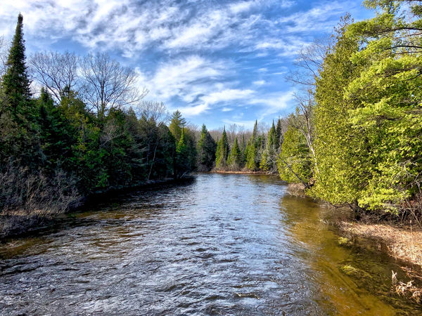
Photographed in Fife Lake, MI. Critique, comments and suggestions always welcomed. Thanks.
Select download for additional resolution.
Select download for additional resolution.
Mar 12, 2019 19:22:28 #
genocolo wrote:
I prefer number 1. Photo seems unnatural to me—fisherman and sand are too yellow imo. Otherwise I like it.
LESTAHL wrote:
The first one. Forget the 2/3 rule sometimes, this one is better at the 50/50 rule.
Two more for number one. As for the color, it was late afternoon and the lighting was a gorgeous golden hue so it was not unnatural at all.
Mar 12, 2019 19:19:23 #
SuperflyTNT wrote:
#3 The one with the room at the top but some of the bottom cropped off.
Good point...........so I should have made a third crop.
Mar 12, 2019 19:18:32 #
gvarner wrote:
I’d try cropping #1 to bring the bottom right corner up and in to be closer to the diagonal from the first wave. This would also bring the horizon line closer to the middle and give a bit more balance, I think.
Appreciate your suggestion Gvarner.