Bonners Ferry Barn
Feb 10, 2019 18:30:55 #

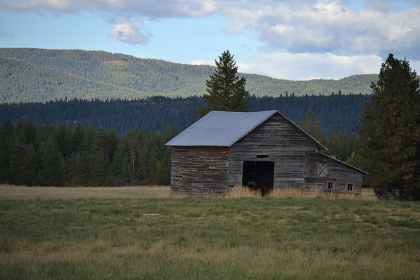
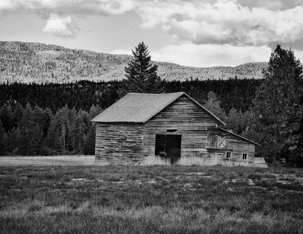
For some time now, I've struggled to get a decent color print from the one attached. As you can see, the colors are quite muted and dull. However, as my skills have developed with black & white conversions, I was able to pull out what I consider a pretty nice black and white. In the process, I tried to achieve a fair share of grey scale zones. My only concern at this point is the washed out clouds. Comments are welcome, both positive and negative. The post process utilized Affinity software and Silver Effects from the Nik Collection. Ken
Feb 10, 2019 18:41:15 #

Photobum wrote:
For some time now, I've struggled to get a decent ... (show quote)
I like the bw, it brings out the details and textures.
Feb 10, 2019 18:48:17 #

Feb 10, 2019 19:38:49 #

I like B&W too, fits the scene. I don't have the expertise to help with what you're trying to do. Maybe Linda will see your post.
Feb 10, 2019 19:44:02 #
Feb 10, 2019 19:49:24 #

Photobum wrote:
Ken, The Black and White is beyond excellent and outstanding.Great tonal range.For some time now, I've struggled to get a decent ... (show quote)
Feb 10, 2019 20:06:33 #
If there is a weakness in this shot, I agree it's the clouds. I am going to go against the majority here and say I like the color shot best. It takes the most advantage of the sky.
The problem with Silver Efex is that changes effect the whole picture. I don't know Affinity, but if it has the capability I would create a layer of just the sky and darken the clouds just a little bit.
The problem with Silver Efex is that changes effect the whole picture. I don't know Affinity, but if it has the capability I would create a layer of just the sky and darken the clouds just a little bit.
Feb 10, 2019 21:17:46 #
Photobum wrote:
For some time now, I've struggled to get a decent ... (show quote)
You could use an adjustment layer and mask for your sky using a red filter!
Feb 10, 2019 21:22:32 #
Photobum wrote:
For some time now, I've struggled to get a decent ... (show quote)
The clouds are a bit blown out. Nothing that a gradient filter and a bit of DeHaze wouldn't fix. Look at my post regarding Lightroom's Luminosity Masking panel for some other good tool tips.
Feb 10, 2019 21:34:44 #
Curmudgeon wrote:
If there is a weakness in this shot, I agree it's the clouds. I am going to go against the majority here and say I like the color shot best. It takes the most advantage of the sky.
The problem with Silver Efex is that changes effect the whole picture. I don't know Affinity, but if it has the capability I would create a layer of just the sky and darken the clouds just a little bit.
The problem with Silver Efex is that changes effect the whole picture. I don't know Affinity, but if it has the capability I would create a layer of just the sky and darken the clouds just a little bit.
Actually, just the opposite is true of Nik Silver Effects. By using control points, you can selectively adjust the size, tone, contrast, etc. in specific areas. In the black & white image, I used about a dozen control points to get the tonal separation i was looking for. Be that at it may, thank you for your input. I'll create a separate layer and see what can be done. Ken
Feb 10, 2019 21:35:54 #
rgrenaderphoto wrote:
The clouds are a bit blown out. Nothing that a gradient filter and a bit of DeHaze wouldn't fix. Look at my post regarding Lightroom's Luminosity Masking panel for some other good tool tips.
Thank you!
Feb 10, 2019 21:37:40 #
Photobum wrote:
Actually, just the opposite is true of Nik Silver Effects. By using control points, you can selectively adjust the size, tone, contrast, etc. in specific areas. In the black & white image, I used about a dozen control points to get the tonal separation i was looking for. Be that at it may, thank you for your input. I'll create a separate layer and see what can be done. Ken
Obviously I have much to learn. I'll probably be up most of the night trying to learn control points.
Feb 10, 2019 21:44:23 #
Curmudgeon wrote:
Obviously I have much to learn. I'll probably be up most of the night trying to learn control points.
No worries. There's dozens of YouTube videos to check out. Some of my favorites are by Anthony Morganti. Just do a search for Nik Collection or Silver Effects Pro. Easy stuff to grasp. Enjoy!
Feb 10, 2019 21:46:02 #
Photobum wrote:
No worries. There's dozens of YouTube videos to check out. Some of my favorites are by Anthony Morganti. Just do a search for Nik Collection or Silver Effects Pro. Easy stuff to grasp. Enjoy!
Like I said, all night long. thanks again.

Feb 11, 2019 03:21:11 #
Old Timer
Loc: Greenfield, In.
Great B&W good tonal range and contrast. I agree with the comment on the sky but over all a winner.
If you want to reply, then register here. Registration is free and your account is created instantly, so you can post right away.