Rust
Jan 11, 2019 02:42:41 #

The Marin headlands lie across the Golden Gate from San Francisco. In the 20th century, the military used the headlands for defensive emplacements to ward off an invading fleet. In WW2, the existing guns were upgraded by the addition of several sixteen-inch batteries, which in turn were replaced by Nike missiles. None were ever used and the Nike missiles were likely useless except to reassure the civilian population during the cold war.
When the military had no more use for it, a great development was planned with housing tracts and retail malls and all the other sorts of things one expects from a city. Fortunately, some people had a greater vision. They campaigned for the notion of turning it all into parkland - and won. The old emplacements are still there, crumbling away or, sometimes, kept in a state of arrested decay.
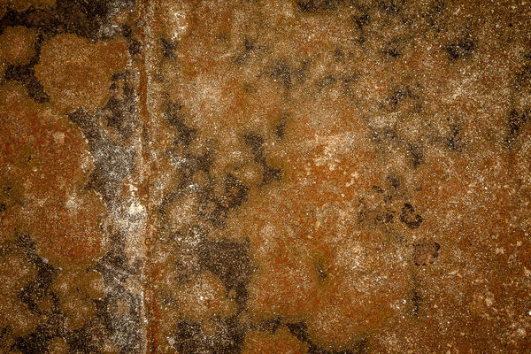
The big guns needed spotters - people who could see the ships coming and where the shells fired from the headlands fell. These people hunkered down in little steel bubbles, half buried, with slits they could look through. This photo is of the surface of one of those spotting stations as it appears today.
When the military had no more use for it, a great development was planned with housing tracts and retail malls and all the other sorts of things one expects from a city. Fortunately, some people had a greater vision. They campaigned for the notion of turning it all into parkland - and won. The old emplacements are still there, crumbling away or, sometimes, kept in a state of arrested decay.
The big guns needed spotters - people who could see the ships coming and where the shells fired from the headlands fell. These people hunkered down in little steel bubbles, half buried, with slits they could look through. This photo is of the surface of one of those spotting stations as it appears today.
Jan 11, 2019 06:45:18 #

Jan 11, 2019 06:50:37 #
I'M sorry but with all of the highlights (little white spots) I find the image quite confusing, I would suggest you retake the image under different lighting, overcast or shading the area from bright sun. Rust can be very difficult to photograph especially when wet.
Jan 11, 2019 08:09:57 #

I'm drawn first to the only recognizable shape, the vertical line that stands out with help of some thicker areas of white and gray. There's a subtle depth created by that and the floating blob in upper left. I like the image!
Jan 11, 2019 08:31:39 #
Linda From Maine wrote:
I'm drawn first to the only recognizable shape, the vertical line that stands out with help of some thicker areas of white and gray. There's a subtle depth created by that and the floating blob in upper left. I like the image!
Indeed, the vertical line with the light-colored spot satisfies the rule of "thirds, in my mind anyway.
I like the story behind the image, too!
Jason
Jan 11, 2019 13:36:06 #
Manglesphoto wrote:
I'M sorry but with all of the highlights (little white spots) I find the image quite confusing, I would suggest you retake the image under different lighting, overcast or shading the area from bright sun. Rust can be very difficult to photograph especially when wet.
I appreciate the critique. The white spots are not highlights. The surface is quite dull, and the day was foggy, and the surface was not wet. I think if I did it again, the results would be similar.
That said, your critique has merit. There is no clear focal point. It's all texture.
Thanks for commenting!
Jan 11, 2019 13:38:39 #
Linda From Maine wrote:
I'm drawn first to the only recognizable shape, the vertical line that stands out with help of some thicker areas of white and gray. There's a subtle depth created by that and the floating blob in upper left. I like the image!
Thanks. The vertical line is a seam where they welded two steel plates together. I almost didn't post this image because of that line.
Jan 11, 2019 13:40:59 #
htbrown wrote:
You just never know what people are going to like and what they aren't. I don't think I've ever seen a consensus of opinion Thanks. The vertical line is a seam where they welded two steel plates together. I almost didn't post this image because of that line.

And your texture would make an awesome "texture" as part of playful pp too!
Jan 11, 2019 13:41:14 #
JasonC wrote:
Indeed, the vertical line with the light-colored spot satisfies the rule of "thirds, in my mind anyway.
I like the story behind the image, too!
Jason
I like the story behind the image, too!
Jason
Huh. I never thought about the rule of thirds when working with this image. Guestimating the location of the line in the frame, it's more like the rule of fourths. Maybe I'll try sliding the right edge in to put the line on the third.
Jan 11, 2019 13:44:51 #
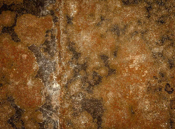
Here's the image cropped for the rule of thirds. Is it an improvement? I can't decide.
Jan 11, 2019 14:05:55 #
htbrown wrote:
Here's the image cropped for the rule of thirds. Is it an improvement? I can't decide.
Yes that revised image better approximates the rule thirds; I like it better.
Jan 12, 2019 08:49:17 #

htbrown wrote:
The Marin headlands lie across the Golden Gate fro... (show quote)
Interesting. I'm guessing the straight line is some sort of welding.
Jan 12, 2019 11:10:41 #

htbrown wrote:
Here's the image cropped for the rule of thirds. Is it an improvement? I can't decide.
No, it makes the image too boring. The "rule of thirds" is about 5% of the total compositional principles, and, as in this case, actually can take away from the dynamics of a photo.
Your original choice reveals your innate compositional eye. If one analyzes the composition (I taught composition and design in a college art dept. for 30 yrs) it will be found to be quite complex, using balance, triangular, and circular compositional principles.
I do wonder if a LITTLE more value range and contrast would bring out the beauty you saw.
Beautiful work.
Jan 12, 2019 13:32:08 #
artBob wrote:
No, it makes the image too boring. The "rule ... (show quote)
Thank you for the compliment.
I added a tiny bit of contrast and it helped: A little bit more and it was too much.
I'm not familiar with the term 'value range'. Could you give me a thumbnail definition?
Jan 12, 2019 13:46:59 #
htbrown wrote:
Thank you for the compliment.
I added a tiny bit of contrast and it helped: A little bit more and it was too much.
I'm not familiar with the term 'value range'. Could you give me a thumbnail definition?
I added a tiny bit of contrast and it helped: A little bit more and it was too much.
I'm not familiar with the term 'value range'. Could you give me a thumbnail definition?
Sure. Make the darks darker, while still keeping some detail in them. Make the lights lighter, without causing the lightest to go all white ("blow out"). Various programs have various ways of doing this.
Good luck!
If you want to reply, then register here. Registration is free and your account is created instantly, so you can post right away.