Which photo for the contest?
Jul 18, 2018 16:20:01 #

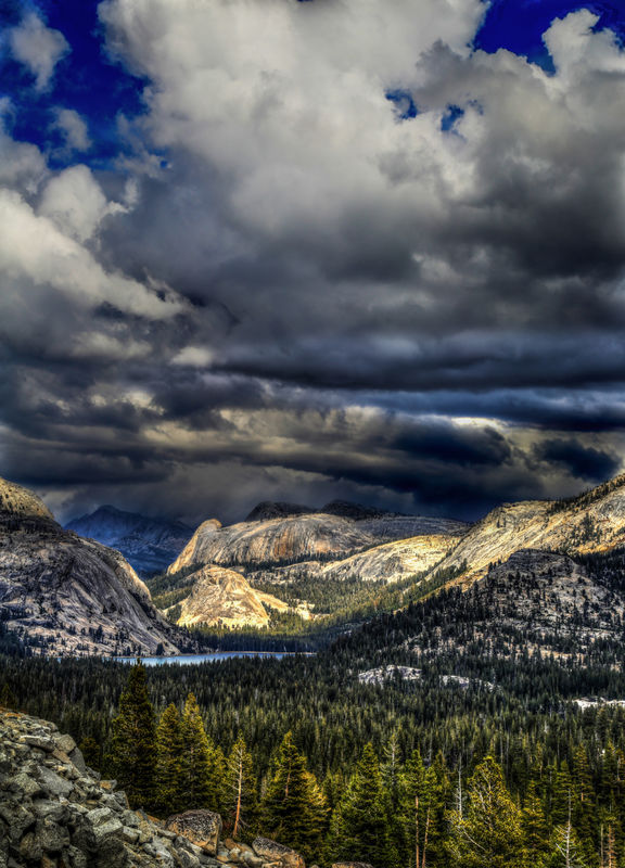
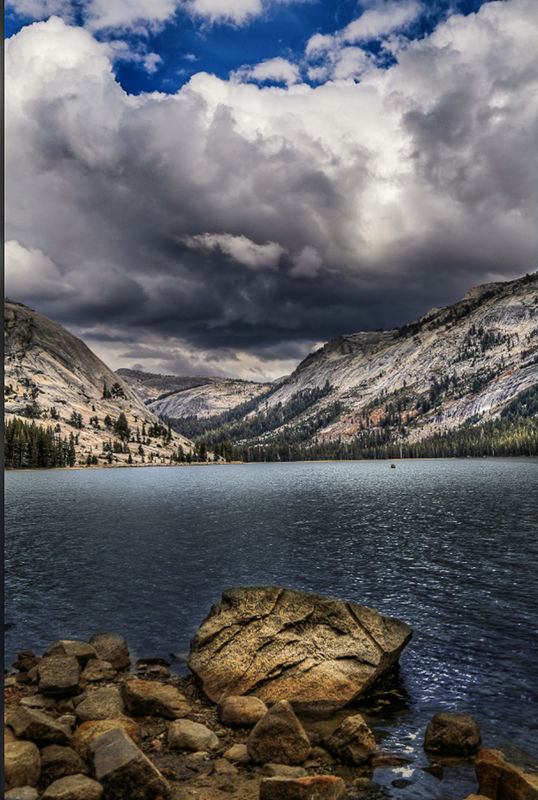
I have my idea which of these two photos I would like to submit into our local city photo contest, but if I am overwhelmingly wrong please let me know.
Which do you prefer?
Thanks in advance.
Which do you prefer?
Thanks in advance.
Jul 18, 2018 16:20:58 #

Jul 18, 2018 16:22:57 #

Both beautiful, Brent, but I'm choosing the first. Don't know why though, because the second is equally lovely.
Jul 18, 2018 16:23:46 #

Jul 18, 2018 16:25:06 #

BrentHarder wrote:
I have my idea which of these two photos I would like to submit into our local city photo contest, but if I am overwhelmingly wrong please let me know.
Which do you prefer?
Thanks in advance.
Which do you prefer?
Thanks in advance.
I vote for photo one. The light on the mountain draws the eye!
Jul 18, 2018 16:31:20 #
IDguy
Loc: Idaho
Do you have either in landscape format?
If not I’d choose 1 and crop just above the lighted clouds over the mountains.
If not I’d choose 1 and crop just above the lighted clouds over the mountains.
Jul 18, 2018 16:35:49 #
I vote for #2, but... you might want to horizontally straighten the lakeshore as your background horizon, and lose the border on the left? This may also give you the opportunity to use the bottom right rocks diagonal line to exit exactly at that corner, which will more easily draw the viewers eye to the next diagonal line (on the right side of the large rock in the foreground), and then across the lake to the corresponding hillside on the left background?
Of course, it might just be me, but when I’m asked to judge landscape photographs, I tend not to choose those where distant shorelines aren’t horizontal, and foreground lines and features don’t lead the eye through and into the background. On the chance that your judges might be similarly persnickety, best to remove any easy reasons for them to exclude you from the prizes.
Of course, it might just be me, but when I’m asked to judge landscape photographs, I tend not to choose those where distant shorelines aren’t horizontal, and foreground lines and features don’t lead the eye through and into the background. On the chance that your judges might be similarly persnickety, best to remove any easy reasons for them to exclude you from the prizes.
Jul 18, 2018 16:44:10 #

BrentHarder wrote:
I have my idea which of these two photos I would like to submit into our local city photo contest, but if I am overwhelmingly wrong please let me know.
Which do you prefer?
Thanks in advance.
Which do you prefer?
Thanks in advance.
They are both great shots, Brent, but I like #2 the better of them
Jul 18, 2018 16:51:22 #

I like both, but I'm really drawn to the visual excitement of No. 1, both in the sky and the shapes of the landforms. To me it has great impact. Having said that, it doesn't look entirely realistic to me, especially the deep contrasts in the sky, which seem--from my limited experience--to be a bit over processed. I wasn't there, of course, so I may be way off base, OR, that may be your intent, either of which is fine. (Or maybe it's my new display....) In any case, very enjoyable.
Jul 18, 2018 16:59:38 #

Print or Projected? I’d pick #1 for projected - bright and deep. I’d pick #2 for print - beautifully composed and exposed.
Jul 18, 2018 17:03:12 #

BrentHarder wrote:
I have my idea which of these two photos I would like to submit into our local city photo contest, but if I am overwhelmingly wrong please let me know.
Which do you prefer?
Thanks in advance.
Which do you prefer?
Thanks in advance.
Both fine but I like 2 the most.
Jul 18, 2018 17:07:42 #

#1 first but I would crop a little of the sky. #2 needs to have the horizon line corrected.
Very nice.
Very nice.
Jul 18, 2018 17:09:07 #

I vote for #2. But I agree with BB4A above, straighten the lake line. Number #1 is more dramatic. But, to me, does not look real.
Jul 18, 2018 17:30:06 #

I vote for the first one, Brent. I prefer the colors and it took a few seconds of concentration to focus and figure out exactly what I was looking at. #2 is nice and straight forward but that little speck in the water on the right bothers me. Let us know which one you opt for and how you did. Good luck.
Jul 18, 2018 17:32:09 #
alliebess
Loc: suburban Philadelphia
My vote goes to #2, but as several have said, please level the shoreline. #1 is beautiful, but doesn't seem real.
If you want to reply, then register here. Registration is free and your account is created instantly, so you can post right away.