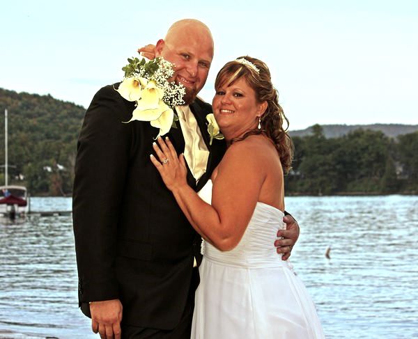
First Wedding Pictures
Oct 17, 2011 16:31:16 #

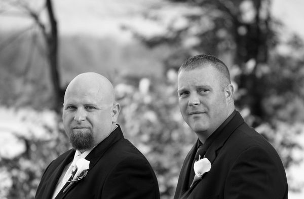
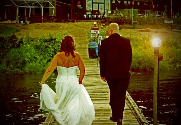
The first a B&W...The second is one that I tried to give a faded look to in a lomagraphic style. I like it and think it works, but it doesn't matter what i think really
Oct 17, 2011 16:38:25 #

I have been concerned about the right light and dark balance in my photos compared to what I see on my monitor and was told to purchase a SPYDER that will correct your monitor color and balance on your computer so that your prints are correct. It looks like this is something that would be a good investment for you as well. I am seeing the same things that the others are seeing so maybe my monitor isn't off in the color area but I don't know exactly where I should have my laptop screen setting for viewing so they are either to light or to dark.
Oct 17, 2011 16:51:56 #

Eagle68 wrote:
The original was dull...
I am using PSE9
johnrennie wrote:
Your color correction is still way off. What post-editing software are you using?
The original was dull...
I am using PSE9
MWAC is right, if you don't get your white balance right, any monochromatic filter you choose isn't going to look right either. Color correction is not that difficult. I assume PSE9 is Photoshop Elements 9. I've never used it, only the full photoshop version, they gotta be pretty similar.
If for some reason I'm not happy with my white balance in LightRoom I'll open the image in Photoshop and color-correct it using levels. There are three eye-droppers in there that will enable you to color correct with 3 simple clicks:
Highs = White
Mids = Gray (or other neutral color)
Low Black
Just click on one of each and your color correction is done.
Check out the link below for details. And next time, shoot in the Auto WB mode until you begin to understand your camera.
http://www.photoshopessentials.com/photo-editing/elements/tone-color/
If this is hard to pick up on YouTube Color Correction in PSE8 or something of that nature.
Oct 17, 2011 16:54:02 #
I use the Spyder Elite, it's good stuff... highly recommended if you're going to start photographing weddings.
Of course, it's useless without a descent monitor.
Of course, it's useless without a descent monitor.
Oct 17, 2011 16:56:06 #
johnrennie wrote:
I use the Spyder Elite, it's good stuff... highly recommended if you're going to start photographing weddings.
Of course, it's useless without a descent monitor.
Of course, it's useless without a descent monitor.
Thanks very much...PSE10 actually..I tried a trial of the full version and it was way over my head..
Oct 17, 2011 17:48:49 #

Due to inflation I'll put my in three (formally two) cents worth. I've had both the full blown as well as the Elements versions of Photo Shop, beginning at v2. I cut my teeth with Adobe Photo Deluxe when Windows first came out. The full PhotoShop gets more into the CGYM aspects for publishers of magazines, that sort of stuff. Elements simply dropped the stuff you and I would never use anyway, and left in all the good stuff -- at a far reduced price. Actually, Elements is a lot closer to the full blown version than you might imagine. Adobe simply played it smart and instead of selling one version of the full blown at $599 per week, per say, they put out the "Elements" version at $99 and sold 40 versions per week. Very smart on Adobe's part. And very fortunate for us. Photo Shop Elements is a very comprehensive image editing software package. Tough to beat at any price.
Eagle68 wrote:
Thanks very much...PSE10 actually..I tried a trial of the full version and it was way over my head..
johnrennie wrote:
I use the Spyder Elite, it's good stuff... highly recommended if you're going to start photographing weddings.
Of course, it's useless without a descent monitor.
Of course, it's useless without a descent monitor.
Thanks very much...PSE10 actually..I tried a trial of the full version and it was way over my head..
Oct 17, 2011 18:42:38 #
Don't worry too much about this first (?) attempt. Next time try this workflow. Set your camera to whatever flash sync speed it recommends and use a flash; matrix meeting; iso 250 (or higher if dark and shooting o/s); flash set to "thru the lens" and the camera WB at "flash." If OD leave the white diffuser off unless shooting close up. Indoor put it on and try bouncing the flash one notch up (unless a REALLY high ceiling). When indoors I bump (double) the ISO up and use manual metering at 1/100 and f5.6 or so and still use WB @ flash. Sometimes you may have to adjust the WB "flash" up or down a level. If you're the "photographer" at the event take the time to use someone dressed in a similar colored dress as the bride and take a cupl snaps. ALWAYS check your histiogram to make sure of exp.!!
Oct 17, 2011 19:18:14 #
You guys are very nice here,and I appreciate the advice! I have been on some forums where they are just hurtful!
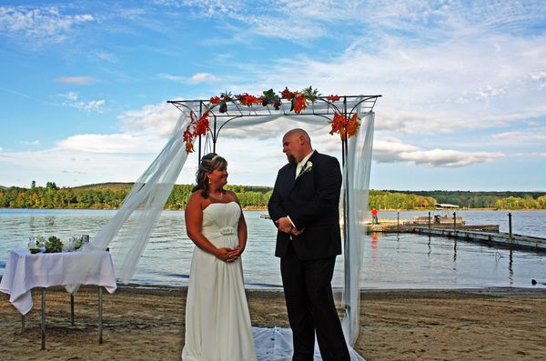
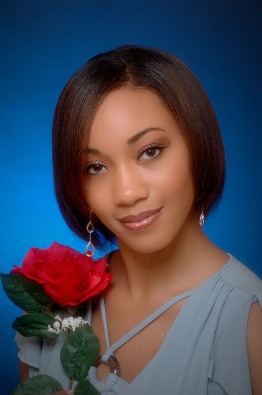
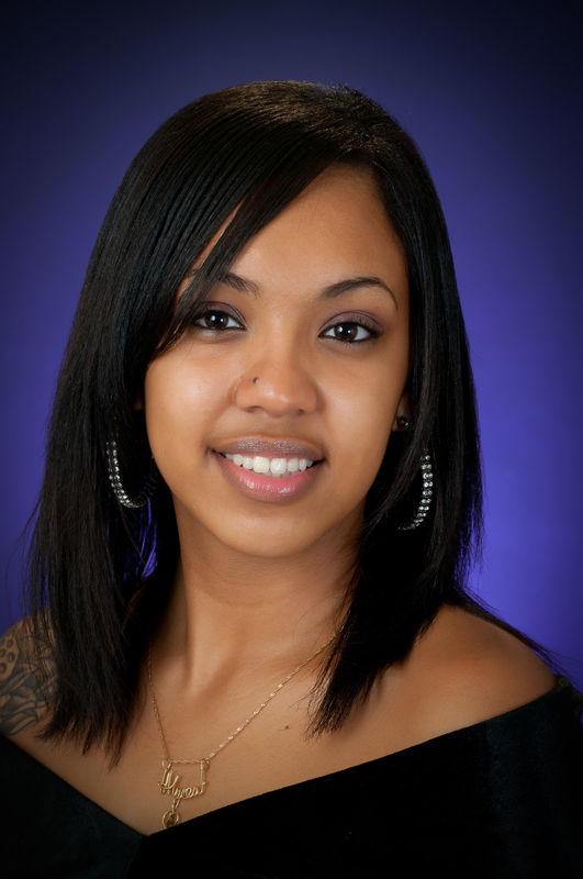
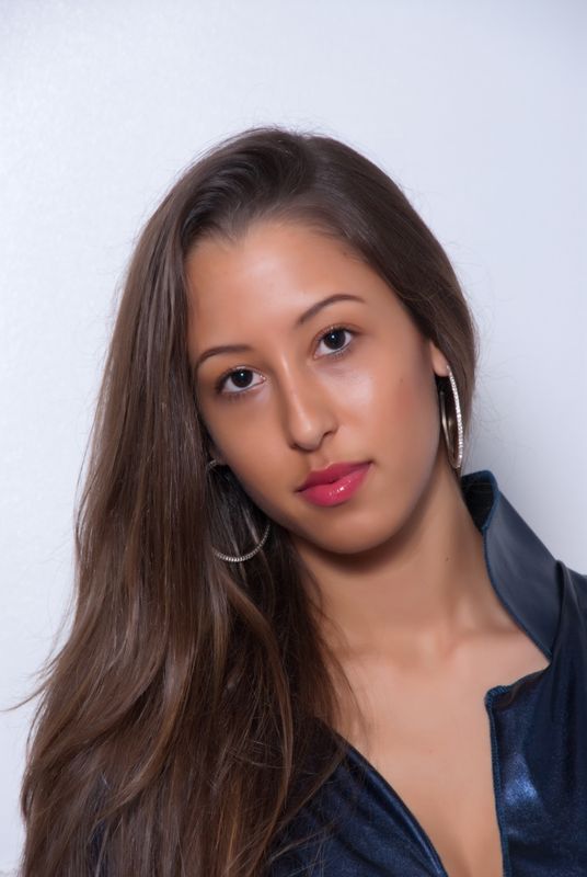
How can I make this one better? Or does it look pretty good?
How can I make this one better? Or does it look pretty good?
Oct 17, 2011 19:22:50 #

THE NEXT TIME YOU SHOOT A WEDDING SHOOT IN RAW . THE CONTROLS IN THE WHITE BALANCE WILL TAKE OF THAT ORANGE PLEASE STEP TO LIGHTROOM 3
GLAMOUR FROM SPARKLE PHOTO
GREAT GLAMOUR SHOTS
Oct 17, 2011 19:25:59 #
SPARKLE PHOTOGRAPHY wrote:
THE NEXT TIME YOU SHOOT A WEDDING SHOOT IN RAW . THE CONTROLS IN THE WHITE BALANCE WILL TAKE OF THAT ORANGE PLEASE STEP TO LIGHTROOM 3
What doesn't help is that they were both sunburned...lol
Oct 17, 2011 19:33:32 #
Oct 17, 2011 19:49:07 #
Oct 17, 2011 19:58:06 #
Your photo quality is truly awesome. Everything is totally perfect... except for the level of the eyes in all three photos which in my opinion would look better if some of the empty space had been cropped off the top of the photos, placing the eyes nearer to upper "thirds line". It's all a matter of opinion and subjective, but to me these photos would have been 100% perfect if eyes were higher up in the frames. Good job, though. Great exposures.
SPARKLE PHOTOGRAPHY wrote:
THE TEMPERATURE OF THE SKIN CAN BE CORRECTED IN LIGHTROOM 3
Oct 17, 2011 20:30:58 #

Oct 17, 2011 20:31:46 #
thanks for the input I'll remember that the next time . this is how I learn from guys like yourself
If you want to reply, then register here. Registration is free and your account is created instantly, so you can post right away.