More Flowers - How about some help...
Sep 19, 2011 15:06:45 #


Sep 19, 2011 15:41:22 #

Gessman,
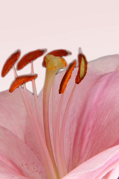
Did you try these with the black area done in white? while I like the angle with the stamen sticking out beytond the petals of the flower, the black is distracting to me for some reason. I think its the color of the pollen pods against the black....and might be just my personal taste. The photos themselves are great. Thanks. Rocco
Did you try these with the black area done in white? while I like the angle with the stamen sticking out beytond the petals of the flower, the black is distracting to me for some reason. I think its the color of the pollen pods against the black....and might be just my personal taste. The photos themselves are great. Thanks. Rocco
Sep 19, 2011 16:20:35 #
rocco_7155 wrote:
Gessman,
Did you try these with the black area done in white? while I like the angle with the stamen sticking out beytond the petals of the flower, the black is distracting to me for some reason. I think its the color of the pollen pods against the black....and might be just my personal taste. The photos themselves are great. Thanks. Rocco
Did you try these with the black area done in white? while I like the angle with the stamen sticking out beytond the petals of the flower, the black is distracting to me for some reason. I think its the color of the pollen pods against the black....and might be just my personal taste. The photos themselves are great. Thanks. Rocco
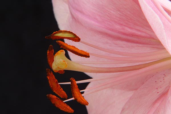
You know, rocco, I didn't even think about a white background and that even opens that idea up to a light pink one, or something on the opposite side of the color wheel, like, what would that be, green. The top one was the original and my concern was about the orientation and cropping. This isn't a staged shot. My wife had put a vase on our deck table with this flower in it and something about that angle I shot it at produced that black background. Probably should have looked at what was behind it but I believe heavily in bokeh and that it heals a lot of wounds. Why don't you do the one of your preference and put it back up here if you have the time and don't mind. I'd like to see how it looks. I don't use PS or anything heavier than my original Elements which ver 2. I haven't gotten into layers yet at all. May never.
Sep 19, 2011 16:22:59 #
Well, my wife says pastel "greenish/yellowish" for the complimentary color. Man, I can't tell. I think I'm half-color blind.
Sep 19, 2011 16:44:48 #
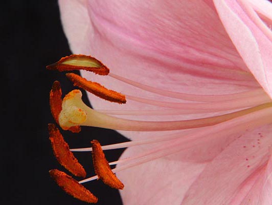
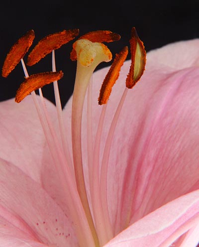
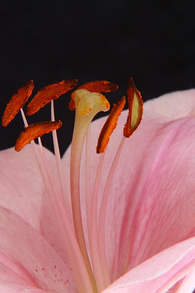
First impression as to framing and cropping I'll go with #3, I like the extra room at the top - room to grow. The horizonal shots to me look like a anti-gravity shot. I understand that flowere are often photgraphed that way but to me when done so they almost need something for perspective such as stems, leaves, butterfly.............
Sep 19, 2011 17:07:17 #
I'd love to take a crack at it man, but unfortunately, I am recovering from an injury at a friend's place and am not on my computer that holds my software. I have been occupying my time poking around here and drooling over everyone's successes. I think a light yellow/orange might set off those umber pollen pods nicely. I cant wait to get back and start posting for real.... Thanks for the opportunity though. Rocco
Sep 19, 2011 17:11:53 #
Either shot is superb. Great macro pix.
Ian
igh1066@hotmail.com
Ian
igh1066@hotmail.com
Sep 19, 2011 18:11:18 #
rocco_7155 wrote:
I'd love to take a crack at it man, but unfortunately, I am recovering from an injury at a friend's place and am not on my computer that holds my software. I have been occupying my time poking around here and drooling over everyone's successes. I think a light yellow/orange might set off those umber pollen pods nicely. I cant wait to get back and start posting for real.... Thanks for the opportunity though. Rocco
It's good to have friends sometimes. I appreciate your willingness and hope you're back where you want to be soon. Thanks.
Sep 19, 2011 18:14:36 #
ianhargraves1066 wrote:
Either shot is superb. Great macro pix.
Ian
igh1066@hotmail.com
Ian
igh1066@hotmail.com
Thanks Ian. I'm ambivalent about it. I think it looks fair either way but then our gooey minds sometimes won't let go of the way we originally saw it and sometimes we think that's the only way it should be. Of course, it could even look good upside down 'cept usually when we see that flower it's not upside down.
Sep 19, 2011 18:17:14 #
notnoBuddha wrote:
First impression as to framing and cropping I'll go with #3, I like the extra room at the top - room to grow. The horizonal shots to me look like a anti-gravity shot. I understand that flowere are often photgraphed that way but to me when done so they almost need something for perspective such as stems, leaves, butterfly.............
but... but... but, #1 is the way nature intended. Have we no respect for mother nature. I hear that can cause a problem. You're right, of course. Thank you for taking the time to comment. I appreciate it.
Sep 19, 2011 20:03:44 #
gessman wrote:
quote=notnoBuddha First impression as to framing ... (show quote)
And again but, but, but - not all flowers grow the same way and nature also grows very few flowers by themselves on a black ground. But yes - tis in the eye of the beholder. Regardless; I always like seeing what you have been up to.
Sep 19, 2011 20:15:19 #

For me, it's between #1 and #2... leaning mostly to #2.
I like that little bit of extra contrast/ empty space.
I prefer that orientation over the unusual ones facing up
*GASP and-a-wink!* ... perhaps just on THIS particular flower or example.
In THIS lily, there is a petal either missing or moved or separated naturally away so we can see the stamens... and I love to be able to see so deep down in from a side view.
Additionally, even though you may not have done a single thing different with all four except change the orientation; the pollen looks un-naturally overly bright in the ones facing upwards.
I don't know why... and ya probably should take that with a grain of salt because I'm under the influence of a new pain pill kickin' in as we speak! *blush&
They are ALL LOVE-ly!!
I really love the color and You did a FAB job of capturing it :)
Sep 19, 2011 20:44:22 #

I'm far from a professional, but here is what I came up with... I tried it with a yellowish green background, but didn't like it.
Before
After
Sep 19, 2011 21:02:33 #
I like the black background, and like the first photo best. Not really sure why. My macro (100mm f2.8L IS) will give me that black background at times too.
Sep 19, 2011 22:49:28 #
notnoBuddha wrote:
quote=gessman quote=notnoBuddha First impression... (show quote)
I wasn't doubting or contradicting. Merely recognizing the flower in it's natural state when found it. I appreciate your input. I personally, don't have a favorite. I'm glad to know how you see it should be. Thanks again.
If you want to reply, then register here. Registration is free and your account is created instantly, so you can post right away.