Grab Shot Composition
Aug 18, 2019 19:20:43 #
Cany143
Loc: SE Utah
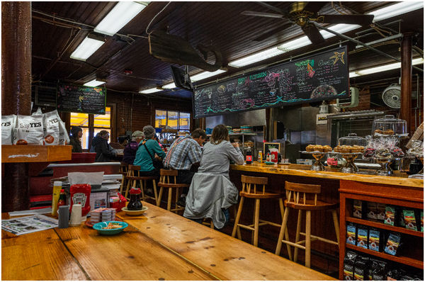
Alt title: Say Yes to No
Alt-alt title: Breakfast in the Port Clyde [ME] General Store, Sept 2016.
Alt-alt-alt title: Compound complex composition, on the fly.
Ordinarily, I bristle at the sight of 'candid' shots in which people are randomly displayed, typically those in which the people shown have their backs to the viewer's view, and are essentially doing little more than happening to be there and are consequently in the picture. Shots like those --to me-- are nearly as deadly as the shots that show a line-up of sorts, a shot in which we see 'here's the fam/friends/cohorts and we're all having a great time, so we'll all say "cheese" and you take our picture while one of us sneezes or blinks or glances lustily at... well.... something or someone other than the camera.' (Actually, as I wrote that, I realized that last part might make for an interesting image at that.... But I digress.)
Analyze this. Images are sometimes more than a sum of 'leading lines' and 'it's so sharp' and 'wonderful contrasts.' Go ahead, pound away any which-way you'd like.
Aug 18, 2019 20:14:25 #
Aug 18, 2019 20:14:34 #
Guyserman
Loc: Benton, AR
I'm trying to get my head around this. You don't like grab shots and you don't like line-ups. It appears the only "people" pictures you like are portraits.
Aug 18, 2019 21:27:58 #
Cany143
Loc: SE Utah
Guyserman wrote:
I'm trying to get my head around this. You don't like grab shots and you don't like line-ups. It appears the only "people" pictures you like are portraits.
That's an interesting take. Doesn't have much to do with the image, or anything I wrote, but it's an interesting take all the same.
Its a post about composition, not people in pictures. My apologies if the title implied otherwise.
Aug 18, 2019 21:43:59 #
Well, here’s my take, it really does have a lot of leading lines and they all lead to the lower left 1/3 point - right where al the people are.
Interestingly to me, the top half of the photo is largely B/W while the bottom is pretty rich in color.
Richard Taylor nails it as the foreground familiarity makes me feel like I am there. Also, it looks like the kind of place I would enjoy a beer and a burger in.
It’s a comfortable picture to look at.
Aug 19, 2019 06:07:17 #

There is only one reason to be in Port Clyde, so Im not looking too closely, but full of anticipation for the near future. Its a photo thats, I guess, near and dear. For me, irregardless of a little iso, its a terrific shot.
Aug 19, 2019 11:10:37 #

There are times when it's best to resist the temptation to lift the shadows as high as they'll go, and this is one of those times. It looks like the sort of place that's not very bright and it's probably a good idea to leave it like that. Brightening will tend to weaken the colours and bring out the noise (it's there if you look for it but it's not so bad that it jumps out at you).
Composition-wise I would probably have gone for a bit less table-top in the foreground which would give more prominence to the group of people and the counter, which I would say are the main sources of interest.
Composition-wise I would probably have gone for a bit less table-top in the foreground which would give more prominence to the group of people and the counter, which I would say are the main sources of interest.
Aug 19, 2019 13:03:30 #
I find this to be a very comfortable picture. Nothing to do with composition, although it does draw you in. This is a place we have probably all been to and would likely return to. It is also a picture of what it used to be like in this country.
Ed
Ed
Aug 22, 2019 10:56:42 #
Cany143 wrote:
Alt title: Say Yes to No br br Alt-alt title: B... (show quote)
A caveat, in general, I like images with primary and clear subject matter and I do understand this is a story-telling image. My first thought is, “there is an awful lot going on in this image.” It is very busy and my eye is all over the place trying to identify the primary and secondary subject(s). The foreground looms large with the breakfast items on the table but there is an awful lot of space around them so I don’t think they were intended to be primary or secondary subjects, and perhaps that section could have been handled differently. My eye in that section and in general keeps going to the light-colored package labled “Say YES,” which I also assume is not a primary or secondary subject. The lightest part of the image is in the front but the people at the bar eating are, I assume, are the primary subject and they are in the dark. Perhaps darkening the foreground and lightening the background would correct this imbalance and place emphasis on the primary subject. Since the people do appear to be the primary subject in the jumble of the image having at least one face completely in view from the side would have created more interest, or perhaps getting two people in earnest conversation would have created additional interest or perhaps even focusing on one interesting person more closely would also tell the story more effectively. Finding a way to isolate the people as the primary subject, while still setting the mood selectively with the surrounding items, would have created an image more centered on the main subject and would have more effectively, for me, conveyed the story at hand. Just my take…
Aug 27, 2019 22:31:59 #
Cany143
Loc: SE Utah
via the lens wrote:
A caveat, in general, I like images with primary a... (show quote)
Its doubtful anybody will see this reply, much less you (via the lens, and/or R.G.) but....
This image is NOT about people, nor was it intended to be. The people that happen to be sitting at the counter are of no particular interest, nor were they meant to be. Their only 'purpose' --composition-wise-- is thematic in nature rather than in placement, something easier to say than explain. Likewise, the image is NOT about 'mood' or notions of nostalgia or anything of the kind. It is about composition. In particular, it is about opposing equivalences. In that sense, it is not about 'feelings'; it is about 'ideas.' And 'ideas' are NOT always simple subjects.
Composition in the sense that --counter to what you suggested R.G.-- reducing, or cropping in some fashion, the lower, brighter portion of the foreground table (where I was seated and where the image was seen and shot) would disrupt one of the main compositional 'opposing equivalences' key to the image. Specifically, note how the lighter foreground 'oppositionally echoes' the darker ceiling; both are triangles of very nearly the same volume, and their 'lines' --literally the hypotenuse of each --and which I only haltingly consider 'leading lines' as the term is commonly used-- 'lead' to the Idea behind the image. And that 'Idea' is quite precisely where the lines lead: to the packages that state, as indicated in an alt-title, "SAY YES to no.' Talk about oppositions.... or paradoxical thoughts.
I'm well aware that 'conceptional' photography is NOT in fashion at present. Over and over again, people want to find, or imagine, some sort of 'feeling' or 'mood' to prevail in a photograph, and that's fine. But imagination is NOT the only trait that imagery has contained over time. Look at the flow of '-isms' that have prevailed over time, and you'll see that's been the case as long as there's been imagery, photographic or otherwise. Classicism > to Romanticism > to Modernism (in all Modernism's various guises).
To flesh the above out further would be to re-write my Master's Thesis. Which nobody here would read.
Aug 29, 2019 11:26:58 #

Cany143 wrote:
Its doubtful anybody will see this reply, much les... (show quote)
Well, I would probably read it, or try to, though it would likely fly over my head.
It is a pleasing image on two fronts for me.
First, because emotion often cashes in ahead of design, it is pleasing for the reason fergmark describes: I know where this is and I know where you're headed and I wanta go too. Furthermore, I AM going there in 3 weeks, along with a few photographer friends from UHH and PM, and wish both of ya'll were gonna be there too.
Second, because it is immensely pleasing visually from a geometrical standpoint, peeking in from the lower left end of the interior of a receding cuboid 3-d form to find all the pieces of the visual puzzle plumb and balancing each other properly as they proceed towards a well-located vanishing point. As someone who came into photography late in life after concluding a career in something utterly art-less, and who has never had a moment's instruction in it, I lack the wordage to discuss what I see beyond the scope of high school geometry. (Geometry and emotion are the two ingredients that inform more of my own photography than any other concept, including rules of composition, which I am rather regularly called out on.)
Always a pleasure to read your interesting threads.
Aug 29, 2019 12:16:50 #
Cany143 wrote:
Its doubtful anybody will see this reply, much les... (show quote)
You said, "Go ahead, pound away any which-way you'd like," and so I did. Apparently you did not mean that as you do appear to be somewhat "huffy" over my response. We all see differently. If I, as the viewer, do not see what you, as the photographer, intended me to see then there is a viewing disconnect of sorts. You intended one thing, I saw another thing. The message was, apparently, unclear to me. So goes life. This is no reason to insult readers and let us know that we don't know as much as you know. Perhaps we really do, but we simply see things differently, which is, to me, one of the wonderful things about photography, that we see a scene differently. One of the hard things is to convey what we see and the message we want to impart to the viewer. Would you have preferred me to say what you actually said you did not want to hear, "O, what a pretty picture!"
Aug 29, 2019 13:58:02 #
Cany143
Loc: SE Utah
Full agreement with your statement: "One of the hard things is to convey what we see and the message we want to impart to the viewer."
I also agree that I wasn't fishing for someone to say "O, what a pretty picture." Rather, I was hoping someone might somehow comment on the (un-orchestrated, spontaneous) composition of the image as it had been presented rather than what they'd have done or preferred instead.
If I've been huffy or insulting --and apparently I have-- then I apologize. I'll try to curb that in the future.
If you want to reply, then register here. Registration is free and your account is created instantly, so you can post right away.