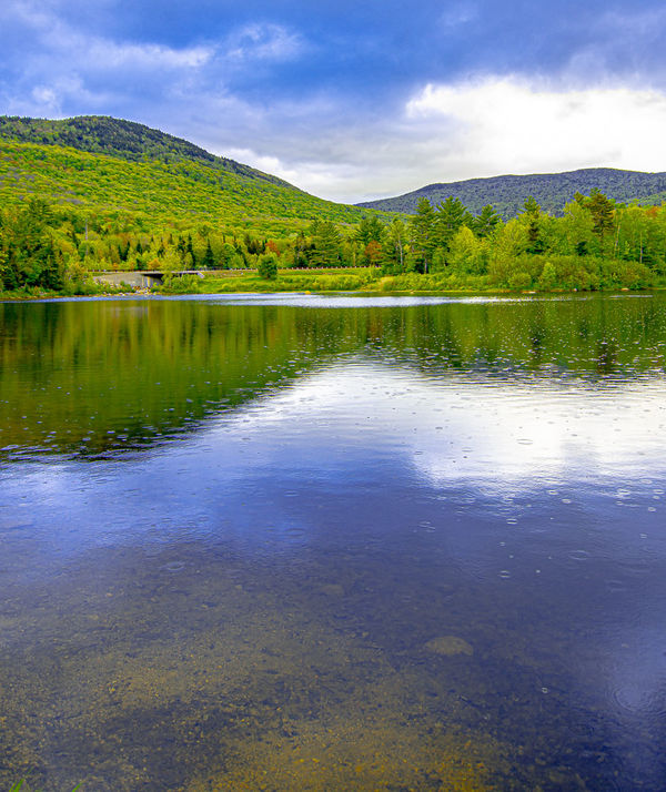
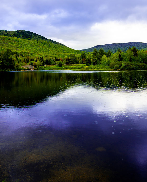
Sprinkles on Corcoran's Pond V 2.0
Jun 11, 2019 22:46:24 #

Edited with UHH'ers suggestions...comment, please !! Thanks Steve
Jun 11, 2019 23:25:25 #
Jun 12, 2019 07:46:14 #
Number two for me. If it's sprinkling you'd expect a darker sheen on the water and distant foliage.
Jun 12, 2019 08:47:44 #

Jun 12, 2019 09:26:53 #
allanj
Loc: New York City
I remember the original post. The version today is definitely an improvement. Of the two posted today, I prefer the first.
Jun 12, 2019 11:06:02 #

I do not recall your original post. Could you post a link to it? Of these two versions, I think I'd like something in between. I really like the blues of the sky and the water in the first one. But I like the greens of the second one better. But maybe it's just a tad too much? I think the greens in the first one look unnatural - too bright. But then, I'm a desert rat, and our greens are so much softer. Are yours actually natural? In the second one there is more variation in the greens. In the first, if you could may make the tall trees a bit darker? Maybe I'm asking for too much.
Another matter: I really like the colour interest in the water at the bottom of the picture. However, when my screen first showed the image, it was actually in more of a 4x5 format, and I found that really pleasing. I wouldn't want to crop out that beautiful bottom colour, but if it were possible to include it in the different format, that would be interesting.
Another matter: I really like the colour interest in the water at the bottom of the picture. However, when my screen first showed the image, it was actually in more of a 4x5 format, and I found that really pleasing. I wouldn't want to crop out that beautiful bottom colour, but if it were possible to include it in the different format, that would be interesting.
Jun 12, 2019 16:35:08 #

If you want to reply, then register here. Registration is free and your account is created instantly, so you can post right away.