Comments on this editing style, please
Apr 20, 2019 17:22:30 #
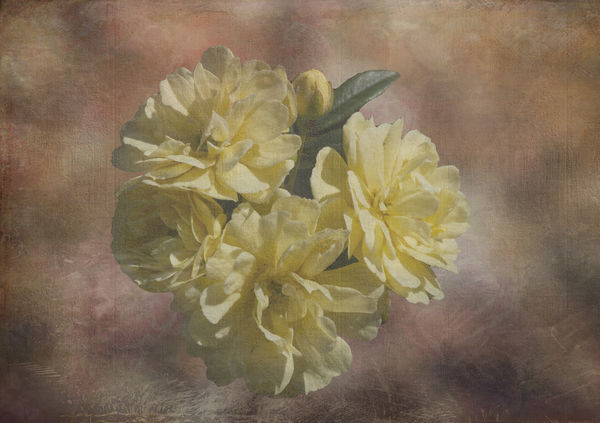
First attempt at this style.
Feel free to fold, spindle or mutilate. All comments appreciated.
Feel free to fold, spindle or mutilate. All comments appreciated.
Apr 20, 2019 17:34:57 #
Apr 20, 2019 17:52:54 #
kenievans
Loc: Dallas
I think it is really pretty. You used the background you made and you did a very good job on the flower masking and blending the edges.Two suggestions. First I think I would either desaturated your background just a little or add more saturation to the flowers. Your background is a little overpowering compared to the flower.
Second I would do a little dodging on the right side of the background to just lighten it up a little. It will match the background to the direction of the light on the flower. If you notice there is more shadow on the left side of the flower.
Nice job creative job sir!
Second I would do a little dodging on the right side of the background to just lighten it up a little. It will match the background to the direction of the light on the flower. If you notice there is more shadow on the left side of the flower.
Nice job creative job sir!
Apr 20, 2019 17:57:11 #

Curmudgeon wrote:
First attempt at this style.
Feel free to fold, spindle or mutilate. All comments appreciated.
Feel free to fold, spindle or mutilate. All comments appreciated.
I would have brightened or saturated the yellow a bit, but that's just me. A pleasant antique look

Apr 20, 2019 20:31:13 #

I like Keni's idea to emphasize the direction of light a bit more. Also, re color saturation, if you didn't experiment with a slight masking of the texture effect from the flowers, you might try just to see how it works. A subtle adjustment - not major 
My other observation is that the flower doesn't seem perfectly centered. I'm just going by "eyeball," so I could be wrong, but the tiny bit it seems to be off is drawing my attention away from the overall beauty and colors.
Congrats on your beautiful result!
My other observation is that the flower doesn't seem perfectly centered. I'm just going by "eyeball," so I could be wrong, but the tiny bit it seems to be off is drawing my attention away from the overall beauty and colors.
Congrats on your beautiful result!
Apr 20, 2019 21:10:36 #
Thanks all. Working with any part of an image without affecting the rest of the image is beyond my skill level at this time. 
Apr 20, 2019 21:23:14 #
Curmudgeon wrote:
You'll have it down in no time! If you were working with PS layers, check out Crichmond's tutorial (with a downloadable printable version to reference):Thanks all. Working with any part of an image without affecting the rest of the image is beyond my skill level at this time.
https://www.uglyhedgehog.com/t-585131-1.html
Or, if you prefer videos, Google can direct you to You-Tube.
Apr 21, 2019 04:46:57 #

Softness can be a very effective look, but here it just looks wishy-washy. The flowers need more contrast and possibly more saturation, even if softness is the intended look.
Apr 21, 2019 05:35:14 #

Very good effort for a first try, like the other comments I too feel the flower should stand out from the background a bit more. Also when you cut your flower out zoom in to make sure you have all the black edges taken off as they can spoil an image.. 
Apr 21, 2019 05:57:18 #

Apr 21, 2019 06:40:21 #
Hopefully your original image came from a camera and not a post card, but either way, in its presented form, it appears to have a lot of "noise" in it. A good de-noise program can help. PS de-noise is okay, but a more advanced program like Topaz is better to get rid of the noise and striations. Once you accomplish this, highlight or warm the flowers (your subject matter), for a better presentation.
Good Luck.
Good Luck.
Apr 21, 2019 09:07:12 #
Guyserman
Loc: Benton, AR
Curmudgeon wrote:
First attempt at this style.
A new career is launched. You're on a path of no return. Good job.
Apr 21, 2019 10:28:34 #

Very comforting, subtle piece. Everything works towards that--excellent job!
Apr 21, 2019 10:59:21 #
EOB Photo wrote:
Hopefully your original image came from a camera and not a post card, but either way, in its presented form, it appears to have a lot of "noise" in it. A good de-noise program can help. PS de-noise is okay, but a more advanced program like Topaz is better to get rid of the noise and striations. Once you accomplish this, highlight or warm the flowers (your subject matter), for a better presentation.
Good Luck.
Good Luck.
FYI. All my subjects come from my camera.
Apr 21, 2019 11:12:41 #
EOB Photo wrote:
I think what you're seeing is the texture of the overlay. If you aren't familiar with the use of textures and layer blend modes, it's a fun and addictive means of creating a unique look. Here are two recent topics:...it appears to have a lot of "noise" in it.
https://www.uglyhedgehog.com/t-584844-1.html
https://www.uglyhedgehog.com/t-581889-1.html
You can make your own, buy them or find free online:
https://www.uglyhedgehog.com/t-586267-1.html
.
If you want to reply, then register here. Registration is free and your account is created instantly, so you can post right away.