Another IR
Feb 21, 2023 18:46:22 #

Feb 22, 2023 07:17:28 #
sueyeisert
Loc: New Jersey
How about more information about the photograph. Is it 590nm and processing??
Feb 22, 2023 08:11:56 #

sueyeisert wrote:
How about more information about the photograph. Is it 590nm and processing??
Yep, we IR people are a nerdy bunch and need to know the details.
Feb 22, 2023 14:35:56 #
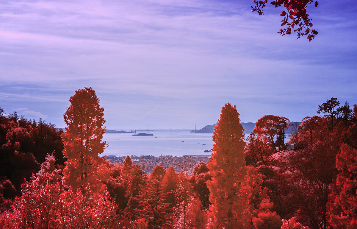
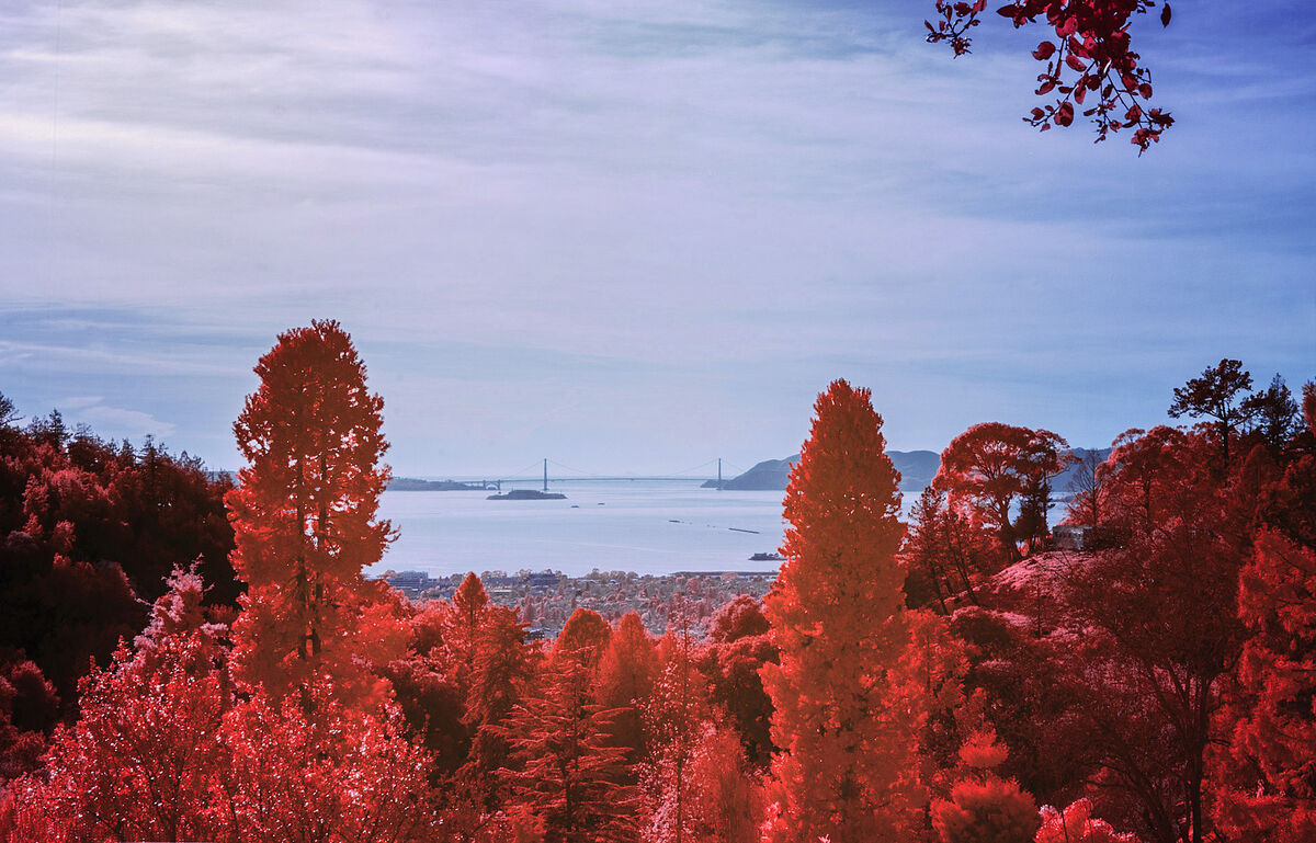
720nm conversion. Processing with Rob Shea's actions. Standard red-blue shift and then some channel mixes.
This is the first camera that I converted to IR. I was reading that 720 was a good place to start. My next camera was converted to 590nm. Better.
This is the first camera that I converted to IR. I was reading that 720 was a good place to start. My next camera was converted to 590nm. Better.
Feb 23, 2023 11:31:41 #
topcat wrote:
Looking at the Golden Gate
Nice image. Wonderful composition. But what catches my eye immediately is that the clouds have too much violet in them. The coloring of the trees should be what gets my attention. But those clouds interfere with this. Makes the image seem not yet completed.
Hope you don't mind, but I edited your image and desaturated the violet out of the clouds and now my attention is immediately drawn to the trees. Also slightly changed the hue of the blue sky just a bit to get closer to the true color of the sky.
Also interested in knowing where you are taking this image from? This looks to be from the hills above Oakland.
Thanks for sharing.
Feb 23, 2023 12:28:39 #
JimH123 wrote:
Nice image. Wonderful composition. But what catc... (show quote)
Yes, you did make it better. That colour in the clouds did bother me, but I got tired of fooling around with it and just gave up.
I was in UC Botanical Garden, near the rose garden section. I saw the bridge and I thought that I would try. The trees were in shade, soo I was surprised when they came out in IR.
Feb 23, 2023 12:48:24 #
topcat wrote:
Yes, you did make it better. That colour in the clouds did bother me, but I got tired of fooling around with it and just gave up.
I was in UC Botanical Garden, near the rose garden section. I saw the bridge and I thought that I would try. The trees were in shade, soo I was surprised when they came out in IR.
I was in UC Botanical Garden, near the rose garden section. I saw the bridge and I thought that I would try. The trees were in shade, soo I was surprised when they came out in IR.
Yes, the UC Botanical Garden in Berkeley would be in position to have the view you saw for this shot. Can't quite see the Bay Bridge, which is too the left out of sight. Alcatraz is certainly visible in the center with the Golden Gate Bridge farther out in the distance. The piers of San Francisco would be on the left.
Normally I would do the clouds in Lightroom in which it is extremely easy to deal with the clouds. But this time, so I didn't have to import it, I just opened it in Photoshop and then used NIK's Viveza and took care of the colors. Very simple procedure.
Feb 23, 2023 17:43:28 #
JimH123 wrote:
Yes, the UC Botanical Garden in Berkeley would be ... (show quote)
I never thought of using Viveza. That is a good trick. Thank you.
Feb 23, 2023 17:58:21 #
topcat wrote:
I never thought of using Viveza. That is a good trick. Thank you.
Yes, give Viveza a try. Setting control points is powerful. All kinds of uses with IR images.
One thing I find with pseudo color images is that something in the image has to look normal. And usually that is the sky. Once the brain connects with the normal part, the pseudo color part is much better appreciated.
Alternately, if going after B&W, Viveza can allow for more gradual color changes, which may look awful in color, to produce beautiful B&W's with lots of grayscale. I find filters like 850nm to produce very harsh B&W, but filters like 590nm allow more visible light to be present, resulting in wonderful grayscales.
Feb 23, 2023 18:15:10 #
JimH123 wrote:
Yes, give Viveza a try. Setting control points is... (show quote)
Yes. The first camera that I had converted was 720nm. It was OK, but then I went to 590nm. I am going to bring some of the photos that I was working on into NIK to see what they can do. I used to use NIK for everything, but I haven't in a while.I have been using Tony Kuyper and his Luminosity masks for a lot. I think that they are easy and work great.
https://goodlight.us/
Jan 12, 2024 09:37:12 #

topcat wrote:
Looking at the Golden Gate
Lovely and it has a fantasy-world look that is very appealing ⭐⭐⭐⭐⭐
Jan 12, 2024 12:56:09 #
joecichjr wrote:
Lovely and it has a fantasy-world look that is very appealing ⭐⭐⭐⭐⭐
Thank you, Joe
If you want to reply, then register here. Registration is free and your account is created instantly, so you can post right away.