Check out Black and White Photography section of our forum.
Before and After
Nov 4, 2022 16:11:06 #
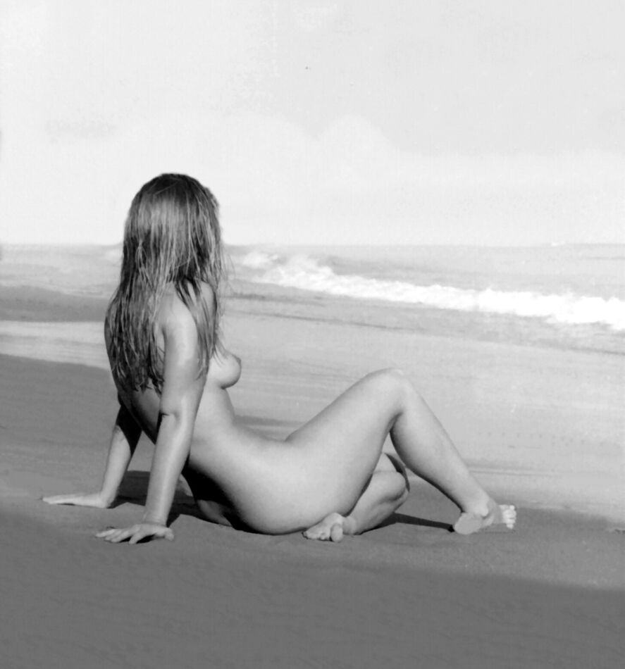
We see here an image that I "messed around with". Not very impressive but I thought I'd share some of my minimalist work for fun.
Nov 4, 2022 17:32:48 #

Image 1 - Love the B&W. Great tone, pose, exposure...
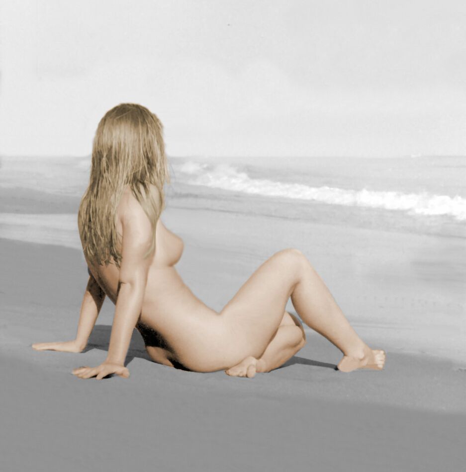
Image 2 - Colorization is okay. However, the photo loses some of its "soul".
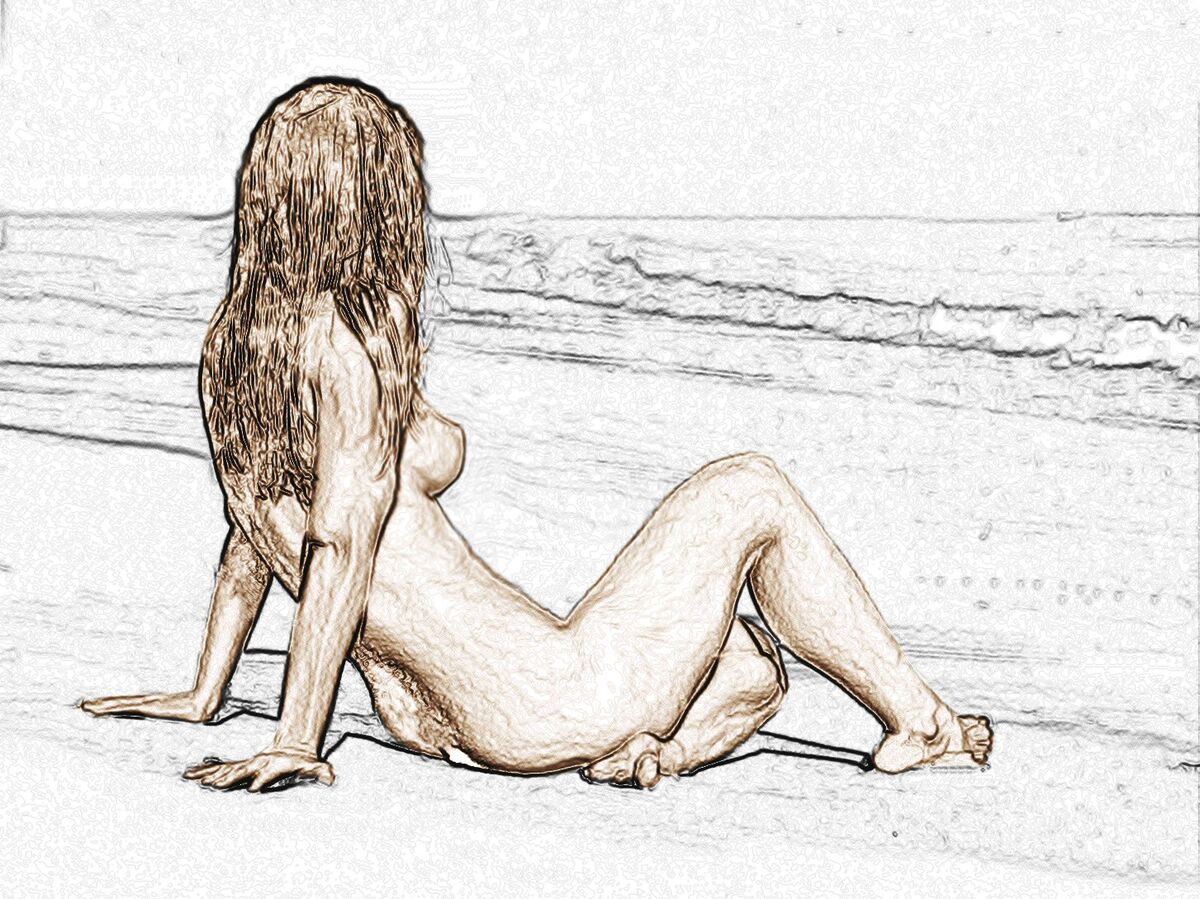
Image 3 - Makes for a great "sketch". Really different.
Image 2 - Colorization is okay. However, the photo loses some of its "soul".
Image 3 - Makes for a great "sketch". Really different.
Nov 4, 2022 18:11:07 #
RogStrix
Loc: UK
Perhaps add a periscope on the horizon above her knee, sort of watching you watching me...
Check out Wedding Photography section of our forum.
Nov 5, 2022 06:38:05 #

Jim Tonne wrote:
We see here an image that I "messed around with". Not very impressive but I thought I'd share some of my minimalist work for fun.

Nov 5, 2022 07:09:20 #

Nov 5, 2022 07:55:02 #

Nov 5, 2022 08:01:57 #

Check out Panorama section of our forum.
Nov 5, 2022 08:47:45 #

Nov 5, 2022 10:06:12 #
Nov 5, 2022 10:52:52 #

Jim Tonne wrote:
We see here an image that I "messed around with". Not very impressive but I thought I'd share some of my minimalist work for fun.
You are losing contrast and darks when you colorize. That doesn't have to happen.
Nov 5, 2022 11:33:42 #

Check out The Pampered Pets Corner section of our forum.
Nov 5, 2022 13:37:18 #


Nov 5, 2022 14:45:27 #
WirtzWorld
Loc: SE WI
My opinion only: there’s no reason to colorize this photo. The monotone is great just the way it is. It’s a really nice shot. But I know there are those who prefer color. I believe there’s enough color in the monochromatic version.
I, however, am not innocent if unnecessary photoshop hijinks, do do your thing.
I, however, am not innocent if unnecessary photoshop hijinks, do do your thing.
Nov 5, 2022 14:58:54 #
WW: Did that "color" thing for fun, experimenting with the technique. The first image, B&W, is surely a good one to use as a guinea pig. - JimT
Nov 5, 2022 19:30:48 #

If you want to reply, then register here. Registration is free and your account is created instantly, so you can post right away.
Check out Infrared Photography section of our forum.