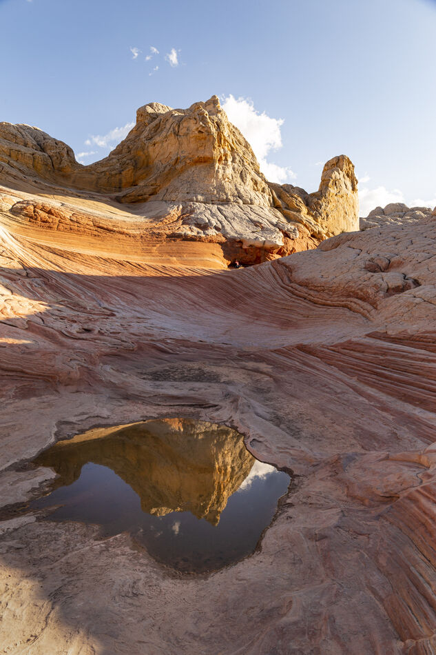
does the light in the bottom left corner detract from the image
Aug 5, 2022 21:27:42 #
PoppieJ
Loc: North Georgia
I am considering placing this image in a competition in a couple of weeks. The thing that has me wondering about it is the sunlight in the bottom left corner. I have tried a crop to get rid of it and have included that for comparison. This has the added benefit of taking some of the dead space out of the sky. I also considered cloning shadows into that corner so as to save the texture on the right side of the picture, but have not done that. Any comments and help will be appreciated
Aug 5, 2022 22:05:30 #

The crop works. The reflection of the sky in the foreground puddle will distract the eye from the high the contrast involved.
PoppieJ wrote:
I am considering placing this image in a competition in a couple of weeks. The thing that has me wondering about it is the sunlight in the bottom left corner. I have tried a crop to get rid of it and have included that for comparison. This has the added benefit of taking some of the dead space out of the sky. I also considered cloning shadows into that corner so as to save the texture on the right side of the picture, but have not done that. Any comments and help will be appreciated
Aug 6, 2022 01:53:03 #

You don't need to crop it out - just tone it down a bit. If you use the Highlights slider the selection doesn't have to be precise because the darker area won't be affected much by that adjustment, if at all. If necessary, duplicate the adjustment. Cropping puts the puddle too close to the edge.
Aug 6, 2022 06:12:17 #
Orphoto
Loc: Oregon
I agree with rg. I would use local adjustments to tone down the other bright left edge areas. Try to darken the sky slightly. Consider also slightly warming the white balance in the shady foreground. Make sure it retains some blue cast.
Aug 6, 2022 06:27:12 #

Stated the other way around... does the main image distract from the light at the bottom left corner? I looked and saw a different view and made the light in the puddle the new main image.
I did a vertical flip and then cropped it to make the reflected image of the mountain centered in an interesting frame... an image within an image, photo.
I did a vertical flip and then cropped it to make the reflected image of the mountain centered in an interesting frame... an image within an image, photo.
Aug 6, 2022 06:59:37 #

PoppieJ wrote:
I am considering placing this image in a competition in a couple of weeks. The thing that has me wondering about it is the sunlight in the bottom left corner. I have tried a crop to get rid of it and have included that for comparison. This has the added benefit of taking some of the dead space out of the sky. I also considered cloning shadows into that corner so as to save the texture on the right side of the picture, but have not done that. Any comments and help will be appreciated
I actually like the first one better. Thanks BE SAFE!!
Tom
Aug 6, 2022 08:11:40 #
PoppieJ
Loc: North Georgia
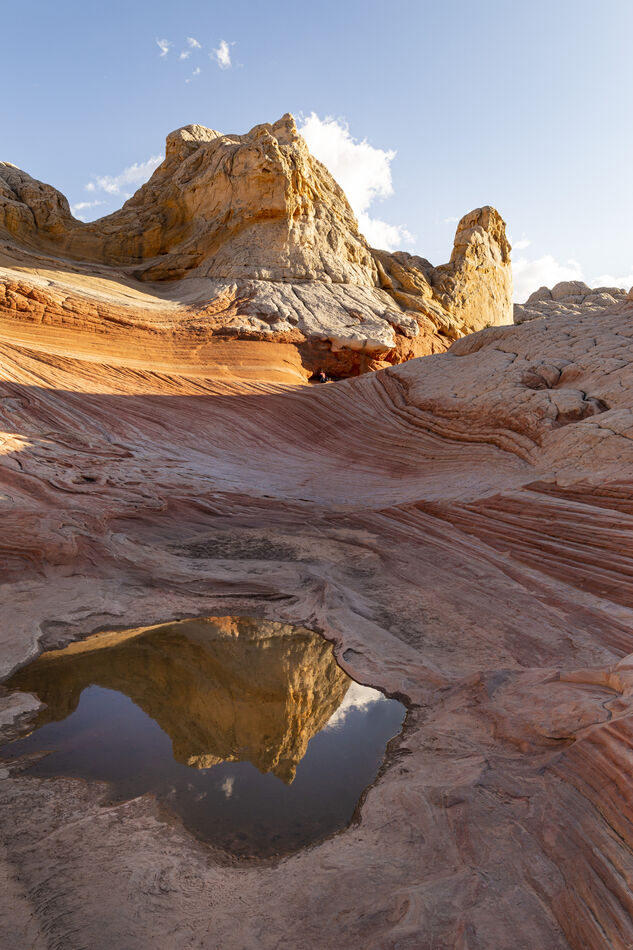
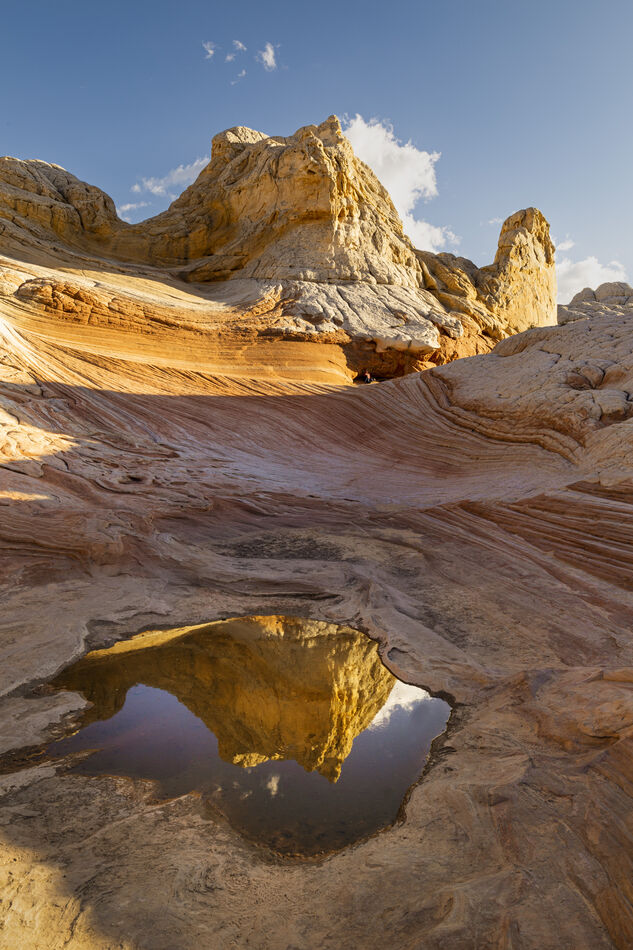
using some of the comments that you have made I went back to my original picture and made a few changes, so now we have 3 pictures to compare. I think that the 3rd picture is more dynamic than the other 2. tell me what you think
Aug 6, 2022 08:25:12 #
The reflection has been over-boosted to the point where it doesn't look realistic. Just dial it back a little.
Aug 6, 2022 08:39:30 #

The light area bottom left forms a triangle that is repeated twice more as you ascend the left edge of the image. I like it.
Aug 6, 2022 09:28:30 #
PoppieJ wrote:
using some of the comments that you have made I went back to my original picture and made a few changes, so now we have 3 pictures to compare. I think that the 3rd picture is more dynamic than the other 2. tell me what you think
I think this is the one. Good work. Thanks BE SAFE!!
Tom
Aug 6, 2022 10:07:42 #

PoppieJ wrote:
I am considering placing this image in a competition in a couple of weeks. The thing that has me wondering about it is the sunlight in the bottom left corner. I have tried a crop to get rid of it and have included that for comparison. This has the added benefit of taking some of the dead space out of the sky. I also considered cloning shadows into that corner so as to save the texture on the right side of the picture, but have not done that. Any comments and help will be appreciated
Personally, I would just shade in the lower left corner with a brush in post. The light going up the left side look good to me.
Aug 6, 2022 11:19:30 #
PoppieJ wrote:
using some of the comments that you have made I went back to my original picture and made a few changes, so now we have 3 pictures to compare. I think that the 3rd picture is more dynamic than the other 2. tell me what you think
Crop down to just above the ridge in the darkness and you end up with an interesting eye.

Aug 6, 2022 15:01:19 #
PoppieJ wrote:
I am considering placing this image in a competition in a couple of weeks. The thing that has me wondering about it is the sunlight in the bottom left corner. I have tried a crop to get rid of it and have included that for comparison. This has the added benefit of taking some of the dead space out of the sky. I also considered cloning shadows into that corner so as to save the texture on the right side of the picture, but have not done that. Any comments and help will be appreciated
The images brightness is lopsided with all shadow on one side and both bright areas on the other. The crop is still not right. Theres a great sense of dead mass on the right thaz killing the image. I would just scrap it.
Aug 6, 2022 15:49:43 #
User ID wrote:
The images brightness is lopsided with all shadow on one side and both bright areas on the other. The crop is still not right. Theres a great sense of dead mass on the right thaz killing the image. I would just scrap it.
Don't take this the wrong way. Do you make money with photography? Tanks BE SAFE!!
Tom
Aug 6, 2022 18:31:02 #

R.G. wrote:
You don't need to crop it out - just tone it down a bit. If you use the Highlights slider the selection doesn't have to be precise because the darker area won't be affected much by that adjustment, if at all. If necessary, duplicate the adjustment. Cropping puts the puddle too close to the edge.
 I agree.
Don
If you want to reply, then register here. Registration is free and your account is created instantly, so you can post right away.