A couple of images from Peggy's Cove, Nova Scotia
Jul 14, 2022 16:22:47 #
mwsilvers
Loc: Central New Jersey
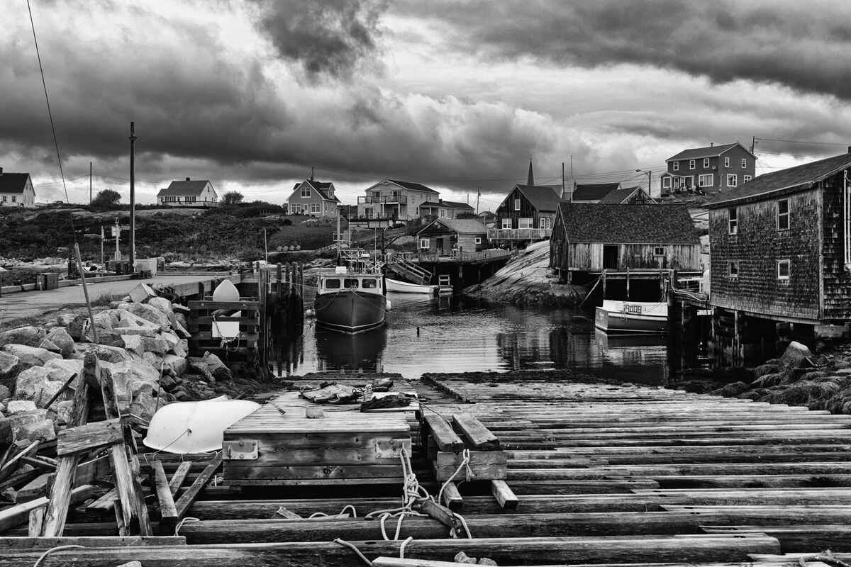
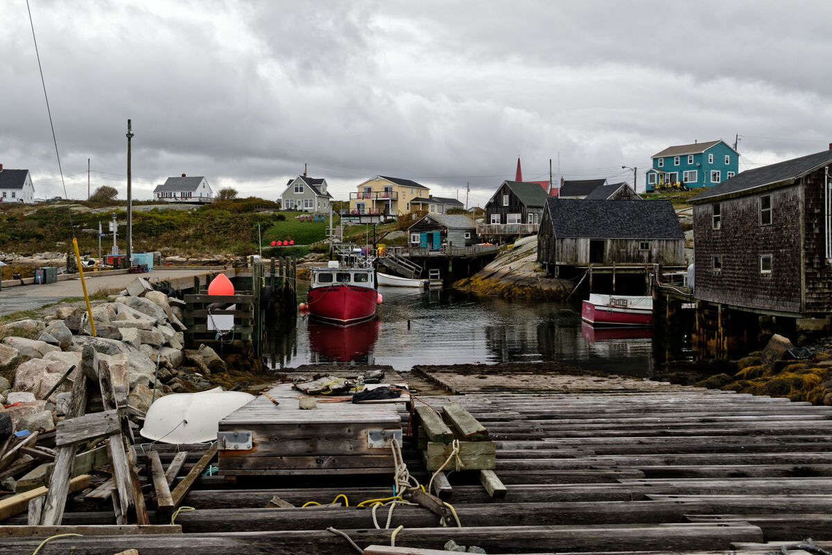
My B&W skills are still pretty weak, but here are a couple of examples from Peggy's Cove, N.S on a very cloudy late afternoon. Any suggestions would be welcomed.
Jul 14, 2022 16:34:50 #


Jul 14, 2022 16:37:45 #

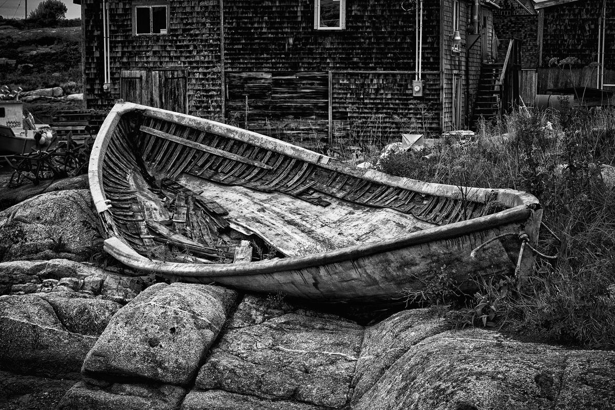
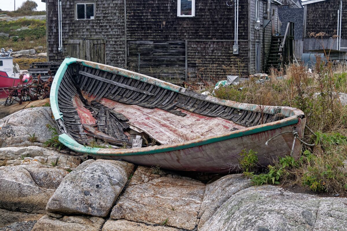
What a wonderful location to photograph! I think #2 is terrific as-is. Mesmerizing textures and shapes.
In #1 the first thing I see is the brightest element aside from the sky, the overturned, featureless dingy (?). For me the sky overpowers the great variety of houses and other details (a great sense of place!), but dramatic skies may be your preference.
Unless you're trying for a specific aspect, I think a little crop from the left to remove the angled wire and the partial house on the hill would be an improvement.
For processing, there is always dodging and burning to help direct the eye around. Subtle changes can make a big difference. I'd probably lighten the upper part of the lobster boat that faces us + the little boat behind/to right of it. Maybe the more centered house? Is this beginning to sound way too anal, Mark?
Jul 14, 2022 17:50:56 #

Jul 14, 2022 17:59:54 #
mwsilvers
Loc: Central New Jersey
Linda From Maine wrote:
What a wonderful location to photograph! I think #... (show quote)
Thanks for your comments Linda. I'm out right now, but I will look at the image again later this evening taking your suggestions into consideration.
With regard to the second image, I worked to make the rotting boat pop from its background.
Jul 14, 2022 21:32:56 #
mwsilvers
Loc: Central New Jersey
Linda From Maine wrote:
What a wonderful location to photograph! I think #... (show quote)
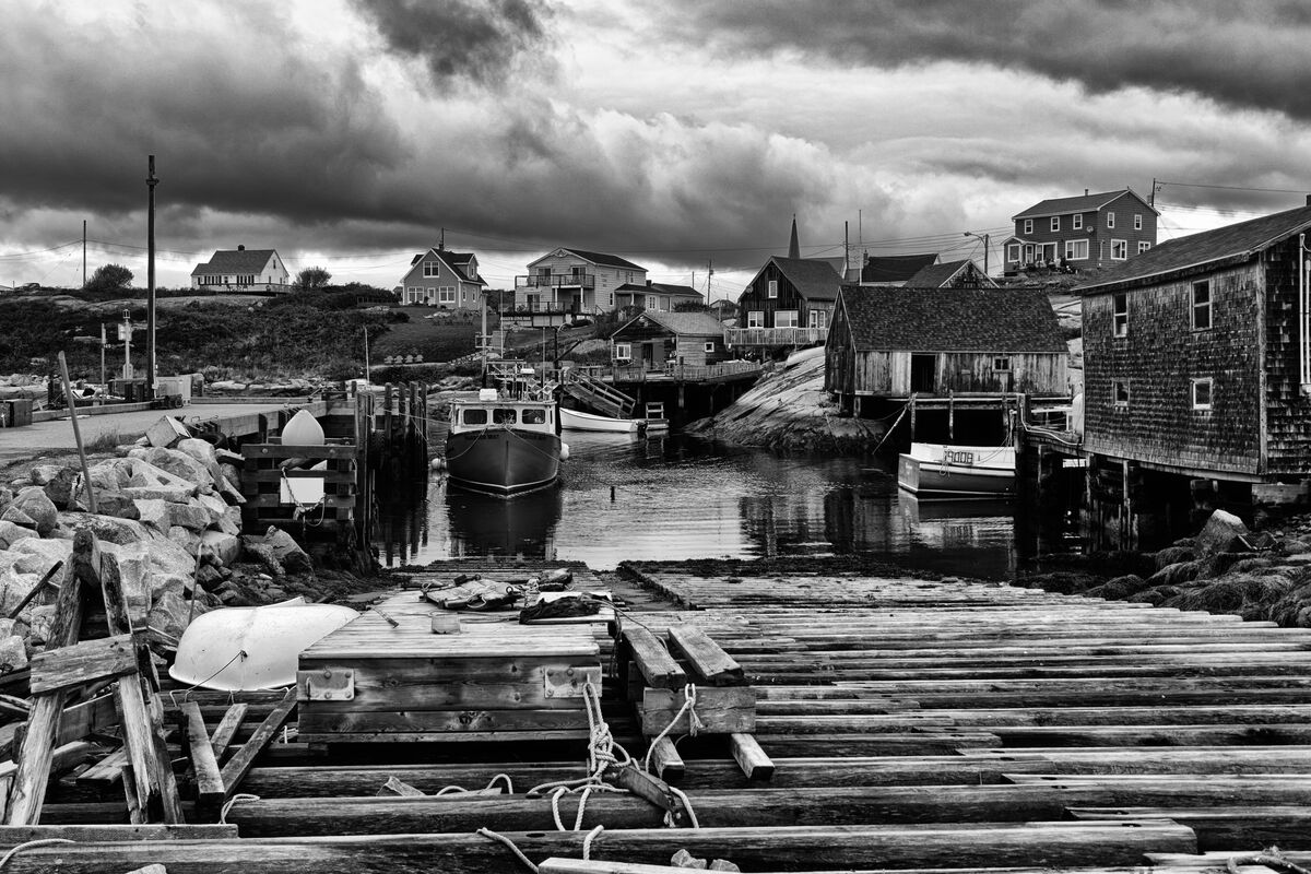
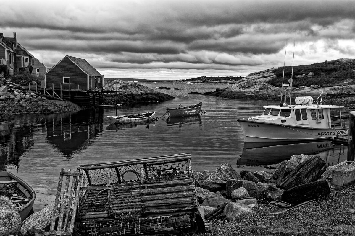
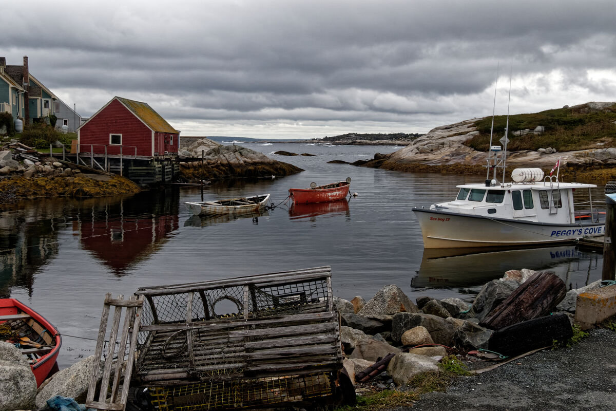
I think I addressed most of your observations. I cropped out the partial house, removed the distracting wire and darkened the very white boat. I like the sky the way it is. Here is another cut. Any additional comments? I've also attached another image from Peggy's Cove.
Jul 14, 2022 21:36:20 #

Jul 15, 2022 07:06:40 #
mwsilvers wrote:
Thank you Mark! I love the third photo also. Were you originally thinking about black and white when you photographed these? They sure make great conversions!I think I addressed most of your observations. I cropped out the partial house, removed the distracting wire and darkened the very white boat. I like the sky the way it is. Here is another cut. Any additional comments? I've also attached another image from Peggy's Cove.
Jul 15, 2022 07:49:47 #
gmontjr2350
Loc: Southern NJ
I really like the edits to image #1.
Some really nice work here!!!!
George
Some really nice work here!!!!
George
Jul 15, 2022 08:39:44 #
mwsilvers
Loc: Central New Jersey
Linda From Maine wrote:
Thank you Mark! I love the third photo also. Were you originally thinking about black and white when you photographed these? They sure make great conversions!
Thank's Linda. Actually, they were all originally intended as color shots but I thought they would work in B&W as well. Here are the processed color versions.
Jul 15, 2022 09:36:32 #

Jul 18, 2022 10:31:14 #

The rotted boat is my favorite and I like the B&W better than the color.
Jul 21, 2022 14:27:13 #
mwsilvers
Loc: Central New Jersey
CHG_CANON wrote:
The rotted boat is my favorite and I like the B&W better than the color.
Thanks. Besides adjusting the shadows and increasing contrast and sharpness globally for the B+W version I all used local adjustment tools to separate the boat from the background to make it pop a bit more.
If you want to reply, then register here. Registration is free and your account is created instantly, so you can post right away.