Brightness adjustment question.
Jun 21, 2022 20:57:03 #

Because I'm very rarely ever near or at a desktop computer, it's a tablet (or maybe, phone sometimes) that's my tool for editing and posting photos. (Okay, so now you know it's just a hick using caveman tools in this photography pursuit, that you're dealing with here.)
I aim for having the brightness of edited photos looking realistic, and light/shadow differences that hopefully help to define shape, texture, contrasts, etc., as the photos display on the tablet screen.
So, yesterday, via an older (probably 20+ years old monitor, I saw some of my photos I've put on UHH because I was showing a few to someone who was interested in a look at some I've done. The monitor is larger than the tablet screen and seemed to be a reasonable choice for the older, weaker eyesight of the person who wanted to have a look.
Well, the monitor displayed the photos noticeably brighter than my tablet, to the point where they seemed to be approaching the point of looking "washed out". Not like a color shift really, nor blown out highlights, but just as if they were processed with the brightness adjustment set higher than necessary.
Well, I'm not sure if my tablet displays them with the brightness level a little off, or if the older monitor displayed them in a way consistent with some earlier technology that makes them look different. I wasn't there that long, and time was a little tight right then, so I didn't put any time into checking if there is a brightness adjustment on that monitor.
Okay, so now leading into the question:
I've been adding a tad more brightness to photos I post on UHH, (but nothing approaching the amount of difference between how they looked on my tablet vs that monitor) because they looked a bit dim in the UHH site if I don't bump the brightness up slightly.
I don't do anything in twitter, FB, instagram or anything else, so I've no comparisons with other web postings to see if the photos seem more dim as a general rule if I put them on the web.
Not exactly sure how to pose the question, though, if my processing is to blame, or what, because when I use my tablet to look at the photos on UHH, they don't appear brightened too much. But is it my tablet display that is too dim?
Here are some examples, where I'll show what I posted, along with a brightened version, trying to make it look on my tablet screen how they looked on that monitor.
When you view them, do brightness levels seem okay, just differences to be expected between devices, or do I need to make changes to what I'm doing in the processing?
Thanks for any help!.
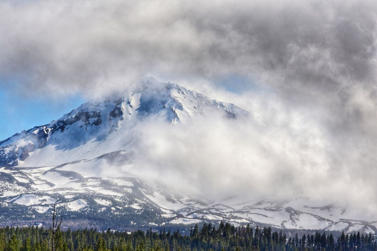
What was posted.
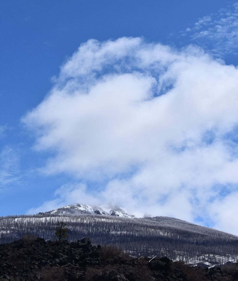
Brightened comparison
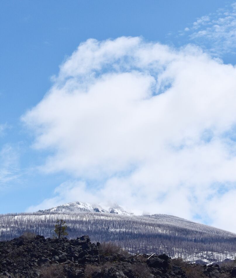
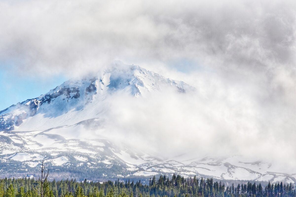
What was posted
Brightened comparison
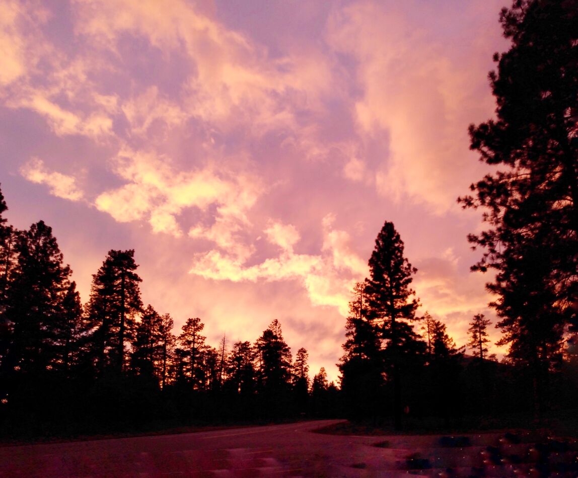
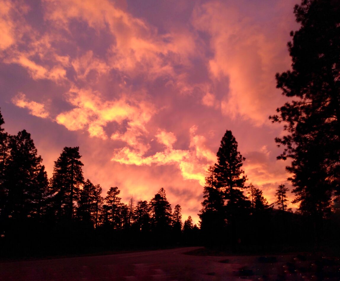
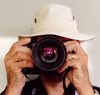
What was posted
Brightened comparison
Jun 21, 2022 21:21:16 #

dustie wrote:
Because I'm very rarely ever near or at a desktop ... (show quote)
On my calibrated and profiled 4K monitor, your "as posted" (not brightened) images look best. The brightened images are pretty awful.
I'm sure your friend's monitor was not properly calibrated and profiled. Most tablets are at least close... especially iPads.
Monitor calibration is the process of LINEARIZING the output of red, green, and blue channels so that they add up to perfect neutral gray when the brightness levels are equal in all channels of your file. In other words, 40, 40, 40 is dark neutral gray, 127, 127, 127 is middle neutral gray, and 200, 200, 200 is light neutral gray. In other words, the OUTPUT of the monitor matches the file.
A monitor PROFILE is a little lookup table that matches the characteristics of your specific monitor specimen to the standards used in your computer operating system. It is used to match the color of your files to the monitor you use so the color you see on the monitor is what will print on a printer or display on any other properly calibrated and profiled device.
I wouldn't try to adjust your images arbitrarily as you did. Brightness and color adjustments done without reference to a standard will not result in files that print well, and they won't look normal on the vast majority of monitors, either.
Jun 21, 2022 21:36:45 #
burkphoto wrote:
On my calibrated and profiled 4K monitor, your &qu... (show quote)
Thank you very much!
I really like your statement, "...they won't look normal...". They didn't.
(Maybe they weren't offensive to dimming, aging eyesight, though, because the pics were appreciated.)
Jun 21, 2022 22:21:10 #

I agree with Bill's comment above, but I wish you'd stored the attachments so we could confirm your colorspace setting too. There may be a few issues involved. We should investigate the full question, not just the first possible solution.
Jun 21, 2022 22:35:58 #
CHG_CANON wrote:
I agree with Bill's comment above, but I wish you'd stored the attachments so we could confirm your colorspace setting too. There may be a few issues involved. We should investigate the full question, not just the first possible solution.
The bulk of the editing is done in Snapseed, with some minor global adjustments in Google Photos editor sometimes, since I'm basically just mobile device equipped. Will that make any difference?
I'm unaware of colorspace settings in Snapseed, but am not particularly knowledgeable nor advanced far in any of this.
I know there is a tool in there for curves adjustment, but that is not what you are addressing, is it?
Jun 21, 2022 22:44:51 #
dustie wrote:
All the editing is done in Snapseed since I'm basically just mobile device equipped. Will that make any difference?
I'm unaware of colorspace settings in Snapseed, but am not particularly knowledgeable nor advanced far in any of this.
I know there is a tool in there for curves adjustment, but that is not what you are addressing, is it?
I'm unaware of colorspace settings in Snapseed, but am not particularly knowledgeable nor advanced far in any of this.
I know there is a tool in there for curves adjustment, but that is not what you are addressing, is it?
Cameras have a colorspace for JPEGs. Digital editors have colorspaces for both RAW and JPEG (and other image formats). If you have your camera set to sRGB, than colorspace is likely not a potential issue. But, oddly colored images and / or brightness issues are many times colorspace related.
Jun 21, 2022 23:02:25 #
CHG_CANON wrote:
Cameras have a colorspace for JPEGs. Digital editors have colorspaces for both RAW and JPEG (and other image formats). If you have your camera set to sRGB, than colorspace is likely not a potential issue. But, oddly colored images and / or brightness issues are many times colorspace related.
The camera colorspace is set to sRGB.
Any photos done by phone, I don't know what the default there is. I don't have a high-end phone to set something like that (or even know if higher class phones can offer that).
I'm still just in the baby steps of JPEG's, so far. I've tried a very few shots in RAW, but nothing I would show anyone. I've got to get some practice and experience with that first.
Have only had a "real camera" for a month or less, and still wobbling along on training wheels with it as I get opportunity here and there.
(Thank you for reaching out with some help. I'll have to continue discussion later, sometime. Am due at a worksite before too long and I hate to ever be the one who doesn't show before start time.)
Jun 22, 2022 00:38:06 #
Camera phones mostly save JPEGs in sRGB color space, but some will record HEIC files in P3 color space. HEIC is a much newer High Efficiency Image Codec that Apple hopes will replace JPEG (it might take 25 years to do that!).
sRGB is the universal, easiest to work with standard color space. It's not the best for everything, but it is the best for most people to use most of the time.
I have Snap Seed on my iPhone. It is pretty basic and unlikely to be a problem unless you make something look really wonky on your tablet.
sRGB is the universal, easiest to work with standard color space. It's not the best for everything, but it is the best for most people to use most of the time.
I have Snap Seed on my iPhone. It is pretty basic and unlikely to be a problem unless you make something look really wonky on your tablet.
Jun 22, 2022 12:02:55 #
Perhaps check the settings on your tablet. On my iPad there is a setting tab “display & brightness.” Depending on where you set the slider, you could be getting a different amount of brightness when you view your photos on the tablet. Might want to check.
Jun 22, 2022 15:52:25 #
burkphoto wrote:
Camera phones mostly save JPEGs in sRGB color spac... (show quote)
Both phone and tablet I have are Android, so, probably not influenced by the Apple venture?
When I first explored the use of processing images, some of the early tries at processing, I did have too much of sharpening or contrast, maybe saturation adjustments, and ended up with crunchy or lightly barbecued looks, kind of wonky....beginner shortcomings, as I had to learn it's pretty easy to get carried away with increasing / decreasing effects.
There is no way I'm advanced to a point of getting it perfect, now, but the big difference between the look shown on the two different screens had my attention right away. It was so consistently obvious in every pic, not some better and some worse and some ok. It's reassuring to know what looks acceptable on the tablet screen doesn't look way off on your properly adjusted equipment.
Do you happen to know right off, if there is color space selection in Snapseed, and where to find it?
I believe I've explored around in its functions and features pretty fully, and don't recall coming across it. I'll check in some of the youtube offerings, too. Some of them seem to be more complete on giving info than the Snapseed tutorials and info in textual articles.
Thank you again.
Jun 22, 2022 15:57:05 #
JimRPhoto wrote:
Perhaps check the settings on your tablet. On my iPad there is a setting tab “display & brightness.” Depending on where you set the slider, you could be getting a different amount of brightness when you view your photos on the tablet. Might want to check.
Thanks for commenting on that.
Yes, there is brightness adjustment in the Android tablet I use, as well. It is turned up and the pics look ok on its screen, just no where near the overly brightened look on that older monitor screen.
If you want to reply, then register here. Registration is free and your account is created instantly, so you can post right away.