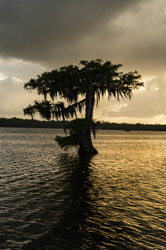
sunset on the lake
May 8, 2022 21:20:59 #
PoppieJ
Loc: North Georgia
I haven't seen anything in this section lately so I thought that I would share this for comment. I have shown it to several people with mixed comments. Some say good, some say not so much. would be interested to see what you have to say and any suggestions for improvement. I am using a Canon G7X, not quite a point and shoot but almost. Thanks
May 9, 2022 06:48:39 #

I would be interested in seeing a B&W version.
Odd color, storm cloud?
More detail in the cyprus might make it more interesting.
Odd color, storm cloud?
More detail in the cyprus might make it more interesting.
May 9, 2022 09:44:04 #

PoppieJ wrote:
. I haven't seen anything in this section lately so I thought that I would share this for comment. I have shown it to several people with mixed comments. Some say good, some say not so much. would be interested to see what you have to say and any suggestions for improvement. I am using a Canon G7X, not quite a point and shoot but almost. Thanks
Compositionally I would crop to move the tree from dead center. Did your original shot capture the light source (the Sun)? My eye is drawn directly off the page to the right. If available, I naturally want to see more. Otherwise, it’s a photo of a tree without much detail. My first question I ask myself is, “What is the subject of the photo and does it capture the most attention?”
May 9, 2022 10:01:27 #

I love the shape of the tree. I also really like the absence of distracting elements. The first thing I'd do if it were mine is straighten the horizon. I'd try bringing up the shadows a bit to offer a few more details in the tree. If that weren't possible, I'd look at making it a full silhouette. The curious part is that the two sides of the image have totally different tones. Is that simply an anomaly of the light?
May 9, 2022 11:03:34 #

The tree as a silhouette with a plain background would have worked well, but the background vegetation on the distant shoreline breaks up the image too much and obscures some of the outline of the tree. The sky is good and the water is good but as has been noted, the inconsistent colouring looks odd.
May 9, 2022 11:47:24 #

May I suggest straightening the horizon before you go to any other changes. Then move the tree to the left and open the shadows on the tree itself.
Dennis
Dennis
May 9, 2022 20:43:31 #
PoppieJ
Loc: North Georgia
PoppieJ wrote:
I haven't seen anything in this section lately so I thought that I would share this for comment. I have shown it to several people with mixed comments. Some say good, some say not so much. would be interested to see what you have to say and any suggestions for improvement. I am using a Canon G7X, not quite a point and shoot but almost. Thanks
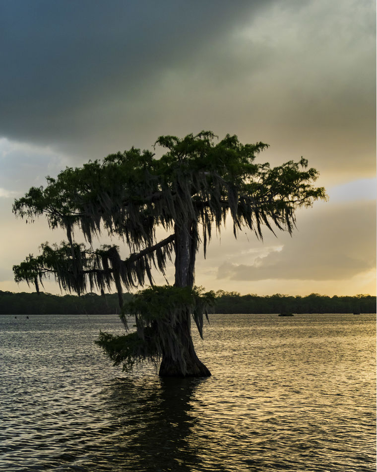
thanks for the comments. I have reprocessed the picture. I straightened the horizon, I cropped to move the tree more to the bottom and left of the frame. There is not much that I can do with the color cast as that is what was there, I did however use the sponge tool to raise the saturation level on the lake and in the sky and I also dodged the tree some to make it less of a pure silhoutte. Let me know what you think
May 9, 2022 22:43:44 #
The tones in the tree are good and the straightening really helps. I would have probably moved the tree to the right, but I understand that would have taken sunlit water, which was the point of the image.
May 10, 2022 01:15:42 #
Since this is your chosen direction you should try to differentiate between the tree and the distant vegetation. Try making that part of the tree a bit brighter and the distant vegetation a bit darker.
May 10, 2022 11:52:49 #
I like what you have done with the photo. Much better in my opinion. Thank you for working with us. A question for you if I may. How do you like the photo now? Do you like it better now or do you like your original better. After all it is your photograph and only your opinion counts for you to be happy.
Dennis
Dennis
May 10, 2022 20:14:34 #
PoppieJ
Loc: North Georgia
dennis2146 wrote:
I like what you have done with the photo. Much better in my opinion. Thank you for working with us. A question for you if I may. How do you like the photo now? Do you like it better now or do you like your original better. After all it is your photograph and only your opinion counts for you to be happy.
Dennis
Dennis
I think better than the first effort. I am liking the comment above about darkening the tree line on the distant shore to seperate it from the main tree subject
May 10, 2022 21:40:45 #
PoppieJ
Loc: North Georgia
PoppieJ wrote:
I think better than the first effort. I am liking the comment above about darkening the tree line on the distant shore to seperate it from the main tree subject
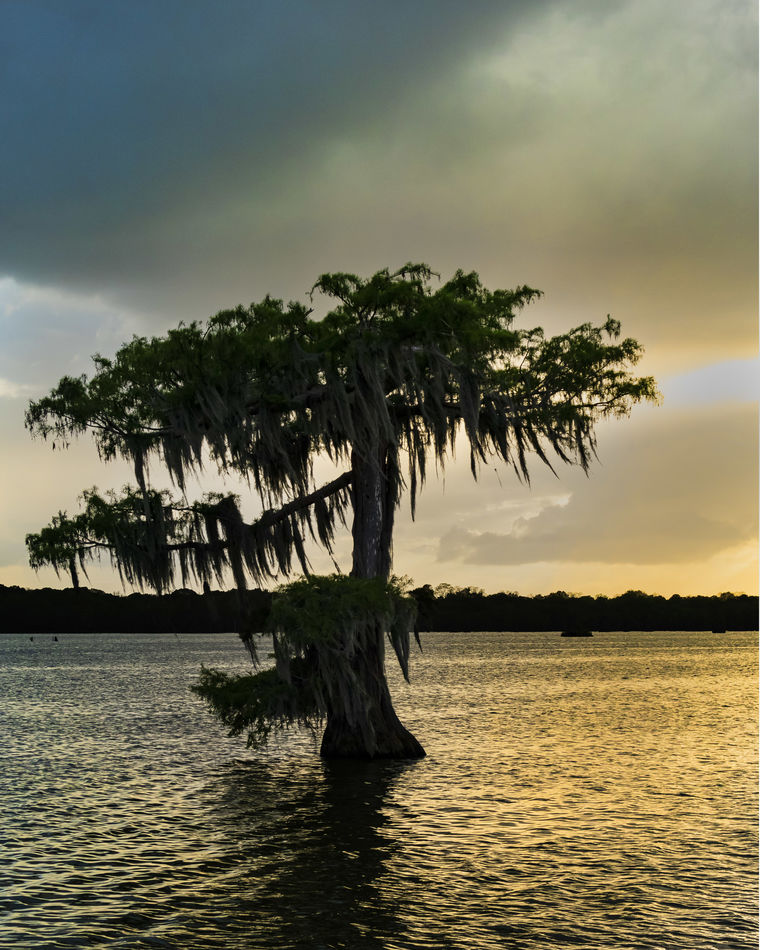
here is my final copy hope that you like it
May 11, 2022 11:01:09 #

May 15, 2022 12:22:48 #

AzPicLady wrote:
I love the shape of the tree. I also really like the absence of distracting elements. The first thing I'd do if it were mine is straighten the horizon. I'd try bringing up the shadows a bit to offer a few more details in the tree. If that weren't possible, I'd look at making it a full silhouette. The curious part is that the two sides of the image have totally different tones. Is that simply an anomaly of the light?
I found the two sides being different colors to be the most interesting part of the photo. As someone intimated above, the tree doesn't hold much interest because of the lack of detail. I like the golden color on the right and how it contrasts with the steel gray on the left. I agree that showing the light source if possible might add some interest.
edit - I like the edits you made. Bringing out some green around the top of the tree was a nice addition to your color palette, which was limited here. It's amazing how a simple edit like straightening the horizon can change a photo. Good job. It is a much more interesting shot now, with the tree off center and the beautiful light.
May 20, 2022 01:08:35 #
dennis2146 wrote:
May I suggest straightening the horizon before you go to any other changes. Then move the tree to the left and open the shadows on the tree itself.
Dennis
Dennis
If the tree itself were more symmetrical I would keep it centered. But its not.
This may break the rules but it saves me a lot of typing:
If you want to reply, then register here. Registration is free and your account is created instantly, so you can post right away.