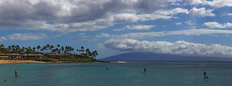
Napili Bay, Maui Hawaii
Sep 16, 2021 11:28:08 #

This panorama is made up of nine 18MP files, this pushed the limits of my software. I used Canon’s DPP4 to use Adobe RGB and add Fineness to the sharpening, then everything else in PS CS3. I was amazed how well PS can handle almost 4GB memory processing. I usually finish with RawTherapee for dehaze and vibrance but it wouldn’t load the 3GB TIFF file on my PC. In this case I used the soft light and saturation adjustments in PS.
Full resolution un-cropped image link: https://www.reddit.com/r/Outdoors/comments/pp83zx/napili_bay_maui_hawaii/
Full resolution un-cropped image link: https://www.reddit.com/r/Outdoors/comments/pp83zx/napili_bay_maui_hawaii/
Sep 16, 2021 11:55:40 #

The results are both pleasant and engaging - just what we're looking for in our shots.
Sep 16, 2021 17:53:44 #

Sep 16, 2021 19:30:19 #
R.G. wrote:
The results are both pleasant and engaging - just what we're looking for in our shots.
Thanks, R.G, I took a more refined approach to my editing this time.

Sep 16, 2021 19:32:21 #
UTMike wrote:
Beautiful result, Craig!
Thanks so much, Mike! The colors are always better in Hawaii 😎
Sep 17, 2021 08:12:22 #

Sep 17, 2021 10:29:18 #

Sep 17, 2021 14:03:08 #
Sep 18, 2021 14:23:24 #
Craigdca wrote:
This panorama is made up of nine 18MP files, this ... (show quote)
I like that there are paddleboarders and swimmers in the water. The clouds really make this shot. A seamless pano. Good job.
Erich
Sep 18, 2021 14:39:21 #
NJFrank wrote:
Very pleasant results. Makes you want to be there.
Hi Frank, thanks for your feedback although I meant to say so earlier. (I probably missed the Send button.)
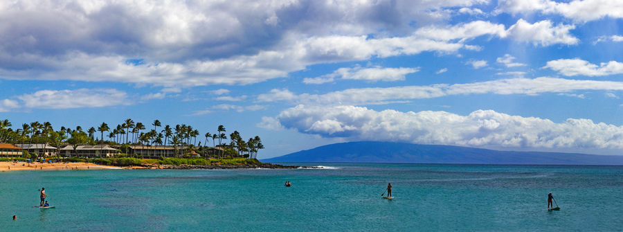
I had posted this in the Pano section and the crowd there prefers brighter and more colorful. I produced a version to try it out, but would like this group’s opinion as well.
Here’s that updated version for consideration.
Sep 18, 2021 14:45:28 #
ebrunner wrote:
I like that there are paddleboarders and swimmers in the water. The clouds really make this shot. A seamless pano. Good job.
Erich
Erich
Thanks, Erich, I was glad they were there also. Initially I was planning to remove them but they convey a great mood.
Check out the updated brighter version I just added. I’d like to to know your reaction - be honest as always, of course.
Sep 18, 2021 14:53:06 #
Craigdca wrote:
Hi Frank, thanks for your feedback although I meant to say so earlier. (I probably missed the Send button.)
I had posted this in the Pano section and the crowd there prefers brighter and more colorful. I produced a version to try it out, but would like this group’s opinion as well.
Here’s that updated version for consideration.
I had posted this in the Pano section and the crowd there prefers brighter and more colorful. I produced a version to try it out, but would like this group’s opinion as well.
Here’s that updated version for consideration.
As much as I enjoyed the orginal, this is just a tad brighter and the swimmer and boarder show up better.
Sep 18, 2021 15:02:18 #
Craigdca wrote:
Thanks, Erich, I was glad they were there also. Initially I was planning to remove them but they convey a great mood.
Check out the updated brighter version I just added. I’d like to to know your reaction - be honest as always, of course.
Check out the updated brighter version I just added. I’d like to to know your reaction - be honest as always, of course.
As thumbnails, the brighter version is the clear winner. Once you look at them blown up in download, however, I find that I like them both equally. The original is moodier and less "post card" than the brighter version. I would keep them both.
Erich
Sep 18, 2021 15:27:55 #
NJFrank wrote:
As much as I enjoyed the orginal, this is just a tad brighter and the swimmer and boarder show up better.
There is definitely more pop in the brighter version. I was just glad I didn’t blow out the bright clouds.
Sep 18, 2021 15:30:34 #
ebrunner wrote:
As thumbnails, the brighter version is the clear winner. Once you look at them blown up in download, however, I find that I like them both equally. The original is moodier and less "post card" than the brighter version. I would keep them both.
Erich
Erich
That’s how I feel about the two versions, too. The factor I can’t control is everyone’s viewing display brightness and settings, such as vivid, cinema or standard. If I were to print it I’d aim for a happy medium.
If you want to reply, then register here. Registration is free and your account is created instantly, so you can post right away.