Two different views
Sep 13, 2021 19:35:27 #

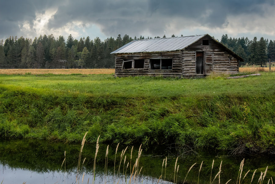
My experiment today was to take 2 images, of the same subject, at the same time of day, from slightly different angles and to see how unlike each other I could make them and still preserve the integrity of the image. I did replace the sky in each, as the lighting was pretty monochrome. The skies are images I have taken personally, so consider each image a composite if you need to! 
Which is your preference, and, more importantly what determined your choice? And if you didn't like either of them, please don't tell me...
Tools: Sky swap in PS, Precision Contrast in Topaz Studio 2, black & white sliders, Curves for a bit of balance, various filters for details and touchup.
Thanks for stopping by!
Sep 13, 2021 20:25:05 #

Sep 13, 2021 21:06:22 #

#2 for me too. Good framing in the foreground of the cabin. The sky is good too, it matches the over lighting, i.e. no shadows anywhere.
Sep 13, 2021 21:15:46 #
Cany143
Loc: SE Utah
Well.... if I can't say I think they both sucked, then what's the point of living??? And who are you to deny me my 1st Ammemment Rites? Hitler or somebody?
That said, I believe the first version is the better of the two. To use a cliche, we know immediately what the subject is --its clearly the log castle-- and we're visually led into it by an effective progression of a distinct foreground, a middle ground (where the subject rightfully resides), and a background that further establishes the subject's place in the cosmos (or in Montana, whichever is closer). In other words, its an effective photograph, as photographs go.
That's not to say the second 'take' is horrible; it isn't. But in general, it really isn't especially good. The so-called 'framing' afforded by the trees is basically inane, and makes neither a statement nor does it establish a 'mood' (I know you like moods, so I hoped I might get props --or non-threatening hate mail--for mentioning it) other than one that cries 'I was confused!'
The sky replacements are nice, though. They're consistent lighting-wise, and consequently they aren't the usual offensive and/or inappropriate ones we've more often seen. Regardless, you'da been better off waiting for a better, REAL sky to happen, and going back to shoot the scene properly.
(We still friends, Tommy?)
Sep 14, 2021 08:01:35 #

It all depends on what your intention was. If you were wanting to emphasize the cabin, the first does a better job. On the contrary, if the scene was the emphasis, then the second is the winner.
Just for the aesthetics of a pleasing photo, I would choose the first one. But, as I said earlier, it all depends on your intention.
Just for the aesthetics of a pleasing photo, I would choose the first one. But, as I said earlier, it all depends on your intention.
Sep 14, 2021 09:47:15 #

Of the two, I prefer the first. I like the inclusion of water and the grasses in the foreground. I really like the composition of the second shot which is more about the overall scene.
Sep 14, 2021 10:11:00 #
I much prefer the 1st image. Like Cwilson I like the water in the foreground. I also feel the colors are more vibrant; the 2nd image looks kind of washed out in comparison. But mostly I like the way the cabin stands alone as the hero in the 1st image without makeup or framing. Even though the age and some neglect is apparent, you can still imagine bringing it back to life and making it livable again.
Sep 14, 2021 10:55:27 #

I like #1. If the cabin is the subject, #2 has too many distractions. Also, the colors in #1 are more appealing.
Sep 14, 2021 11:33:17 #

Both are nice images and good crops, but I like #2 better with the trees framing the cabin. For me it gives a greater sense of the sparse surroundings and draws the viewer's eye into the pictures and then to the cabin which is the subject of the photo.
Sep 14, 2021 12:36:46 #
Thanks for the input, one and all! It seems opinion is relatively evenly matched between the two. I personally like #1 for a number of reasons, but #2 has dimensions lacking in #1 - which is why I tried to get something different between the 2!
As far as Cany's suggestions go, I agree - a real sky under better conditions would be preferable. However, the 9/11 Memorial where these images were taken was on private property, so the chances of going back are slight.
I like the MOOD the framing creates in #2, but I can see where it might be viewed as superfluous or distracting. I don't agree, but I can see how that opinion might be generated.
I appreciate all the input - it helps me become a better photographer, and that's what it's all about!
PS - (still friends, Cany)
Sep 14, 2021 12:44:51 #
I like the first one but not the second. I find the foreground trees distracting. I like the water in the foreground but I am conflicted about the grasses. The create a conflict in what to focus on, the grasses or the cabin. This is good in that it keeps my eye moving around the scene but detracts some from the cabin. The lines in the grass both mimic the lines in the roof and give counterpoint to the logs that make up the walls of the cabin.
Sep 14, 2021 14:46:58 #

I like the first one best. The cabin is sharp, the subject is obvious, and the sky supports the lighting. The framing in the 2nd one throws me off a bit as it doesn't appear as left and right sides are equally out of focus, or equally sharp. Interesting exercise, we all learn together. Bev
Sep 14, 2021 17:21:07 #

Picdude wrote:
I much prefer the 1st image. Like Cwilson I like the water in the foreground. I also feel the colors are more vibrant; the 2nd image looks kind of washed out in comparison. But mostly I like the way the cabin stands alone as the hero in the 1st image without makeup or framing. Even though the age and some neglect is apparent, you can still imagine bringing it back to life and making it livable again.
Ditto re #1 and I don't like the sky in #2 -- # 1 is much better all around.
If you want to reply, then register here. Registration is free and your account is created instantly, so you can post right away.