There's More To It Than Just White Balance
Aug 21, 2021 12:17:09 #

This article contains some advanced considerations for capturing and portraying color scenes, subjects, etc. As such, it may be of interest to a select few. Additionally, if you are converting to black and white, having accurate colors in the initial photograph is essential to rendering the appropriate shades of gray in the conversion. If you aren’t one to desire doing a bit of additional processing, it’s best to skip this.
What is Color Cast (Hue Contamination)?
Whether you’re aware of the correct terminology or not, you have likely experienced hue contamination happening in your photographs already. Put simply, hue contamination is when one color is affected by the presence of another color in close proximity or filtered through a colored environment. A color cast is an overall wash of color caused by the light in which a photo was shot.
Hue contamination is a, sometimes, subtle but, noticeable color tint to an image. This is seen as an overall cast. Casts occur when white balance is inaccurate or light is contaminated with a color. This article is focused on the latter. An example is light bouncing from a colored surface or filtered through a colored environment. Though not really a topic for this article, if the color cast is due to white balance inaccuracy, it's an easy fix in post-processing software with white balance/tint sliders. If the cast came from light reflected off a colored surface or filtered through a colored environment, it can require a more in-depth fix involving selective color adjustments.
For example, if you’re photographing two subjects side by side, one of them is white and the other one red, the white subject will likely take on a pinkish tone due to the fact that it’s receiving bounced light from the red subject close by.
This hue contamination happens around us all day every day and we are so accustomed to it that most of us never even notice it. So why bring it up? I bring it up because it’s contamination when it happens in our shots. It's especially disconcerting when we aren’t aware of it.
We may even ignore it and not even try to correct it. Regardless, hue contamination is there and we should take note and address it. What if we are truly concerned about portraying the colors as we visually observed them.
Let's consider doing a color photograph in the woods. The surroundings are green, the leaves in the trees, some bushes and maybe there’s even green grass on the floor around you. The daylight comes through the trees, is reflected off all the foliage, etc. The entire scene is enveloped by this green influence. The tree bark, usually a brown color is affected by this environment of green. Not quite what your eyes revealed but definitely caught by the camera.
What About Just Using White Balance?
White balance is based on the Kelvin scale that specifically deals with balancing a certain range of colors based on temperature. So no matter how hard you try, a lot of these hue contamination shots simply can’t be fixed with white balance alone. Black and white photographers have a slight advantage here but for a more accurate conversion, hue contamination needs to be considered prior to that conversion. Remember, the hot-or-cold Kelvin temperature scale starts at absolute freezing 0K (-273.15ºC) while the hue-based Kelvin scale relating to color temperature starts with black as the zero point.
Hue contamination is often a localized effect. Let’s revisit that white subject that looks a little pink now because it was next to a red one. Applying color balance to correct the white subject without affecting the whole image is near impossible. This makes hue contamination such a troublesome problem and one that is oftentimes overlooked.
We have mentioned hue contamination. So what is hue?
Hues are made up of the three primary colors (red, blue, and yellow) and the three secondary colors (orange, green, and violet) that appear in the color wheel or color circle. When you refer to hue, you are referring to its pure color. That is the visible spectrum of basic colors that can be seen in a rainbow. When hues are combined with other color qualities, such as saturation, chroma, or intensity, then the resulting combination is known as the color’s chromaticity.
Is There a Science Behind Hue?
Each pure hue correlates to a different dominant wavelength of light that is then received and processed by the human eye. In other words, different hues correspond with a different wavelength of white light that the human eye/brain interprets as pure color.
What Is the Difference Between Hue and Color?
It’s easy to confuse the word hue with the word color, and they are often (incorrectly) used interchangeably. Color is the broad term that describes every tint, tone, hue, or shade that the human eye can see, including white, black, and gray.
The definition of hue, on the other hand, refers only to the pure spectrum color names found on the color wheel: red, orange, yellow, blue, green, and violet.
Overall, every color has a dominant hue. For instance, the color “navy” has a blue hue, and according to color theory, “magenta” has a dominant hue of violet.
In digital photography, colored light can also be measured as color temperature. Every light source has its own hue. Colors from light sources that move towards blue are considered “cooler” temperature-wise, whereas colors closer to red are considered “warmer.”
What Are Tints, Tones, and Shades?
Color is not constant, and hues can be mixed, manipulated, and changed to create colors that appear lighter or darker:
Tints are created by adding white to any hue found on the color wheel, which desaturates and lightens the hue. You can also combine hues together and add white to create a tint of that specific color blend. When you see colors that appear as pale hues, the effect has likely been obtained through tinting.
Tones are created by adding grey (or a mixture of black and white) to a hue. Depending on the amount of grey added, the tone may be darker or lighter than the hue it was added to. Shades are created by adding black to a hue. The amount of black added will affect the darkness of the shade, and will often make the original color appear “dark-hued.” You can use different shades of a color to achieve gradation, which refers to the technique of gradually transitioning from one hue or shade of a color to another.
What is Radiosity?
Radiosity was taught years ago in the film days. Currently, It's hardly mentioned in association with photography anymore. If it is used currently it is more related to how light and color act upon one another in computer-generated worlds. It has made quite a bit of advancement in 3D modeling. It's how light affects one surface when in proximity to another. This gives those making 3D models textures and added depths of realism to the models they create.
However, we photographers find it the bane of creating realistically rendered photographs, especially in portrait work. I suggest, for those not faint of heart, look up Radiosity in Computer Graphics page on Wikipedia. ( https://en.wikipedia.org/wiki/Radiosity_(computer_graphics) ). I’ll warn you now. There’s math involved.
Regardless of what you want to call it, or if you want to ignore it, hue contamination is a very real problem for us photographers, That is if we want to depict objects like people, cars, clothing, and so on in the best possible way.
No client, or maybe even yourself, wants to photograph a white subject and produce a photograph that has a slight pinkish cast to it.
Color ( Hue) Contamination in Action
In the attached photographs, used with the gracious permission of those who took them, I've included the original and next to it a “gross” hue correction, to illustrate the points of this article. I've also included the selection of the predominant hue of the scene.
Taking a Closer Look
At first, you may not think it’s a big deal. Our eyes and brain are so accustomed to normalizing color variance when it’s in proximity to similar tones, but as the images are adjusted you should be able to see just how dramatic the effect is. Almost every scene is affected by a blueish hue, due to the sky. Landscapes can be affected by dirt/sand (brown), foliage (green), etc.
How Can This Knowledge Be Put to Practice?
You may look at the example images and think that it’s just a byproduct of taking photos. There’s no use worrying about it. Although there are times when this can’t be avoided, hue contamination is very real and it is something we can adjust, now that we know it's there.
As shown in the attached images, hue contamination is always there in color photographs. However, we can reduce the effect through judicious adjustment.
Can I Use This Knowledge to My Advantage?
The good news is that you can use this hue contamination effect to your advantage if you’re clever. Remember that this radiosity isn’t exclusive to color — you can use blacks and grays to add dimension to your subjects. Being aware of it allows us to adjust for it in processing. It may be that in certain situations the colors are outside the white balance spectrum and this presents more work to do in processing.
So, in conclusion, you are now aware of hue contamination. How you wish to deal with it is up to each of us.
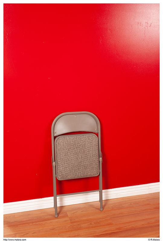
One Can Imagine What Photographing in This Room Would be Like
Deer Photo
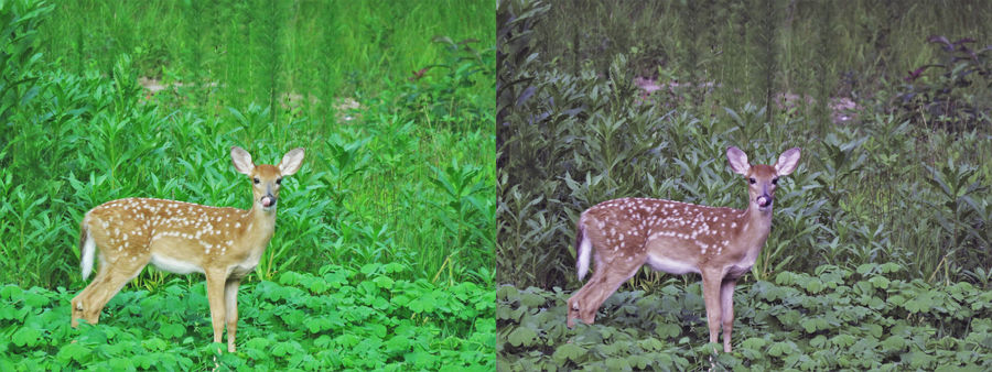
(Download)
Contaminating Hue of the Deer Photo

Cactus Blossom
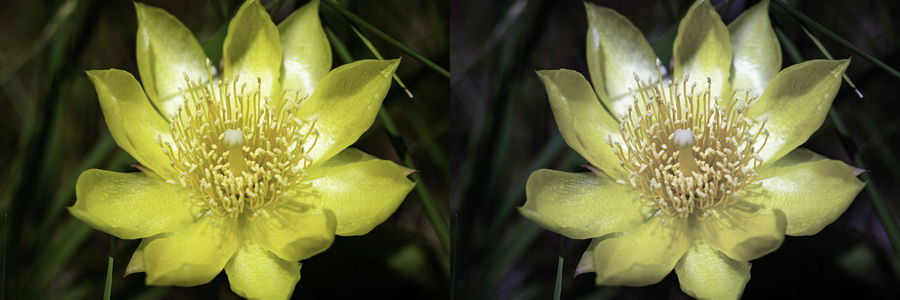
(Download)
Contaminating Hue of the Cactus Blossom

Falls Photo
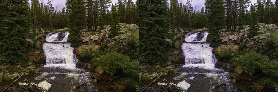
(Download)
Contaminating Hue of the Falls Photo

Dahlia Photo
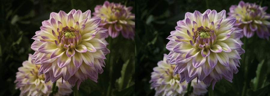
(Download)

Aug 21, 2021 12:40:40 #

Wow...I need to say more; Thanks Bob, for your thorough explanation of a common problem. The Hue/Tint/Tone/Shade differentiations alone are worth the price of admission. One of the reasons I'll convert to B&W, and this may be unconscious, is casting. I think the raising of awareness is *very* helpful.
Aug 21, 2021 12:41:40 #
Aug 21, 2021 13:26:43 #

Aug 21, 2021 13:59:52 #
John, for the vast majority of my photographic adventures, I used black and white film. Hardly ever paid attention to color. Then, when digital arrived and captured natively in color, I continued with my black and white mindset. Over time, some things began to warrant attention. Sure, WB was initially one of them. But still, there was something affecting the colors I was seeing. That's when I discovered hue contamination. The next adventure was how to deal with it. Over time, I found methods that worked. In some cases, the change was quite apparent, in some, it's very subtle but, being the "perfectionist", I worked on every one of my photos. It's now a standard step in my processing.
--Bob
--Bob
jaymatt wrote:
Interesting and food for thought!
Aug 21, 2021 15:03:13 #


Aug 21, 2021 17:20:37 #

Bob, really appreciated your tutorial. We are constantly talking color in our photo study group and for as long as I've been photographing, I'm just in the last 4 or 5 years understanding color, or trying hard to. Your article made a lot of sense to me and appreciated your examples. You made it easy to see the contamination. Did your contamination color come from blurring the original color image on a new layer, inverting it, then blending the new blurred layer with the original layer or is there a better way? I'm using ACR or PS to help with my white balance as oppose to trying to customize white balance in-camera.
Since different conversion filters use slightly different algorithms, I'm thinking that might contributed to contamination also. I'm a tried and true Photoshop user (not lightroom) and use ACR, but with On1, Topaz, Luminar, etc., all coming out with RAW conversion filters, I couldn't help but wonder. But then if we handle it in post, it wouldn't matter.
Again, thanks for your information. Bev
Aug 21, 2021 17:32:43 #
Bev, the initial corrections were a lot more complicated than what I use now. I started by writing a program that would find the average of each R, G, and B value for each pixel. The provided an arithmetic mean of the values. Then, it would see how much each pixel needed to be adjusted to achieve a middle gray point.
It's a lot easier now, and, like yourself, I use Ps. So, to start I create a duplicate of the image and then work with that copy initially. I apply an average blur to that copied image. Then, bring the original image to the front and work with that. The copied image needs to have a portion of it visible behind the working image. To the original, I add a curves adjustment layer. I select the Gray eyedropper, the middle of the three. I then click anywhere in the copied image. That will apply the overall correction, as shown in these examples.
If you need some additional information, please PM me and we can work through it.
--Bob
NikonGal wrote:
Bob, really appreciated your tutorial. We are cons... (show quote)
Aug 21, 2021 17:39:24 #
I will need to work my way through your method to understand the curves adjustment layer implications. I will PM if additional questions. Thanks for your reply. Bev
Aug 22, 2021 07:03:17 #

Damn you rmalarz, you have ruined my day with your forever discussion... you opened Pandora's box and the colored flies flew. Those flies by definition let loose a process that generates many complicated problems as the result of unwise interference in something that was once simple and accepted; in this case, simple Kodak click the button photography let us do the hard work made universal by good ol' George Eastman.
Life is a forever learning process and a realization that what we see every day is not really what we see if we analyze the images transmitted to our AI brains which were hardwired and learned algorithms process. Made more difficult because we fool ourselves.
In your discussion, rmalarz , the word Radiosity stood out as new in the context of photography. Certainly, it applies to our monitors and our TV images... and to flashlights. They all emit radiation thus conforming to "the total radiation (emitted plus reflected) leaving a surface, certainly including the reflected radiation and the emitted radiation. Also, a rendering algorithm which gives a realistic rendering of shadows and diffuse light. The algorithm can be by computer or by our minds.
Your reference was off by a click and is better given with the math as:
https://en.wikipedia.org/wiki/Radiosity_(computer_graphics)
With that reference, we need to hold onto Alice's hand really tight as we jump down the rabbit hole!! The Mad Hatter who was exposed to Mercury doing daguerreotypes may explain.
https://www.historycolorado.org/story/preservation/2014/10/02/mad-hatters-and-anatomy-daguerreotype
In photography, obviously, or image viewing is two opposing types of Radiosity light emitted from the screen and so-called "white light" interacting with dyes and pigments on printer paper. What is observed and what is reflected. The process is color subtraction, RGB shined on a cloth that absorbs blue will appear R+G or Yellow. The energy or the B will be stored in the cloth which will eventually have so much energy it will explode [not] or get warm. Simple example:
White light=(R + G + B) so if we have an ink that absorbs Blue then (R + G + B) - B = R + G = Y ... yellow
This assumes that our white light is balanced... and we picked up the correct bulb at Walmart having the correct Kelvin temperature.
https://www.bhphotovideo.com/explora/photography/tips-and-solutions/understanding-white-balance-and-color-temperature-digital-images
https://spectrum-brand.com/blogs/news/colour-of-lighting-and-make-up-the-facts
OK, we have the bulb... the white balance... But our brains are not calibrated and we do not see color correctly and we really screw up when there is a neighboring color. The neighbor affects what we see... "Two colors, side by side, interact with one another and change our perception accordingly. The effect of this interaction is called "simultaneous contrast." Since we rarely see colors in isolation, "simultaneous contrast" affects our sense of the color that we [think we] see. For example, red and blue flowerbeds in a garden are modified where they border each other: the blue appears green and the red, orange. The real colors are not altered; only our perception of them changes."
http://www.webexhibits.org/colorart/contrast.html
Oh, OK! easy!! But complications arise in the eye/brain processing. Brains off calibration! So yes, we have a psychological problem with our adjustment of color in our photos... Again Alice may help us with this the guy behind the curtain, on loan from Ozz, is a nut doctor to adjust what we see as it affects our emotions.
https://disruptedlogic.com/2018/03/18/the-psychology-of-color-for-game-development/
Yes, careful, this is the Dr who said to Vincent van Gogh "lend me your ear" and I will explain. Vincent took him literally cut off his ear and gave it to the Dr. The glasses the Dr prescribed greatly affected Vincent's color use and perception ... Xanthopsia... the seeing of yellow... "plausible agents that might have modified the artist's color perception. Xanthopsia due to overdosage of digitalis or santonin." Photographers, be aware of what you eat drink, and who you associate with. Enough said time for a decaf coffee.
https://pubmed.ncbi.nlm.nih.gov/1794418/
Aug 22, 2021 08:41:02 #

Aug 22, 2021 09:52:12 #

dpullum wrote:
... the word Radiosity stood out as new in the context of photography. Certainly, it applies to our monitors and our TV images... and to flashlights. ...
And it does not apply to photography.
dpullum wrote:
The process is color subtraction, RGB shined on a cloth that absorbs blue will appear R+G or Yellow. The energy or the B will be stored in the cloth which will eventually have so much energy it will explode [not] or get warm. Simple example:
White light=(R + G + B) so if we have an ink that absorbs Blue then (R + G + B) - B = R + G = Y ... yellow
This assumes that our white light is balanced..
White light=(R + G + B) so if we have an ink that absorbs Blue then (R + G + B) - B = R + G = Y ... yellow
This assumes that our white light is balanced..
You are close to the mark and probably understand it better than you expressed it in your brief statement.
White balance is achieved by getting a neutral mix of red, green and blue for something that we know is supposed to be white even if the light incident on the subject is not properly balanced. For example, the white paint in Bob's first image appears to have been made white regardless of the color of the incident light, including any light reflected onto the white paint from other walls, the ceiling and floor.
In color photography there are three primary colors (red, green and blue) and three complementary colors (cyan, magenta and yellow). The complementary colors are respectively the exact opposite of the three primary colors.
Anyone who has used a WB probe in a color editor should be aware that white balance uses two trade-offs - yellow vs blue (temperature) and green vs magenta (tint). We only need two because the third (red vs cyan) is controlled by the other two trade-offs. In other words, there are only two degrees of freedom in white balance, not three.
Things start getting difficult when a scene in not overwhelmingly bathed in light of the same color like we can manage in the studio.
Out of doors in broad daylight there may be one white balance for direct sunlight and a different color of light coming from the blue sky (about 3 or more stops less intense). This can result in blueish shadows but that might look normal. We might be more bothered by the green tint that we get from sunlight being filtered through a canopy of leaves.
It's easy to deal with all of this simply by leaving the camera's WB set to Daylight. WB does not alter the raw file. It's easy to correct everything during the raw conversion on your computer.
Aug 22, 2021 09:56:48 #

Bob, this is very well written, easy to understand and to the point. Well done!
Aug 22, 2021 10:26:52 #

Aug 22, 2021 10:45:25 #
dpullum, thanks for participating. I'm looking forward to reading through the links you provided. As you pointed out, at first it seemed simple, set WB in the camera, even if it is Auto WB. Let the camera do the work. Unfortunately, RAW isn't affected by that, except for some limited settings. So, as pointed out in the article, there are other "sinister" forces involved, those being the environment in which one is photographing. As you, and the article pointed out, we continually adjust what we see to make what we observe "correct". The camera doesn't. Thus, if we are persnickety, the need to make photographic adjustments to present what is captured in a manner that our mind would see it.
--Bob
--Bob
dpullum wrote:
Damn you rmalarz, you have ruined my day with your... (show quote)
If you want to reply, then register here. Registration is free and your account is created instantly, so you can post right away.