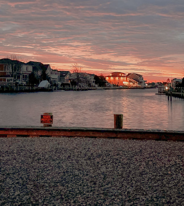
A Sunset By The Water
May 18, 2021 11:46:25 #
CassidyMariya
Loc: New Jersey
What do you think of this image? Is there anything I can do to make it better? Please let me know thank you!
May 18, 2021 12:28:16 #

This is a lovely image. However, if it were mine, I would crop off the bottom. I would get rid of the rocks and rail. If you are comfortable cloning, you could crop just above the rail and then get rid of the sign and post. That would leave a little more of the water. If not, you could crop just over the sign and post. I would probably add just a touch more contrast, but not much.
I just tried those changes and I liked it but it needs to be what you want it to be.
I just tried those changes and I liked it but it needs to be what you want it to be.
May 19, 2021 05:57:58 #

I would go along with Cwilson341. I also feel that the image is not level. Maybe a little lens distortion.
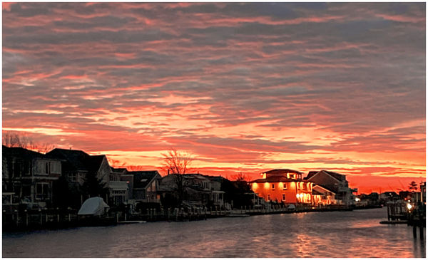
I had a quick play with it in PSPro2020. I cropped the quayside and posts and levelled it to what seemed best for me. Then used the curves tool to get a bit more beef in the sky and the hue map set at -15% to punch up the red in the sky. I don't know what other editors call these functions.
A picture says a thousand words, so I hope you don't mind my version of your image.
May 19, 2021 06:23:24 #
CassidyMariya
Loc: New Jersey
John N wrote:
I would go along with Cwilson341. I also feel tha... (show quote)
No I don’t mind at all I appreciate it actually. Thank you
May 19, 2021 07:17:08 #

Beautiful image! One thing you might consider is cropping out some of the foreground.
May 19, 2021 08:13:04 #

As mentioned by others crop the bottom to get rid of the gravel rail and signs. I like John’s idea, but perhaps not as intense.
May 19, 2021 09:55:27 #

Cwilson341 wrote:
This is a lovely image. However, if it were mine, I would crop off the bottom. I would get rid of the rocks and rail. If you are comfortable cloning, you could crop just above the rail and then get rid of the sign and post. That would leave a little more of the water. If not, you could crop just over the sign and post. I would probably add just a touch more contrast, but not much.
I just tried those changes and I liked it but it needs to be what you want it to be.
I just tried those changes and I liked it but it needs to be what you want it to be.
👍🏻👍🏻👍🏻
May 19, 2021 13:51:43 #
NJFrank wrote:
As mentioned by others crop the bottom to get rid of the gravel rail and signs. I like John’s idea, but perhaps not as intense.
Always good to have a second eye, and I'd agree - it is a bit intense, particularly right hand side just above the quayside. Might have another go later.
May 19, 2021 14:01:28 #
John N wrote:
Always good to have a second eye, and I'd agree - it is a bit intense, particularly right hand side just above the quayside. Might have another go later.
Welcome to my world. I have a tendency of going too far with the sliders.
May 19, 2021 14:30:01 #
captivecookie
Loc: Washington state
Carol nailed it on her first try. She's a genius like that. And you've produced a brilliant photograph (after the crop).
May 20, 2021 19:58:10 #
CassidyMariya wrote:
What do you think of this image? Is there anything I can do to make it better? Please let me know thank you!
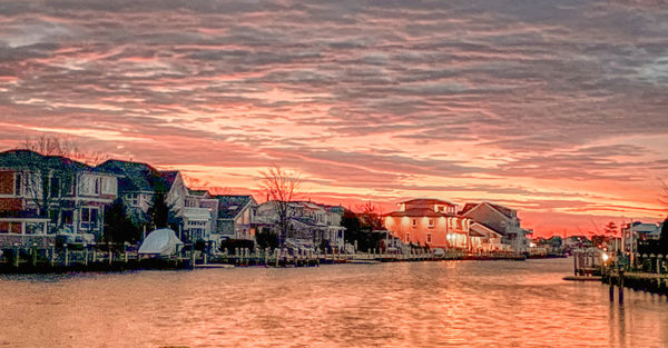
Cassidy, here is just another opinion for you. First, this is one of the best pictures you've posted so far. To improve it I think it just needs a little cropping and tweeking.
The foreground doesn't add much to your composition. As others have said, I would crop the foreground but just above the posts, but no further. Then, you see that the sky becomes the most dominant part of the image. If that's you emphasis, then no more cropping. I felt that there was too much sky, so I cropped some of it out. This had the effect of creating more of a landscape/pano than a portrait oriented image. Since the sky was still a significant part of the image, I brought out more of the reds and increased the contrast. This left a flat foreground, so I felt that increasing the reds in the homes and foreground complemented the sky. This just color graded and brightened the rest of the image to match the color cast of the sky. Then the brightly lit home on the right became too bright, so I reduced the brightness and saturation until I felt it matched the rest of the scene.
Hope this helps
Mike
May 24, 2021 15:55:28 #
CassidyMariya wrote:
What do you think of this image? Is there anything I can do to make it better? Please let me know thank you!
I think all the comments you received are spot on. I like the edits that were posted to give you a visual of what is being said. SalvageDiver hit the nail on the head. This IS probably the best photo you have posted. It has impact without being overwhelming. Keep up the good work and keep listening to the talented folks here. You are getting better every day.
If you want to reply, then register here. Registration is free and your account is created instantly, so you can post right away.