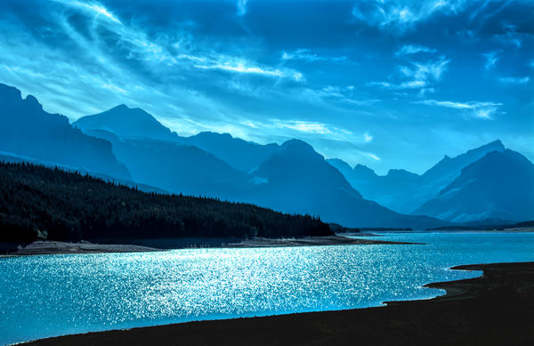
Blue day in Glacier National Park
May 5, 2021 12:42:41 #

Not sure if this is the proper forum for this image, but what the heck. Wanted to use blues and shadings to create a quiet, peaceful effect on this landscape. It was more about the composition, dark areas and the relationship of shades of blue to each other than anything else. Didn't want to go the b&w route on this one - for a change! Download is advisable... 
May 5, 2021 12:46:05 #

I think it's absolutely, breathtakingly beautifully exquisite!!
May 5, 2021 13:01:18 #

I second what Linda said. It is a very nicely composed shot and you have given it a creative interpretation. Beautiful.
May 5, 2021 13:44:25 #
tommystrat wrote:
Not sure if this is the proper forum for this image, but what the heck. Wanted to use blues and shadings to create a quiet, peaceful effect on this landscape. It was more about the composition, dark areas and the relationship of shades of blue to each other than anything else. Didn't want to go the b&w route on this one - for a change! Download is advisable...
What she said...

May 5, 2021 14:16:37 #
Cany143
Loc: SE Utah
Right on the mark! Composition achieved in the relationships and 'placements' of light/dark tones and forms --rather than the simple use of 'things' or 'objects'--, where one repeats/echoes the other in a balanced and harmonious way.
MAJOR kudos!
MAJOR kudos!
May 5, 2021 14:19:51 #
May 6, 2021 02:20:31 #

The tints go from green-blue to purple-blue and that creates more contrast and visual interest than having just one tint of blue. It's not easy to pull that off but the proof that you did succeed is in the vividness of the image.
May 6, 2021 07:53:23 #

May 6, 2021 07:55:45 #
tommystrat wrote:
Not sure if this is the proper forum for this image, but what the heck. Wanted to use blues and shadings to create a quiet, peaceful effect on this landscape. It was more about the composition, dark areas and the relationship of shades of blue to each other than anything else. Didn't want to go the b&w route on this one - for a change! Download is advisable...
Really different. Very nice. How did you pull it off??
May 6, 2021 09:42:41 #

May 6, 2021 10:07:26 #

A "Hollywood NighttimeScene". Time was we'd slap-on a blue gel filter to make this. Ain't digital great!
May 6, 2021 11:19:36 #
Linda From Maine wrote:
I think it's absolutely, breathtakingly beautifully exquisite!!
My most earnest thanks for your kind words, Linda. So good to hear from you!
May 6, 2021 11:22:12 #
Cany143 wrote:
Right on the mark! Composition achieved in the relationships and 'placements' of light/dark tones and forms --rather than the simple use of 'things' or 'objects'--, where one repeats/echoes the other in a balanced and harmonious way.
MAJOR kudos!
MAJOR kudos!
That's precisely what I tried to do - take a landscape with few identifiable "objects" and compose based on the tones and shadings of a particular color. Glad you enjoyed it, and thanks for the kind words!
May 6, 2021 11:25:03 #
Thanks to each of you who took the time to post your comments. Even though I may love an image I produce, I never really know if something I do will resonate with others or fall flat...but this one seems to have hit the popular mark! Thanks again!
May 6, 2021 11:43:16 #
traderjohn wrote:
Really different. Very nice. How did you pull it off??
To be honest, I don't really recall the precise work flow I utilized to get this image.

My usual process is to shoot in RAW and initially use Adobe Camera Raw. In this image, I lowered the blacks and shadows sliders slightly, and moved the temperature slider a good bit towards the blue temp. Highlights were reduced via slider, and the exposure was reduced from the initial image, which was exposed for the sky and left a lot of the image underexposed initially.
In PS I adjusted the white balance, and masked out the foreground and reduced the exposure to essentially remove all foreground details and make it a kind of silhouette effect. I then used a bit of luminosity masking to get the differing tones of blue in the different areas.
Hope this helps, but mostly I just tweaked these parameters around until I got the effect I was looking for...

If you want to reply, then register here. Registration is free and your account is created instantly, so you can post right away.