Joshua Tree sunset
Apr 16, 2021 20:38:46 #

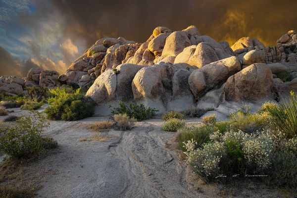
I haven't submitted anything lately, but felt the attached photo was needing some suggestions for improvement from the hogs that offer helpful criticism.
Apr 16, 2021 23:04:22 #
Orphoto
Loc: Oregon
Hi Jon. In all this is a fairly high impact image just the way it is. By way of tweaks I would suggest cropping up from the bottom to just above your name. Not to cut out your name per se, but because you have a fairly large empty zone on the lower left corner that is not helping you. Secondly I would tone down slightly 2 or 3 of the larger really bright rocks.
Charles
Charles
Apr 17, 2021 04:33:32 #

My suggestion is a vignette to channel the viewer's attention more towards the brighter rocks. If you have more options for a crop I would suggest having slightly more sky and slightly less foreground, and keep the highlights in the clouds on the left subdued. I would say the lighting on the rocks is a little beyond moderate but that's part of what makes the lighting interesting.
Apr 17, 2021 07:37:24 #

Orphoto wrote:
...because you have a fairly large empty zone on the lower-left corner that is not helping you. Charles
OK, plant a bush lower left. The smooth way I would do it is to make a horizontal swap and rename adding suffix HF for Horizontal Flip. Next with both images on-screen [window in edit program] clone some of the far-right shrub cluster, now left in the flip image, onto the image adjusting the % transparency and softness to look good to you.
With flipping, the whitish shrub leans toward the center of the image.
Apr 17, 2021 08:45:07 #

R.G. wrote:
My suggestion is a vignette to channel the viewer's attention more towards the brighter rocks. If you have more options for a crop I would suggest having slightly more sky and slightly less foreground, and keep the highlights in the clouds on the left subdued. I would say the lighting on the rocks is a little beyond moderate but that's part of what makes the lighting interesting.
I wouldn't have thought of a vignette, but R.G.'s suggestion is a very good one. I don't see that anything in the rocks blown out. I know how dramatic the lighting is there. Wouldn't you like to show us more than a 61kb view?
Apr 17, 2021 08:48:41 #

I would crop the bottom only to just below your name; going above it removes the base of the bush.
Apr 17, 2021 13:07:53 #
Wow, great suggestions, thank you all! Now I know what I’ll be doing later today. Not quite sure I totally understand dpullum’s comment, though. It’s always interesting how seeing images through others eyes helps me see things I haven’t seen before. Thanks again!
Apr 17, 2021 19:13:36 #
captivecookie
Loc: Washington state
What a beauty. Whatever you do, don't touch the lighting. That grabs the eye the second you see it and nails your attention. Perhaps you can warm it up the very least little bit to make one think of 'sunset' more.
The only thing else you need to do is crop off the bottom, and I'm sorry to say, above your signature. Come within a foot or two of the bottom of the rocks (feet within the image, you know...), which will keep the eye on the drama of the rocks and sky. It will also be more cinematic, a great wall hanging if ever there were one.
The only thing else you need to do is crop off the bottom, and I'm sorry to say, above your signature. Come within a foot or two of the bottom of the rocks (feet within the image, you know...), which will keep the eye on the drama of the rocks and sky. It will also be more cinematic, a great wall hanging if ever there were one.
Jun 15, 2021 22:46:22 #
jonsommer wrote:
I haven't submitted anything lately, but felt the attached photo was needing some suggestions for improvement from the hogs that offer helpful criticism.
Hi Jon,
This is a dramatic and beautiful image of an area I know well. The more you visit this area the more photo opportunities one finds.
I agree several of the suggesting you received back. A vignette would focus the viewers eyes a little more on the rocks. Currently, the dramatic sky competes with the rocks which I feel is the subject of the image. The stream acts as a good leading line allowing the viewer to enter the image from the bottom and leads the viewer directly to the rocks.
Some critique: The image isn't feel balanced to me. You have a lot more weight on the right side compare to the left side of the image. You might consider a different crop or clone some of the plants from the right side over to the left side to add some balance.
The sky is inconsistent with the foreground. In the sky, the sun is coming from the right of the image. You can see that in the cloud highlights. The rocks strongly show the sun coming from the left of the image. This was the first thing I noticed when viewing the image.
Overall, this is a very dramatic and artistic image of a place I really enjoy.
Hope this helps
Mike
If you want to reply, then register here. Registration is free and your account is created instantly, so you can post right away.