B&W Abstract
Apr 12, 2021 11:16:59 #
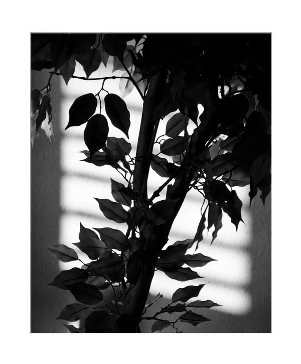
Last night I was sitting on my couch and saw the interesting light behind the house plant. Shot last night opened this morning. Started working the image and came up with this sort of, if not, abstract photo. Probably should close the blinds some to get a wider line between the whites on the wall. Will have an opportunity to reshoot.
Apr 12, 2021 12:01:16 #
I'd have to see the next shot but it is hard to believe it could be any better than this one.
Apr 12, 2021 12:35:22 #

I find this a very appealing shot. The contrast and loose design are very nice.
Apr 12, 2021 14:17:44 #

Good eye! You captured the effect nicely.
Like Jack, I doubt that a second attempt will improve upon this one - but with your good eye you might come up with a second excellent image!
Dave
Like Jack, I doubt that a second attempt will improve upon this one - but with your good eye you might come up with a second excellent image!
Dave
Apr 13, 2021 08:04:23 #

Apr 13, 2021 08:15:47 #

Apr 16, 2021 19:10:43 #
Looks like everyone with comments has approved my shot. 👍
I still want to try another one with the blinds shadow being more pronounced but we've had rain or overcast skys since I shot this.
I still want to try another one with the blinds shadow being more pronounced but we've had rain or overcast skys since I shot this.
Jul 29, 2021 05:14:51 #
"Abstract" should not be used with this image as you have silhouetting going on. The best part about this image and you need to excel with this is the top left where the group of leaves have varying shades and shadows on them. This is where you need to reattempt your image once again and capture more of the shades and shadows of the leave not just a dark silhouette
Aug 13, 2021 15:51:53 #

I think it's a nice image. You have the whole range of black, grays and white. The white square on the wall with the lines running through it make it interesting. Not a fan of the white border. It's a good image without trying to get cute with frames.
I think I can envision what you are talking about with closing the blinds some. Increasing or decreasing the opening might give it some different effects. We'll see.
I think I can envision what you are talking about with closing the blinds some. Increasing or decreasing the opening might give it some different effects. We'll see.
If you want to reply, then register here. Registration is free and your account is created instantly, so you can post right away.