B&W or color?
Jul 7, 2020 18:24:35 #

Jul 7, 2020 18:26:08 #

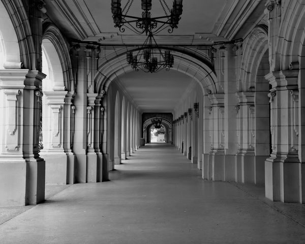
Joe, black and white. But then, I'm more a black and white photographer. As for this photograph, there isn't much color there. However, there is a lot of patterns and geometry which lend themselves to black and white quite nicely.
I've also been know to photograph sunsets in black and white.
--Bob
I've also been know to photograph sunsets in black and white.
--Bob
jkm757 wrote:
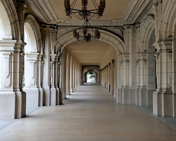
Covered walkway along the Prado, Balboa park.
Jul 7, 2020 18:28:40 #

I like the monochrome. If you center the cursor in the exit arch in download and click, there is a very interesting widescreen crop you might consider as well! Very nice photo!
Jul 7, 2020 18:36:09 #

Another vote for the B&W. As already stated that there is not much color in the image to start with the B&W version shows very nicely. I would add just a touch more contrast.
Don
Don
Jul 7, 2020 18:39:47 #

Very fond of b&w, but I favor the color version here. Both nice.
Jul 7, 2020 18:41:57 #

As suggested, I would also like a little more contrast. Of the two the color has a bit more and has more depth. Most effective in the farthest columns.
Jul 7, 2020 18:49:45 #

Black and White photos often lend themselves to high contrast. This image does not have a great deal of contrast… or possible contrast of light and shadows.
While there is not much color in the other version version… it does add warmth to material that is basically cold.
I therefore feel that the color version has the edge over the B & W.
Barry
While there is not much color in the other version version… it does add warmth to material that is basically cold.
I therefore feel that the color version has the edge over the B & W.
Barry
Jul 7, 2020 18:52:43 #

What are you trying to convey? bbrowner (above) properly analyzes the color, but the B&W is a more "solemn" approach.
Jul 7, 2020 19:07:25 #
UTMike wrote:
What are you trying to convey? bbrowner (above) properly analyzes the color, but the B&W is a more "solemn" approach.
In the opinion of some. But not necessarily all.
Jul 7, 2020 19:13:10 #

Jul 7, 2020 20:21:18 #
Barry, black and white photographs can lend themselves to high contrast. However, the better part of them is done to present the range of gradients between black and white. Thus, the entire scale of tonality. I think quite a few people think of black and white as just that. The in-between tones are equally important.
--Bob
--Bob
bbrowner wrote:
Black and White photos often lend themselves to high contrast. This image does not have a great deal of contrast… or possible contrast of light and shadows.
While there is not much color in the other version version… it does add warmth to material that is basically cold.
I therefore feel that the color version has the edge over the B & W.
Barry
While there is not much color in the other version version… it does add warmth to material that is basically cold.
I therefore feel that the color version has the edge over the B & W.
Barry
Jul 7, 2020 20:27:04 #

Jul 7, 2020 21:35:55 #

While B&W would tend to work well with a photograph such as yours I would take the color photo, when you look at both downloads, the second photo tends to lead the eye through the photo much better, I think the B&W photo needs a little more post processing, it seems a little flat.
Jul 8, 2020 02:41:14 #
Black and White is fine for a black and white world. If you want your photograph to represent something that it is not then go with black and white. If you want it to represent the real world as it exists then go color. This is not a black and white world, it is full of living color.
Jul 8, 2020 05:40:57 #

Tough call. For me it really is 50/50. The 'colour' one is almost a monochrome anyway.
If the B&W one had a tad more contrast it would probably sway me.
If the B&W one had a tad more contrast it would probably sway me.
If you want to reply, then register here. Registration is free and your account is created instantly, so you can post right away.