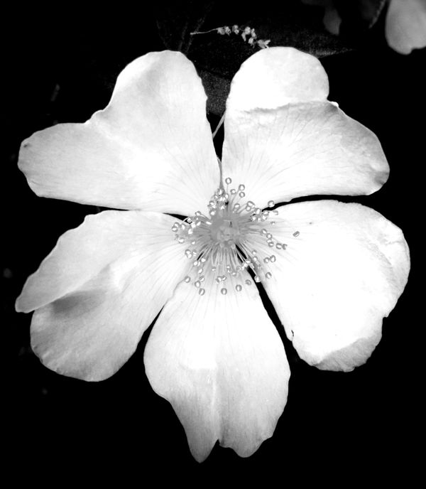
Wild Rose in Black and White
May 18, 2020 18:50:56 #
May 19, 2020 02:03:54 #

Starkness would suit the B&W approach. I find the stuff at the top a distraction. And starkness isn't the same as harshness. The highlights could be toned down a bit without losing contrast.
(PS - This would probably be better off in another section. If you want feedback, try the Photo Critique section or For Your Consideration).
(PS - This would probably be better off in another section. If you want feedback, try the Photo Critique section or For Your Consideration).
If you want to reply, then register here. Registration is free and your account is created instantly, so you can post right away.