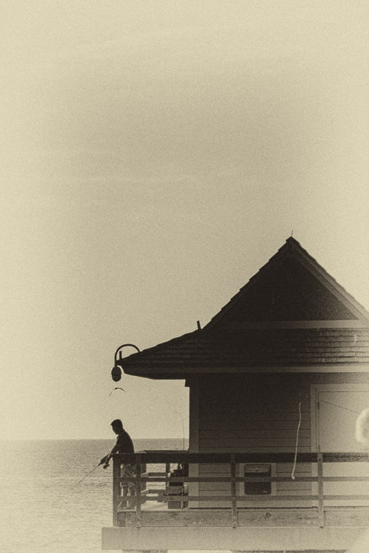
sunset Fisherman II
Mar 17, 2020 13:45:36 #
Firstly, I hope everyone is well and staying safe in these trying times (especially for those of us older folks). I have recently seen several images here on the Hog that made excellent use of negative space. So I thought that I would try my hand at it.
The attached Pic is heavily cropped from one I took earlier this winter at the beach in Naples Florida while waiting for the sunset. First I converted to BW in LightRoom, then I called for editing in Nix Silver Efex Pro where I found the Tint and Grain that I liked. I think i got carried away with the vertical alignment of the fisherman, the bird, and the light. I think that this may have been my first outing with my new Canon EOS R and the kit 24-105 f4 L IS.
Please let me know what you think and what I could have/ should have done differently.

Mar 17, 2020 13:48:53 #
AFPhoto wrote:
Firstly, I hope everyone is well and staying safe ... (show quote)
Interesting image. A vintage look.
Mar 18, 2020 08:07:09 #
I like the color and vintage look, but why did you leave so much sky? It seems to me that if you wanted to convey the feeling of isolation, or of smallness in a larger sky/ocean, that you might consider adding to the left side of the image, more sky and ocean, reducing the importance of the subject. As it is, from looking at this image, I want to see more of the subjects. You might also consider adding more birds to the empty sky?? Just thoughts. If you like this image, that is what is important.
Mar 18, 2020 08:45:16 #
Wanda Krack wrote:
I like the color and vintage look, but why did you... (show quote)
Thanks for looking. I was trying to creat negative Space. I had seen it in several photos recently and thought I would try my hand at it. I didn't notice the bird at first but now I agree that I should add More This picture is a very tiny piece Cropped out of a very large Scene
Mar 21, 2020 09:17:22 #
Hi, AFP,
I like your approach to this image and your idea of the significance of negative space.
It might be emphasized by moving the fisherman and the place he is standing far more to the right, but no higher, so that he is facing into 5he image, rather than out of it. It would reduce the mass of the structure and thereby increase the negative space, which is, IMO, the significant compositional feature to emphasize.
Good eye for an excellent scene that could be “worked” in various ways.
an edit:
I now, after reading previous comments, realize that what I ‘m suggesting is basically the same as Wanda’s suggestion!
Dave
Mar 21, 2020 09:20:53 #
Thanks Dave. I will give that a try. I sure have plenty of time to work on it. Thanks for looking and for your kind comments
Tony
Tony
Mar 21, 2020 09:25:19 #
Wanda Krack wrote:
I like the color and vintage look, but why did you... (show quote)
Thanks Wanda I see that you and Dave have the same view and later today I will edit this in the way that you suggest. Thanks for looking and for your kind comments
Tony
If you want to reply, then register here. Registration is free and your account is created instantly, so you can post right away.


