Critique request
Mar 10, 2020 19:07:43 #
bela1950
Loc: Massachusetts
Hello
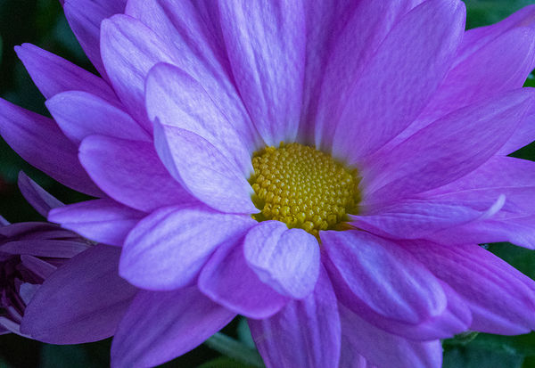
Please critique attached image. I used a 90mm Macro lens; F16, 1/20; 4000 ISO. No flash was used.
Thank you
Please critique attached image. I used a 90mm Macro lens; F16, 1/20; 4000 ISO. No flash was used.
Thank you
Mar 10, 2020 19:16:35 #

Looks great! You might consider using 2048-pixels on the long side to better fill the screens of your audience. Look too at the edges of the frame. There's a bit of brighter green along the left edge of the frame, in the upper left and lower left corner. These slight distractions distract the eye, pulling attention away from the center of the image. They can be easily cloned away.
Mar 10, 2020 19:48:17 #
bela1950
Loc: Massachusetts
CHG_CANON wrote:
Looks great! You might consider using 2048-pixels on the long side to better fill the screens of your audience. Look too at the edges of the frame. There's a bit of brighter green along the left edge of the frame, in the upper left and lower left corner. These slight distractions distract the eye, pulling attention away from the center of the image. They can be easily cloned away.
Thank you for your advice. I will remove the green along edges. What do you mean use 2048 pixels on long side?
Mar 10, 2020 19:51:06 #
bela1950 wrote:
Thank you for your advice. I will remove the green along edges. What do you mean use 2048 pixels on long side?
Your attachment is 1024-pixels on the long side. It opens slightly larger than the embedded thumbnail, but not much larger. This post discusses ideas for pixel resolution of digital images: Recommended resizing parameters for digital images
Mar 10, 2020 20:08:24 #
bela1950
Loc: Massachusetts
CHG_CANON wrote:
Your attachment is 1024-pixels on the long side. It opens slightly larger than the embedded thumbnail, but not much larger. This post discusses ideas for pixel resolution of digital images: Recommended resizing parameters for digital images
Thank you

Mar 10, 2020 21:15:13 #
Well done.
I would have moved the disk floret to the left rather than to the right of center as you have it. That is a minor point. The image seems a little noisy. Assuming that you are shooting indoors, you don't have to worry about movement, so you could use a lower ISO even if that means a slower shutter speed.
Mike
Mar 10, 2020 22:57:03 #
bela1950
Loc: Massachusetts
Blenheim Orange wrote:
Well done.
I would have moved the disk floret to the left rather than to the right of center as you have it. That is a minor point. The image seems a little noisy. Assuming that you are shooting indoors, you don't have to worry about movement, so you could use a lower ISO even if that means a slower shutter speed.
Mike
I would have moved the disk floret to the left rather than to the right of center as you have it. That is a minor point. The image seems a little noisy. Assuming that you are shooting indoors, you don't have to worry about movement, so you could use a lower ISO even if that means a slower shutter speed.
Mike
I can reshoot it with a lower iso and slower shutter since I'm using a tripod The flower is still in bloom.
Thank you
Mar 11, 2020 01:32:26 #
bela1950 wrote:
I can reshoot it with a lower iso and slower shutter since I'm using a tripod The flower is still in bloom.
Thank you
Thank you

Mar 11, 2020 08:34:50 #

bela1950 wrote:
Hello
Please critique attached image. I used a 90mm Macro lens; F16, 1/20; 4000 ISO. No flash was used.
Thank you
Please critique attached image. I used a 90mm Macro lens; F16, 1/20; 4000 ISO. No flash was used.
Thank you
Hello
I am not qualified to critique your image, but I felt it was lacking something, somehow, somewhere.
So I saved your download and PPd with Affinity. I cropped from the left and put the centre of the flower to the left of centre (because the flower is turned to the right). I then added a dark vignette to get rid of the green. Using the auto tools I added contrast to make it pop, and added clarity as I thought the image was soft.
I then thought the image to be more dynamic, was cleaner and had real impact.
This was a simple exercise which I enjoyed - thanks.
Mar 11, 2020 10:01:23 #
bela1950
Loc: Massachusetts
Delderby wrote:
Hello br I am not qualified to critique your image... (show quote)
Greetings
Thank you for taking your time to share your thoughts and advice. I am going to follow your steps to see the results. I use Photo Elements.
Mar 11, 2020 12:09:41 #

It's a very well done shot; my personal preference would be to pull back a bit ignorer to show the full blossom with a bit of "air" around it (assuming a neutral non-distracting background). A shot which includes the vase might add more interest. Just my opinion.
Mar 11, 2020 12:56:24 #
bela1950
Loc: Massachusetts
mffox wrote:
It's a very well done shot; my personal preference would be to pull back a bit ignorer to show the full blossom with a bit of "air" around it (assuming a neutral non-distracting background). A shot which includes the vase might add more interest. Just my opinion.
Personally I too, prefer more of the flower. However, I needed to submit an image to my camera club for an intra club competition. Macro is the genre this month.
Thank you for your thoughts.
Mar 11, 2020 13:56:19 #
bela1950 wrote:
Personally I too, prefer more of the flower. However, I needed to submit an image to my camera club for an intra club competition. Macro is the genre this month.
Thank you for your thoughts.
Thank you for your thoughts.
I don't think that pulling back to get the while blossom into the frame is necessarily the best composition in any case.
Mike
Mar 11, 2020 15:40:37 #
bela1950
Loc: Massachusetts
Blenheim Orange wrote:
I don't think that pulling back to get the while blossom into the frame is necessarily the best composition in any case.
Mike
Mike
Mar 12, 2020 11:44:13 #

From a technical point of view it's a bit soft. If that isn't a deliberate choice you can give it a touch more pop by adding contrast, clarity and sharpening. If the colours end up too strong after you've added contrast you can desaturate, either globally or using the HSL tool to target specific colours (the purple may get a bit too vibrant).
Avoiding the high ISO would have been a good idea. As you say, a tripod and a slower shutter speed are what's needed. While you're at it, a smaller aperture would have given enough DOF to get the nearest petal looking sharper. The very small increase in diffraction will be less detrimental to sharpness than lack of DOF.
Avoiding the high ISO would have been a good idea. As you say, a tripod and a slower shutter speed are what's needed. While you're at it, a smaller aperture would have given enough DOF to get the nearest petal looking sharper. The very small increase in diffraction will be less detrimental to sharpness than lack of DOF.
If you want to reply, then register here. Registration is free and your account is created instantly, so you can post right away.