Three's a charm - right?
Feb 6, 2020 15:51:19 #

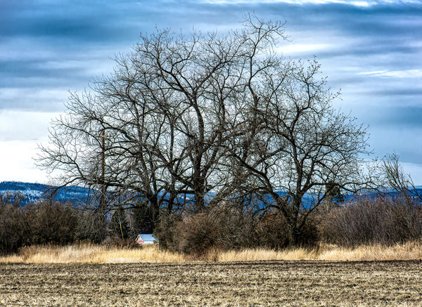
Here are three treatments of the same image. I am asking that you respond with your opinion as to which image gives you the most "impactful" or "emotional" response. Not necessarily the one you feel may have the most (or least) technical merit but the one that just kind of "grabs" you. And if none of them do, please let me know what you might do to improve it (or them!) Thanks in advance for your critical eye and helpful comments! 
Feb 6, 2020 16:24:44 #
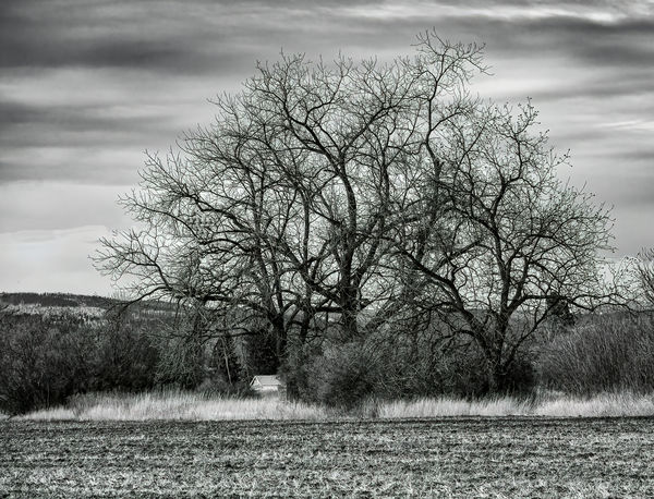
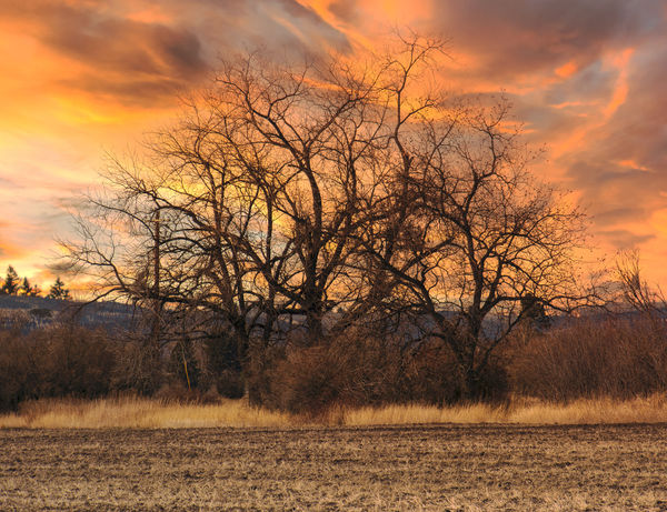
The trees are the primary subject in 1 and 2, but the sky takes over in 3.
I'm not a big fan of B/W, maybe because when I started photography, color was special.
#1 is probably what I would have produced, but #3 is the one that I think has most impact. That probably says a lot about my artistic talent. And my artistic taste, as well, so fold that into my answer.
I'm not a big fan of B/W, maybe because when I started photography, color was special.
#1 is probably what I would have produced, but #3 is the one that I think has most impact. That probably says a lot about my artistic talent. And my artistic taste, as well, so fold that into my answer.
Feb 6, 2020 16:31:42 #

Black and white (with the house cloned out). The third image appears to me to be a different shot from the first two.
Feb 6, 2020 16:51:12 #
kenievans
Loc: Dallas
No. 3 for me all the way. The trees look like they are reaching out to grab the energy blazing through the sky.
I like No. 2 but not as well. Although it really brings out the detail in the trees it has a more subdued energy.
No. 1 just says its cold outside to me.
I like No. 2 but not as well. Although it really brings out the detail in the trees it has a more subdued energy.
No. 1 just says its cold outside to me.
Feb 6, 2020 18:03:50 #
saxman71 wrote:
Black and white (with the house cloned out). The third image appears to me to be a different shot from the first two.
I did replace the sky in #3 as it was the only way I could get the kind of sunset that I wanted. The tree is the same in all 3 images.
Feb 7, 2020 07:25:47 #
#3 has the most impact. I like #2 but perhaps as mentioned, with the house removed.
Feb 7, 2020 08:38:17 #

The black and white speaks to me. At first glance, I thought, “remove the house,” but the more I looked at the photo, the more I realized it belongs there.
Feb 7, 2020 08:43:39 #

Tommy, you've spoiled me with your consistently compelling compositions (sorry for the alliteration, it just popped out  ), so I'm struggling here because none of them appeal to me.
How I see the choices: in all of them the sky competes for attention with the stark trees. But the visual impact of the stark trees is lessened by the busy-ness of the surroundings. I very much like the idea of this series, however!
), so I'm struggling here because none of them appeal to me. How I see the choices: in all of them the sky competes for attention with the stark trees. But the visual impact of the stark trees is lessened by the busy-ness of the surroundings. I very much like the idea of this series, however!
Feb 7, 2020 10:14:14 #
tommystrat wrote:
I did replace the sky in #3 as it was the only way I could get the kind of sunset that I wanted. The tree is the same in all 3 images.
That's interesting. Changing out the sky against a busy image like that tree would be challenging for me. Can you explain how you went about doing that?
Feb 7, 2020 11:59:59 #
saxman71 wrote:
That's interesting. Changing out the sky against a busy image like that tree would be challenging for me. Can you explain how you went about doing that?
I used Luminar 4's AI Sky Replacement feature and did it in 1 click! I used to struggle with replacing the sky, halos, chromatic aberration, etc. but this feature does a great job with very little effort!
Feb 7, 2020 12:02:08 #
Linda From Maine wrote:
Tommy, you've spoiled me with your consistently compelling compositions (sorry for the alliteration, it just popped out ), so I'm struggling here because none of them appeal to me.
How I see the choices: in all of them the sky competes for attention with the stark trees. But the visual impact of the stark trees is lessened by the busy-ness of the surroundings. I very much like the idea of this series, however!
), so I'm struggling here because none of them appeal to me. How I see the choices: in all of them the sky competes for attention with the stark trees. But the visual impact of the stark trees is lessened by the busy-ness of the surroundings. I very much like the idea of this series, however!
Thanks for your candor, Linda! I see what you mean, and perhaps I can reduce the "busyness" of the surroundings, as the starkness of the trees was my primary goal. Appreciate your input!
Feb 7, 2020 17:21:51 #

I really like #3... the sky in that one really pops and makes it for me. However, I do like your B&W image as well. The focus is right on, it is sharp. I do agree with saxman71 about getting rid of the house in the B&W image, I think it would be much better without it. It looks like you did remove the house in #3 though.
Feb 7, 2020 22:28:29 #
OK I'm probably put my foot in my mouth again but here goes. First you are asking me to evaluate two totally different photos. Two are in color and one is black and white. My decision is I like the B&W best. Why, it is an honest representation of the image. I don't know how much PP is involved which is a compliment.
IMHO, the first is a snapshot and the third is an attempt to rescue it.
I too would like the house to disappear.
IMHO, the first is a snapshot and the third is an attempt to rescue it.
I too would like the house to disappear.
Feb 9, 2020 11:51:58 #
Curmudgeon wrote:
OK I'm probably put my foot in my mouth again but here goes. First you are asking me to evaluate two totally different photos. Two are in color and one is black and white. My decision is I like the B&W best. Why, it is an honest representation of the image. I don't know how much PP is involved which is a compliment.
IMHO, the first is a snapshot and the third is an attempt to rescue it.
I too would like the house to disappear.
IMHO, the first is a snapshot and the third is an attempt to rescue it.
I too would like the house to disappear.
B/W images can be produced in different ways. Digital cameras record images in color. If you have the camera set to B/W, it still takes a color image and uses a particular conversion to make it B/W.
Since you're starting with a color image, making it B/W involves converting all the colors to pure luminance with no chromatic information. Since there are three colors you can convert them in different ways involving linear conversion or non-linear. These will result in different B/W images, similar to taking a photo with B/W film, but using color filters on your lens.
So just because ain image is B/W, that doesn't mean it's an "honest representation" of the image.
Of course, that doesn't mean you can't like the B/W image over the others.
Feb 10, 2020 00:00:47 #
mwsilvers
Loc: Central New Jersey
I agree with some of the other comments. The B&W is also my preferred version but with the house removed. Unlike the colored versions it projects an interesting intense and stark image of a lonely subject on a grey winter's day. By comparison, I find the other two images must less compelling.
I didn't care for the last one because it looked to me like an over dramatized Luminar sky even before I realized it was a different sky then the other two, and before you indicated you had replaced it with Luminar. The problem with Luminar skies, in my opinion, is that to make the feature more appealing they provide intense and very over saturated looking sky images. As a result they sometimes tend to replace the original subject as an image's main focal point. That is what is happening here. The last picture is all about the sky, not the tree.
I didn't care for the last one because it looked to me like an over dramatized Luminar sky even before I realized it was a different sky then the other two, and before you indicated you had replaced it with Luminar. The problem with Luminar skies, in my opinion, is that to make the feature more appealing they provide intense and very over saturated looking sky images. As a result they sometimes tend to replace the original subject as an image's main focal point. That is what is happening here. The last picture is all about the sky, not the tree.
If you want to reply, then register here. Registration is free and your account is created instantly, so you can post right away.