Forest Park - With Some POP!
Oct 16, 2011 01:03:04 #

Someone said I needed to add some POP to some of my photos in the park... Played with the Curves and a bit of the Color... Feel free to comment...
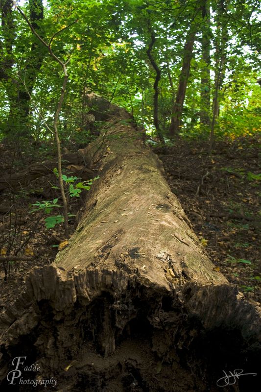
TIMBER!!!
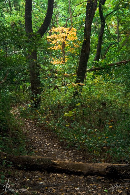
Isolated Color
Oct 16, 2011 01:13:07 #
the second is my favorite... the splash of fall color really helps. it's a bit underexposed, though, and the yellow tree is a bit too centered... perhaps move it to the right a bit, and bring the path a little more toward the middle...
Oct 17, 2011 06:24:31 #
I could be wrong, but it looks as if the path in #2 is leading the eye right towards the patch of color. Leading lines are good.
If you want to reply, then register here. Registration is free and your account is created instantly, so you can post right away.