Philadelphia Art Museum
Jan 5, 2020 18:16:30 #
Hamltnblue
Loc: Springfield PA
Hello
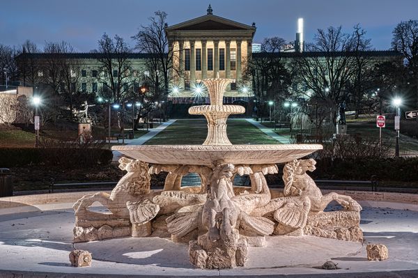
Looking for a critique on the overall picture.
This is a 5 shot HDR with post in Aurora and On1.
I didn't notice until I got home that I was off about 2 degrees with the top of the fountain. (should have been centered on the museum columns in the background.
Thanks
Jim
Looking for a critique on the overall picture.
This is a 5 shot HDR with post in Aurora and On1.
I didn't notice until I got home that I was off about 2 degrees with the top of the fountain. (should have been centered on the museum columns in the background.
Thanks
Jim
Jan 6, 2020 07:58:40 #
Hamltnblue wrote:
Hello
Looking for a critique on the overall picture.
This is a 5 shot HDR with post in Aurora and On1.
I didn't notice until I got home that I was off about 2 degrees with the top of the fountain. (should have been centered on the museum columns in the background.
Thanks
Jim
Looking for a critique on the overall picture.
This is a 5 shot HDR with post in Aurora and On1.
I didn't notice until I got home that I was off about 2 degrees with the top of the fountain. (should have been centered on the museum columns in the background.
Thanks
Jim
The exposures look good. And sharp. My problem is with the overall effect. To me, the fountain is in competition with the structure behind it. Also a small thing like the "Do not enter" sign (red) on the right looks out of place, visually. As well as the bright vertical bar of light over the right roof.
Question. What is the main focus? The fountain? The structure? Who's the "star"?
What I would do differently? Raise the camera to separate the fountain away from the structure. Or shoot structure to the right or left of fountain.
My two and a half centavos.

Jan 6, 2020 10:59:08 #

Vivid and sharp throughout and the lighting is well balanced. The composition is fine as long as you don't mind the building being relegated to a background feature. I would agree with comments about the various distractions, but if you're familiar with that scene you may prefer to keep it real.
Jan 6, 2020 12:21:13 #
Hamltnblue
Loc: Springfield PA
Thanks
With the fountain being the main subject, would it typically be better to put the art museum in the background out of focus?
With the fountain being the main subject, would it typically be better to put the art museum in the background out of focus?
Jan 6, 2020 13:10:21 #
Hamltnblue wrote:
Thanks
With the fountain being the main subject, would it typically be better to put the art museum in the background out of focus?
With the fountain being the main subject, would it typically be better to put the art museum in the background out of focus?
You describe the fountain as being the main subject, not THE subject, so presumably you see the museum as being part of the scene, in which case I'd suggest leaving it sharp. The composition as a whole suggests it's not just about the fountain. You've included the museum by giving it space within the frame so it would be contradictory to then weaken it (and its associated detail) by softening it. It's there for the eye to explore as added interest.
Jan 6, 2020 14:55:34 #
I like the shot. I tend to gestalt a picture. Then if I like it I will browse around and see what it has to tell me. In this case I see a photo of a building and grounds, the composition and lighting is attractive (I never read descriptions until I view the photo) so I stop and look around. For the next few minutes it becomes my picture and I decide why I like it, what, if anything, I would change and why. If I comment I offer personal taste not photographic dogma. To me the 'Do Not Enter' sign is obtrusive due to it's glairing red color and for some reason the little piece of the 'One Way' sign on the right edge makes me uncomfortable. To me this is not a picture that needs, or should have, a focal point. JMHO
Jan 6, 2020 17:43:34 #
Hamltnblue
Loc: Springfield PA
Curmudgeon wrote:
I like the shot. I tend to gestalt a picture. Then... (show quote)
Thanks all,
The pic wasn't planned.
I took my wife on one of my usual shoots on New Years eve. We were walking past the spot and the pic caught my eye. I am asking for critique ahead of returning to try to make it better and of course learn in the process.
If I cropped off the red sign and the same amount from the left, would the result be better or worse in not showing the entire building? I guess a content aware fill might hide the sign as well.
Jan 7, 2020 13:00:08 #
Hamltnblue wrote:
.....If I cropped off the red sign and the same amount from the left, would the result be better or worse in not showing the entire building?.....
Unless it's really important for you to show how big the building is, we don't need to see it full width. However, cloning out the sign shouldn't be difficult. It looks as though you'd be clipping one of the fountain's features if you crop out the sign. And do you want to lose the lights as well? They're not important to the shot for an observer that's never been there, but you have and you may miss that feature. I think it's a case of your own preferences overruling any question about what might be right or wrong.
Jan 7, 2020 16:42:24 #
Hamltnblue wrote:
Thanks all,
The pic wasn't planned.
I took my wife on one of my usual shoots on New Years eve. We were walking past the spot and the pic caught my eye. I am asking for critique ahead of returning to try to make it better and of course learn in the process.
If I cropped off the red sign and the same amount from the left, would the result be better or worse in not showing the entire building? I guess a content aware fill might hide the sign as well.
I wouldn't crop out the signs, I would clone them out therefore not changing the composition at all.
Jan 9, 2020 09:54:31 #
I had to read everything to understand what you might be looking for and the main focus area. When I first looked at it I thought the foreground statue was overpowering along with being possibly to red. Tossed out that idea after reading your responses. Now understanding you want to favor the statue. I believe the statue is fighting for attention because the brightness part of the background building is directly behind the statue. Since you are going to reshoot the scene try and move to the right or left and have the brightest white area of the building just outside of the upper 1/3 of the fountain. Now I don't think they with be fighting for attention. I think the fountain will be your main attraction and the background building just another element. As for signage I agree with other if on your new shot has them in the picture that they should be cloned out not cropped.
Jan 10, 2020 14:06:16 #

Jan 10, 2020 14:09:11 #
Uuglypher wrote:
Hi, Hamiltonblue,
My approach is keep it Simple!
Lighting and sharpness with DOF are all excellent.
To my eye the only fault is the lack of mutual centering of the top of the fountain and the columns of the PAM. Otherwise, it’s a great image of a site with which I an personally well familiar ( having liv3d near Kennett Square and having made many visits to the PAM).
Dave
Jan 24, 2020 18:04:50 #

Stephan G wrote:
The exposures look good. And sharp. My problem i... (show quote)
 I couldn't have said it better.
If you want to reply, then register here. Registration is free and your account is created instantly, so you can post right away.