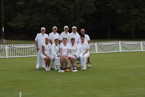
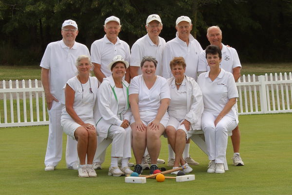
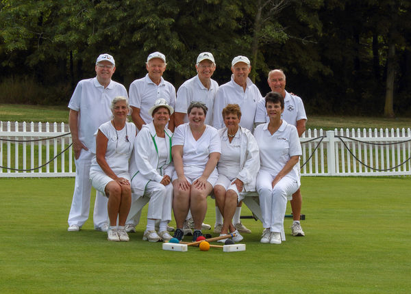
Group Photo
Aug 24, 2019 23:10:19 #
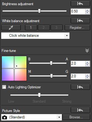
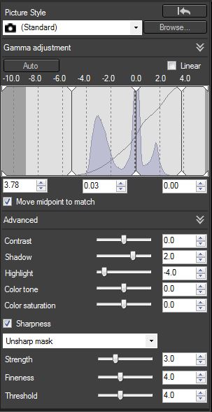
Looking for input again. Here is my original image and my edited image. I am using Canon Digital Photo Professional 4. Here are the steps I took:
Cropped.
Increased brightness to 0.50
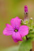
Adjusted white balance with dropper on the left-hand side of the left-hand side mallet.
Raised the shadows to 2
Lowered the highlights to -4
Moved the left-hand slider on the tone curve to the right
Fine tuned the white balance by moving the top slider toward amber (2) and the bottom slider toward green (2)
Removed mallet on ground and hose on fence.
I have included screenshots of my editing panels. Comments appreciated.
Cropped.
Increased brightness to 0.50
Adjusted white balance with dropper on the left-hand side of the left-hand side mallet.
Raised the shadows to 2
Lowered the highlights to -4
Moved the left-hand slider on the tone curve to the right
Fine tuned the white balance by moving the top slider toward amber (2) and the bottom slider toward green (2)
Removed mallet on ground and hose on fence.
I have included screenshots of my editing panels. Comments appreciated.
Aug 24, 2019 23:30:50 #
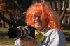
First I wonder why you had so much empty space in the original photo? Second, it would be helpful for you to look at a book on posing groups.
Aug 24, 2019 23:35:51 #
Aug 24, 2019 23:40:19 #
jim quist wrote:
First I wonder why you had so much empty space in the original photo? Second, it would be helpful for you to look at a book on posing groups.
Lots of space in photo -- I was in a tizzy and in a rush. Posing -- this is how the director wanted everyone arranged.
Aug 24, 2019 23:48:53 #
Should have been much closer to the group and the tall lady on the right should have been moved one seat to the left.
Also clone out the "mystery" fingers on the short man's shoulder.
Picky comments.
Shot came out OK though.
Also clone out the "mystery" fingers on the short man's shoulder.
Picky comments.
Shot came out OK though.
Aug 25, 2019 08:20:48 #

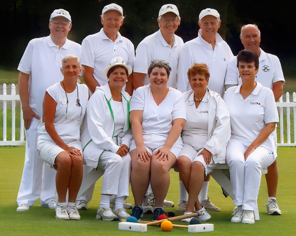
Your edits are fine. I'd up the sharpness slightly and well as adjust the level slightly. The picket fence makes for an odd level where it seems if you make the pickets pure vertical, the people will be leaning too much to the right. But, they seem just a bit leaning to the left side in our view. If you look at the bench, that might be your guide for "level". Or maybe, the crease of the pants of the man standing on the left. For sharpness, change from the unsharp mask to the general sharpening and try 4.0 rather than the 3.0 default. Finally, look at maybe adding a bit more space above the group.
Aug 25, 2019 08:30:44 #

Looks like a good edit all round, especially with the cloning. You don't mention sharpening but it looks like any improvement that it could bring would be marginal. It's possible that you could increase vividness but again the benefits would be marginal and possibly even questionable. The subjects are at ease and smiling pleasantly and their faces are well lit and easy to identify, which I would say are the important things. If you do decide to add sharpening and vividness I would recommend very moderate amounts. In fact if none of the subjects are photographers they'll be delighted with the edit as is  .
.
.Aug 25, 2019 08:41:36 #
Aug 25, 2019 10:57:20 #
jim quist wrote:
First I wonder why you had so much empty space in the original photo? Second, it would be helpful for you to look at a book on posing groups.

Aug 25, 2019 13:22:39 #
Aug 25, 2019 13:45:53 #

agree with others that the crop should be tilted a bit clockwise - perhaps straighten via a horizontal line on the bottom rail of the fencing on either side. Also, the crop could be even tighten on the group - maybe with just three fence pickets with dimensions set to 4 x 5 leaving bottom and top tight to the mallets and tops of mens' heads. The man on the left is positioned much father out than the man on the right. This, of course, could have been adjusted prior to taking the picture. But, it is possible to adjust in post via manipulation of multiple layers in photoshop. Anyway, I fooled around with this a little with final edit attached.
Aug 25, 2019 15:04:19 #
CPR wrote:
Should have been much closer to the group and the tall lady on the right should have been moved one seat to the left.
Also clone out the "mystery" fingers on the short man's shoulder.
Picky comments.
Shot came out OK though.
Also clone out the "mystery" fingers on the short man's shoulder.
Picky comments.
Shot came out OK though.
I love picky comments -- yes, I wanted the woman on the right to move, but no that's what they wanted. Definitely needed to be closer to the group -- good catch on the mystery fingers. Thanks!
Aug 25, 2019 15:07:28 #
CHG_CANON wrote:
Your edits are fine. I'd up the sharpness slightly... (show quote)
Yes, the ground on the court naturally slopes down to the left, but that was the best place for the shot with an uncluttered background. Thanks for the tips on looking for "levelness" and on sharpness improvement.
Aug 25, 2019 15:11:43 #
R.G. wrote:
Looks like a good edit all round, especially with ... (show quote)
No photographers in the group -- except me! I was most concerned with comments on the overall edit job I did. I did no sharpening to my edited image. Thanks for your comments RG!
Aug 25, 2019 15:17:54 #
s2090 wrote:
I leveled the photo, and brought some life back to the trees.
Actually, to me it looks like everyone is leaning to the right a tad. The court (and fence) naturally slopes to the left. The trees look great!
If you want to reply, then register here. Registration is free and your account is created instantly, so you can post right away.