Lifestyles
Aug 24, 2019 10:58:49 #
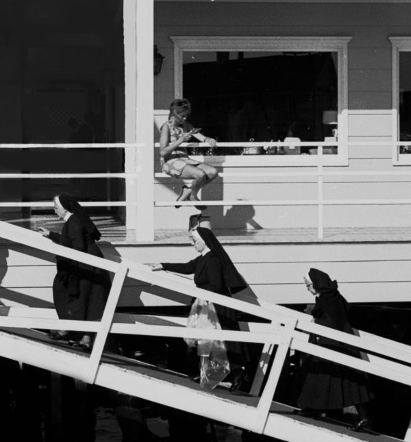
I’ve been playing around with this image, using it to learn photo-editing with Affinity Photo. It was originally shot on black & white film. I scanned the negative, saved as a TIFF, and moved it into Affinity. I like the image because of its content/story/impact but it obviously has serious technical flaws. Too bad I didn’t have a longer lens at the time!
I tried to crop to the subject but maybe adding more (the other people?) would be better. I tried to tone down some distracting highlights but may have overdone it, ending up with too much black. I think the girl’s face needs lightening but we don’t know how to do that yet. Should I remove her handbag (behind the nun’s head)? [Now that I look at the edited image in the post-preview it looks really bad compared to the view in Affinity photo. Don't know what happened. Oh well, back to the drawing board]
Ahh, between editing tools and layers and masks I’m going crazy, but I shall persevere (or at least try to!)
Your thoughts on the photo and possible directions for PP would be very much appreciated!
P.S. - I also posted the edited photo in a thread aimed at discussing the relative importance of the “content” of a photograph compared to technical criteria. If anyone is interested in that discussion please go to: https://www.uglyhedgehog.com/t-607417-1.html
Aug 24, 2019 12:50:06 #

Sometimes when things are less than optimal we have to choose which compromises are going to be the most acceptable for us. The noise and the softness both get worse the more you zoom in on them, but the story-telling aspect of the shot isn't diminished by staying wide. So I would say that compromise #1 is to not zoom in as close.
Lifting the shadows aggravates the noise so I would say compromise #2 is to not lift the shadows as much as we would like. However, we can lift the shadows selectively by applying it to areas that really need it but aren't too bad noise-wise. I applied that to the skirts of two of the nuns because they needed to stand out against a very shadowy background.
Increasing contrast aggravates noise so I would say compromise #3 is to not apply quite as much contrast as we would like.
One thing we can do that doesn't require any compromise is to select various distractions and make them less of a distraction. The bright triangle behind and to the left of the woman, the handbag behind the nun's head and one or two other bits and pieces can be worked on in this way. Another possibility is to use almost undetectable amounts of split toning to add contrast that doesn't depend on the light levels.
.
Aug 24, 2019 17:28:19 #
R.G. wrote:
Sometimes when things are less than optimal we hav... (show quote)
R.G. - Thank you very much for your thoughtful response and editing of the image. As I said, I'm learning how to use Affinity but I have a long way to go. I tried various tools for darkening or removing the distracting light triangle but had trouble controlling them and ended up with too dark an area.
I have to mull over your cropping (I think I like it but not totally sure!
 ). I love what you did with exposure, light/dark and sharpness (what did you use for sharpening? I was not very successful in my attempt!). Your suggested use of split toning gets me into uncharted territory but it sounds intriguing. Will have to learn about it. But first I have to untangle some issues about layers and masks. I also find selections difficult and somewhat intimidating. The nice thing about learning to edit with a black & white image is that it eliminates the color related problems....
Thanks again for your interesting and helpful response.
Aug 25, 2019 09:33:30 #

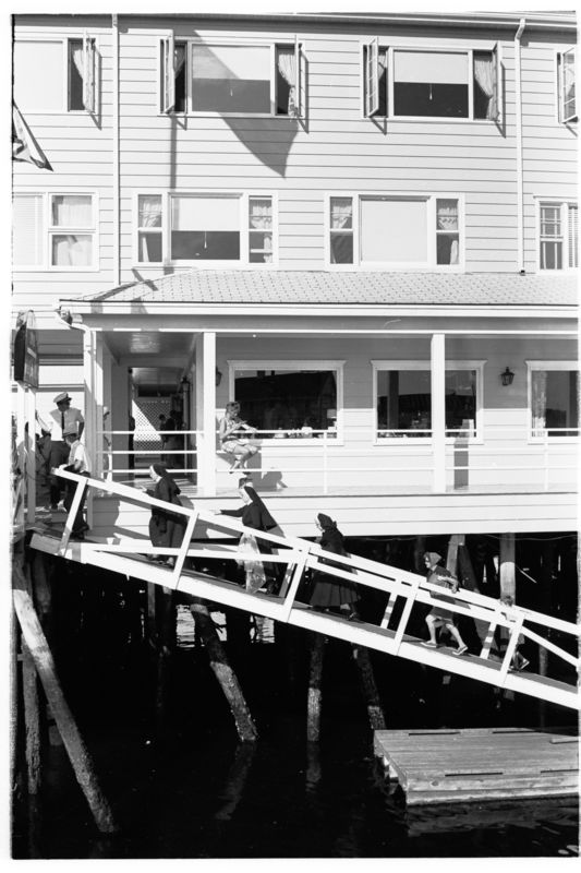
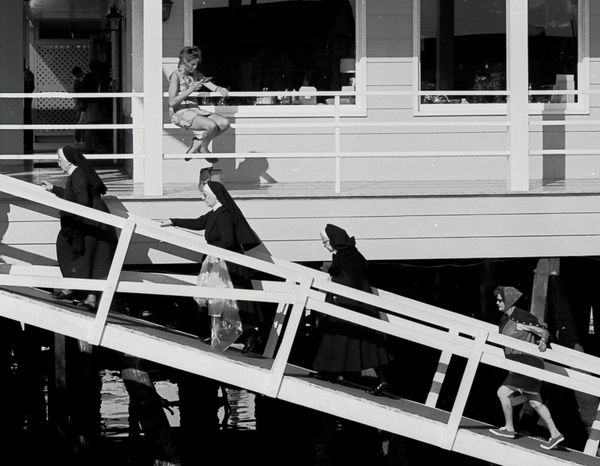
I believe you have the first image just right--it’s an example of a street shot. In the second, it’s difficult to decide what to see--the architecture of the building or the people.
Aug 25, 2019 12:15:35 #
srt101fan wrote:
R.G. - Thank you very much for your thoughtful res... (show quote)
Thanks, and you're welcome. I did the sharpening in Lr making use of the Masking slider and dialing the Details back quite a bit. Both of those steps were to avoid sharpening the noise as much as possible. I also had the Radius and the Sharpen (i.e. the amount) up quite high to counteract the loss of sharpening that the first two steps cause and to keep the sharpening strong on the edges. Adding any sharpening to noise is going to aggravate it but if you zoom in to 100% you can decide on the compromise that you feel comfortable with. The only alternative would be to not add any sharpening, but softness was a problem with the original so you have to go looking for that balance.
It's the same when you come to adding denoise. I used the same level of zoom and kept the Details slider well up, which minimises softening of the edges. You have to balance denoise with softening.
The presence of noise limits the use of the Contrast slider but contrast can be added using the luminance sliders (Whites, Blacks, Highlights etc), bearing in mind that lifting the shadows is going to aggravate the noise so the Shadows slider needs to be avoided or used very tentatively. Again that limits the options but the other sliders can be used to achieve strong contrast. And lifting the shadows can be added to specific areas using a brush. In this case bright highlights were a problem too but that was fairly easy to deal with.
Split toning is a way of adding colour contrast between the brights and the darks. While I was thinking about my response to your post it occurred to me that if you were happy with a tint like sepia you could use that to add significant colour contrast between the brights and the darks. It's not every shot that suits a tint but I think it's worth trying out.
Aug 25, 2019 12:16:42 #
jaymatt wrote:
I believe you have the first image just right--it’s an example of a street shot. In the second, it’s difficult to decide what to see--the architecture of the building or the people.
Thanks jaymatt. I agree with you on the second (original) image, it is visually confusing. I'm still not sure how close to crop it to get to the main subject (the nuns & girl) but it's good to know that my posted try works for you! R.G. had an interesting version.
Aug 25, 2019 17:41:52 #
R.G. wrote:
Thanks, and you're welcome. I did the sharpening ... (show quote)
Many thanks R.G. Good info to file away in my photo editing notebook. I like the sepia idea, will have to try it.
Aug 26, 2019 17:38:21 #
I considered removing all shadows cast by the girl and the nuns since they add much visual clutter. Could this work or would it look unnatural? Any thoughts?
If you want to reply, then register here. Registration is free and your account is created instantly, so you can post right away.